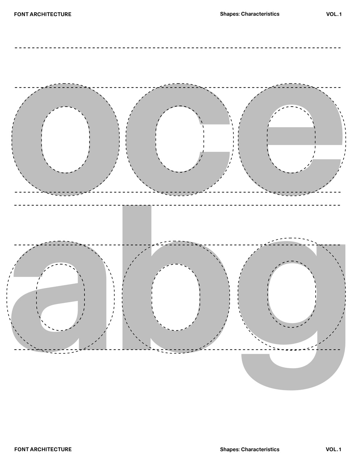
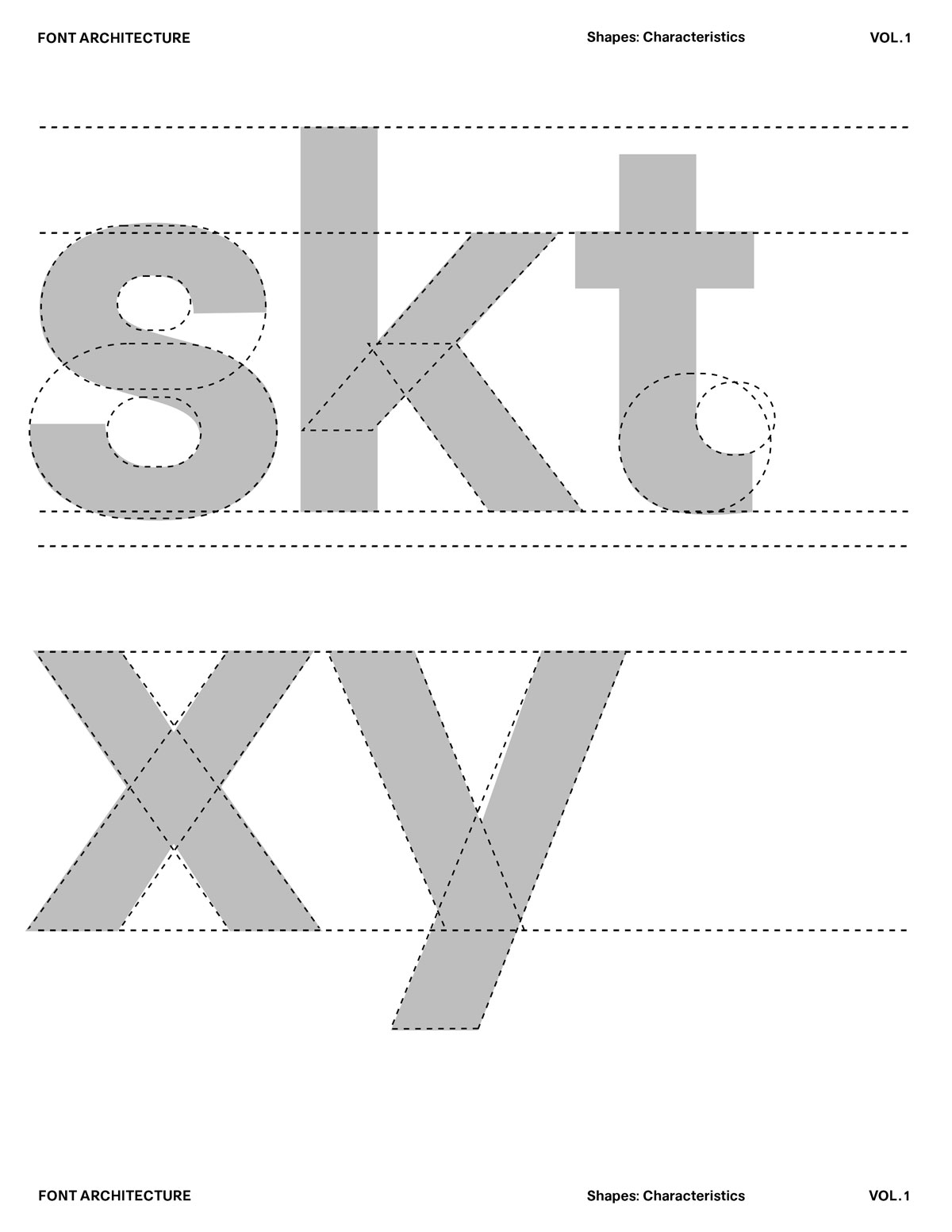
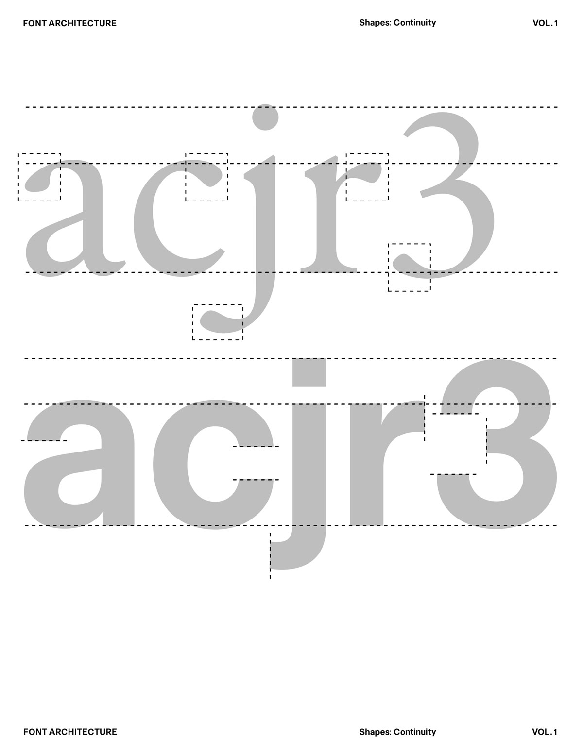
Deconstructing Shapes into Basic Forms
One of the most important skills in type design is learning how to see complex letters as simple shapes. Every curve, stroke, counter, and junction is built from a small set of foundational forms: circles, ovals, rectangles, triangles, and directional strokes. When you break letters down into these basic components, three things happen:
1. You Understand the Structure, Not Just the Outline
Breaking letters into basic forms reveals the underlying skeleton—stems, counters, angles, tension. You stop copying silhouettes and start understanding the architecture of letterforms.
2. Your Drawing Becomes More Consistent
Simple shapes repeat across the alphabet. Once you define a stem, curve logic, or angle, you can apply it everywhere. This creates a typeface that feels unified—built from rules, not guesswork.
3. It Sharpens Your Eye for Optical Corrections
Reducing complexity makes mistakes easier to see. You quickly notice when something feels too heavy, too flat, too round, or off-balance. Deconstruction trains the eye, not just the hand.
The Building Blocks of a Typeface
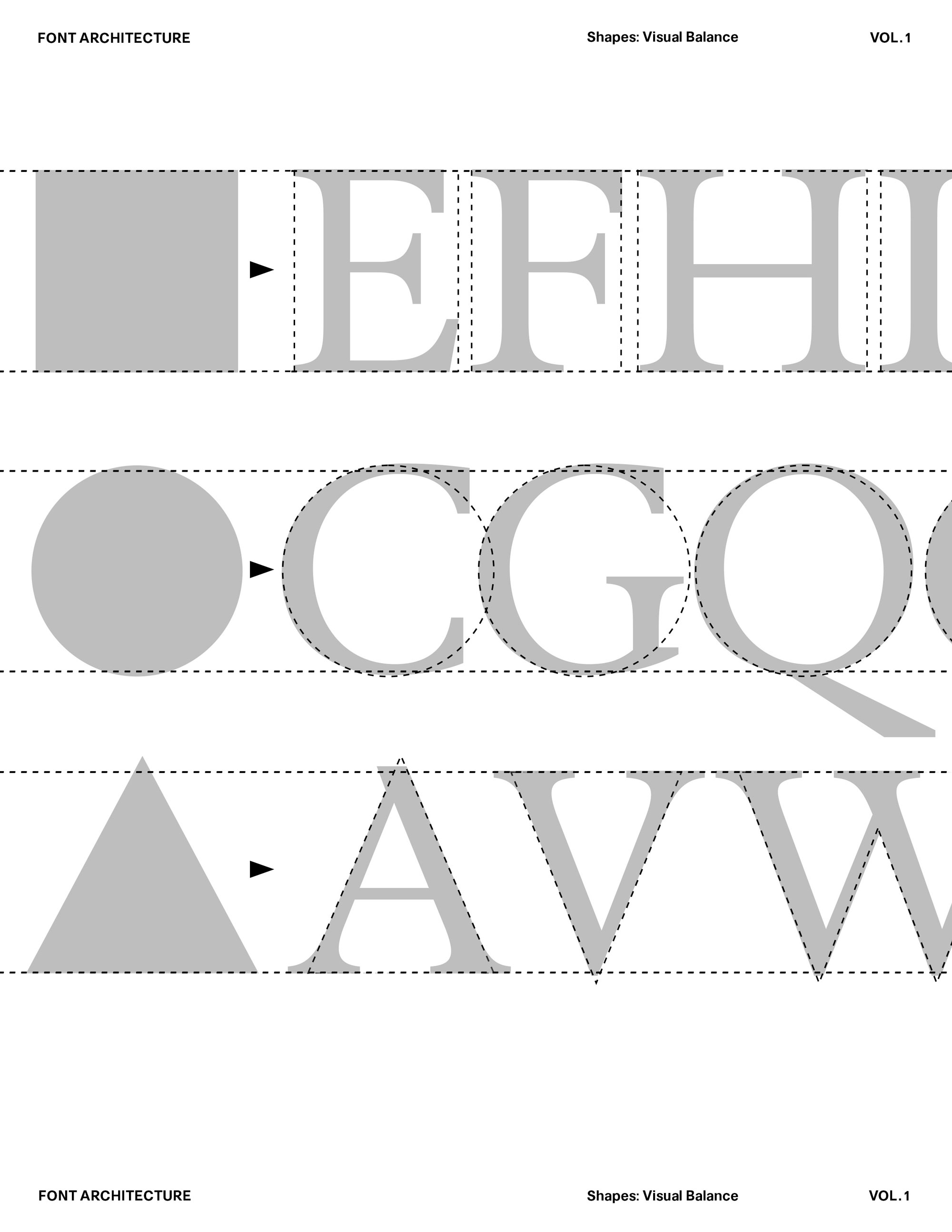
In type design, letters are not designed one by one, they are built from shared shapes. Recognizing and mastering these shapes is what makes a typeface cohesive. Learn to identify and construct the core shapes that form a typeface, and understand how consistency of shapes creates harmony, rhythm, and system.

The challenge:
These shapes never look the same size, even when they technically are. Square-based letters appear visually larger, circular forms look smaller, and triangular shapes feel light or narrow. Your job as a type designer is to correct these illusions.
Control Characters
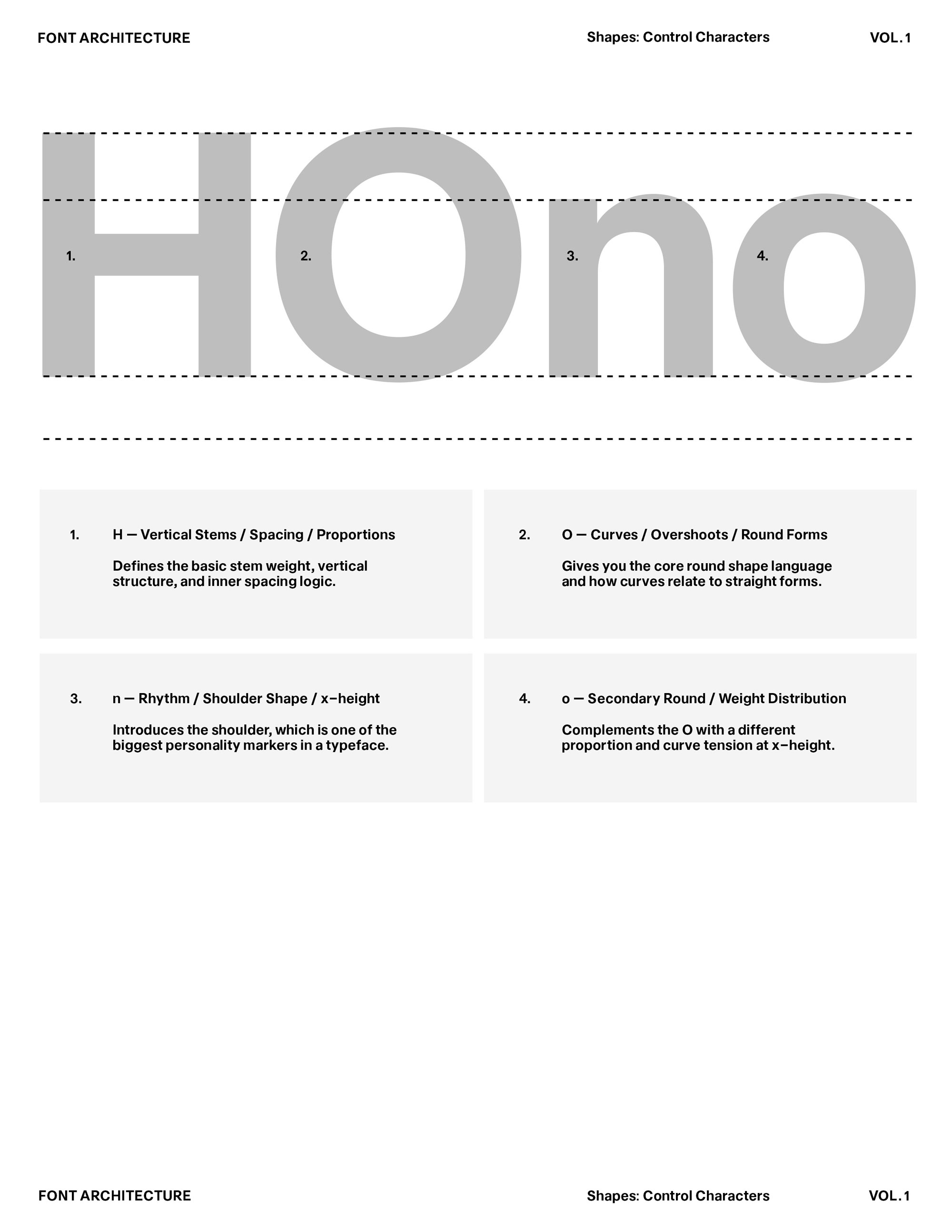
Control Characters are the core glyphs you design first, the shapes that define the logic, rhythm, and visual DNA of an entire typeface. Rather than drawing the full alphabet at once, type designers establish a small set of letters that act as the system builders. These letters reveal the structure, contrast, proportions, and curve logic that every other glyph will follow.
Optical Adjustments
A value that’s perfectly correct on paper can look completely off in form. This is where optical correction matters. Our eyes bend the rules, distort proportions, and shift weight whether we want them to or not. Instead of fighting that, we design with it. Trust what your eyes tell you. Test, adjust, refine. Optical balance often means violating the math so the shapes feel even, consistent, and alive on the page. (We'll dive deeper into each letter in module 2)

Beyond the Math:
Vertical and a horizontal line set to the same thickness never look equal. A horizontal stem must be drawn slightly thinner to appear balanced with a vertical one. This difference is one of the foundational optical corrections inside a typeface. H is the clearest demonstration: its verticals carry weight and structure, while its horizontal bar must be optically adjusted to keep the glyph feeling stable, not heavy.

Curved Shapes:
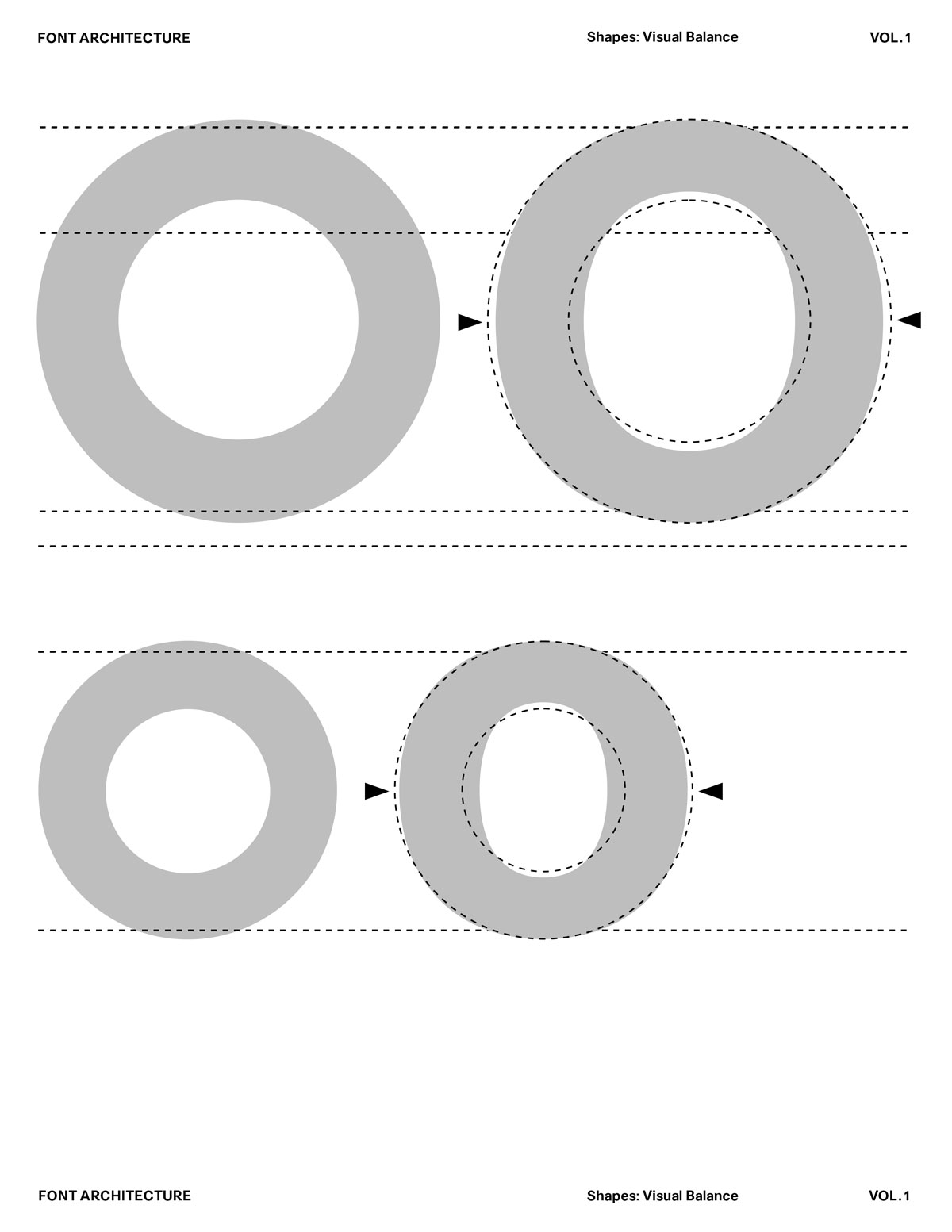
Curves always read visually lighter than straight verticals. Even if the thickness is mathematically identical, your eye interprets a curve as thinner, softer, and less substantial than a vertical stem. To compensate for that optical effect, type designers make the O’s outer form wider than the distance between the H’s vertical stems. This width adds perceived weight, so the letter doesn't collapse or appear weak next to the rigid geometry of the H.
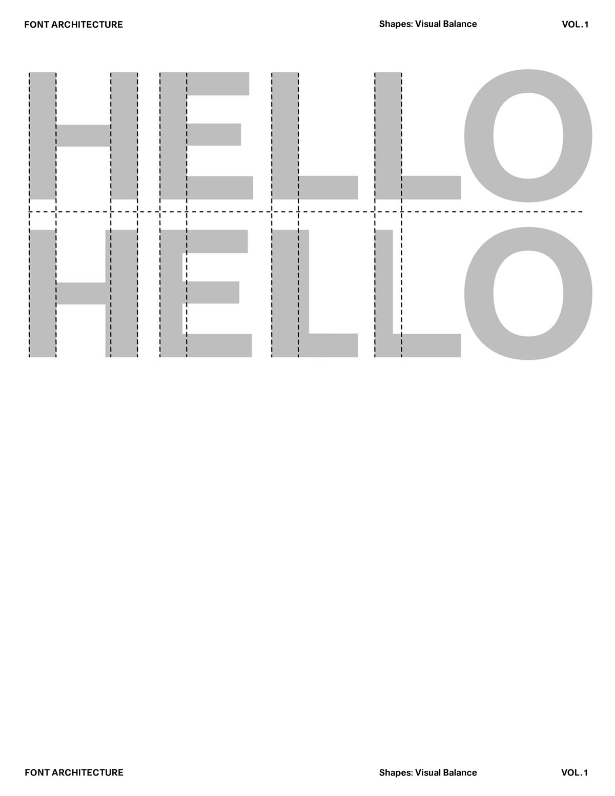
Vertical Stem Weight:
These strokes must carry consistent weight throughout the system, if they vary, even slightly, the entire rhythm collapses. A mismatch in verticals doesn’t just look “off”; it disrupts the internal logic of the design.
Vertical weight is what anchors the shapes, sets the tone, and defines how the typeface feels when it runs across a line of text. Consistency isn’t about rigidity, it’s about giving the system a stable baseline from which every other gesture can evolve.
The Perfect Circle:
It looks like a circle, but in type design, it’s almost never drawn as one. Leaning too hard on perfect geometry is one of the easiest mistakes to make because a mathematically perfect circle simply won’t read like an O. This comes down to human perception: our eyes naturally exaggerate horizontal shapes. A perfectly circular O appears too wide, too heavy, too inflated. So even in geometry-inspired typefaces, designers apply slight corrections to make the form look right.
Duplicating shapes is one of the core habits of professional type designers. Instead of redrawing every letter from scratch, designers reuse stems, curves, counters, and terminals to build a system that feels unified and intentional. This method reveals the hidden relationships between letters, strengthens structural consistency, and accelerates the learning process by turning repetition into understanding. Through duplication, you begin to see how the alphabet shares its DNA, and how a typeface becomes more than individual forms: it becomes a connected, living system.
1. It Builds Consistency Across the Alphabet
When you duplicate stems, counters, curves, and terminals, you’re not just saving time, you’re establishing rules. Reusing shapes locks in proportions, rhythm, and weight distribution, making the typeface feel coherent instead of improvised.
2. It Turns Guesswork Into a System
Duplication shows you what truly belongs to the design. If a shape works when reused in multiple letters, it’s a core part of the system. If it doesn’t, you’ve learned where the system breaks. This transforms the alphabet from isolated drawings into a connected framework.
3. It Speeds Up Learning by Revealing Patterns
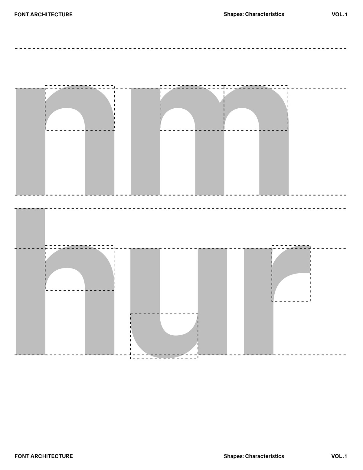
Repeating shapes teaches you which forms naturally relate:
n → h → m
o → c → e
H → E → F
A typeface only feels believable when its characteristics travel consistently from one letter to the next. The same curves, tensions, proportions, and structural decisions must appear throughout the system, creating a sense of unity that readers feel, even if they can’t explain why. Continuity isn’t about making every letter identical; it’s about preserving the design’s DNA as it evolves across different shapes. When these characteristics stay intact, the alphabet functions as one coherent voice rather than a collection of unrelated drawings.
1. Creates a Unified Reading Experience
Consistent characteristics allow letters to blend into text smoothly. Nothing feels out of place, nothing pulls unnecessary attention—the typeface reads as a single, intentional rhythm.
2. Reduces Design Guesswork
When you keep the same structural logic across the alphabet, each new glyph becomes easier to draw. You rely on established rules rather than reinventing forms, which speeds up workflow and keeps decisions grounded.
3. Strengthens the Typeface’s Identity
Shared characteristics give the font a recognizable tone. Whether it’s warm, strict, geometric, or expressive, continuity ensures that this personality remains present from A to Z.