ANATOMY
T
y
p
o
g
r
a
p
h
y
Bar
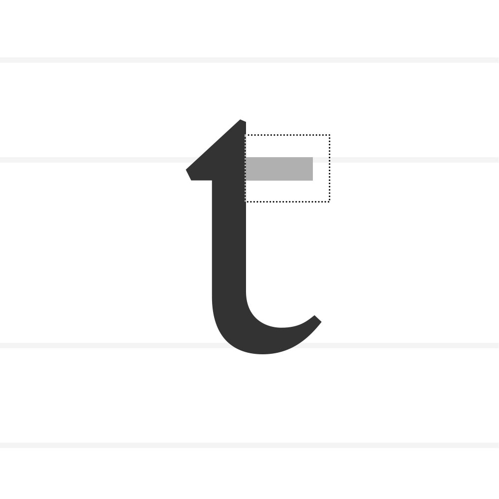
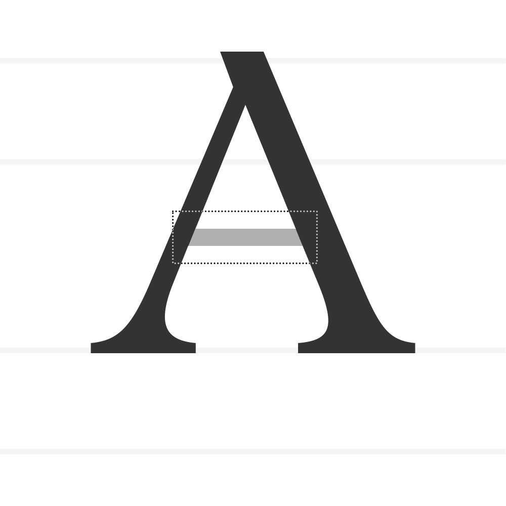
The horizontal stroke in letters like A, H, e, or f.
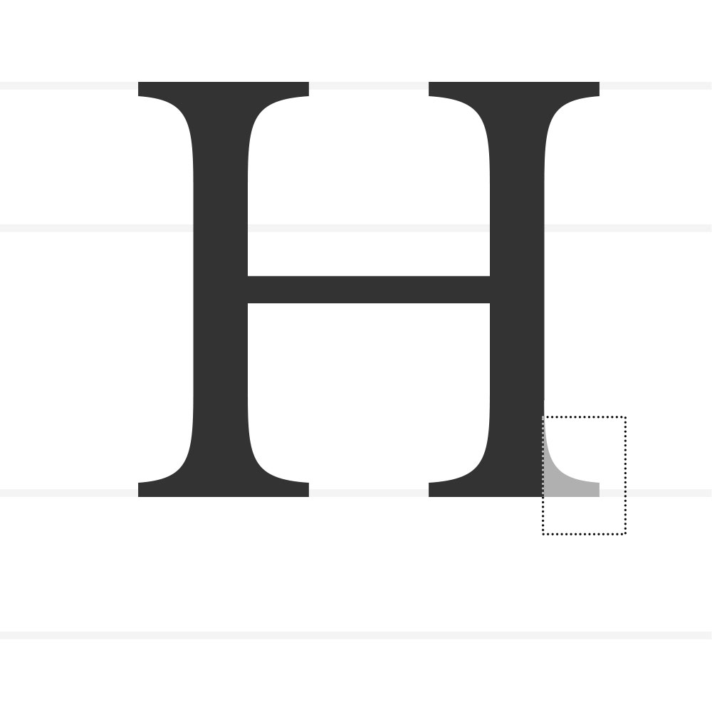
Serif
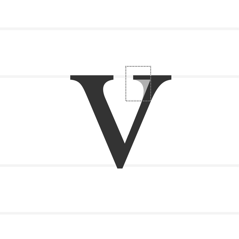
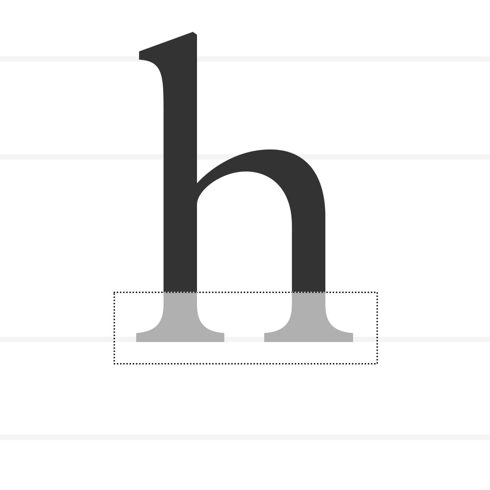
A small line or stroke that is attached to the beginning or end of a larger stroke of a letter.
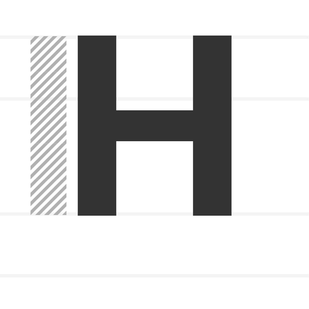
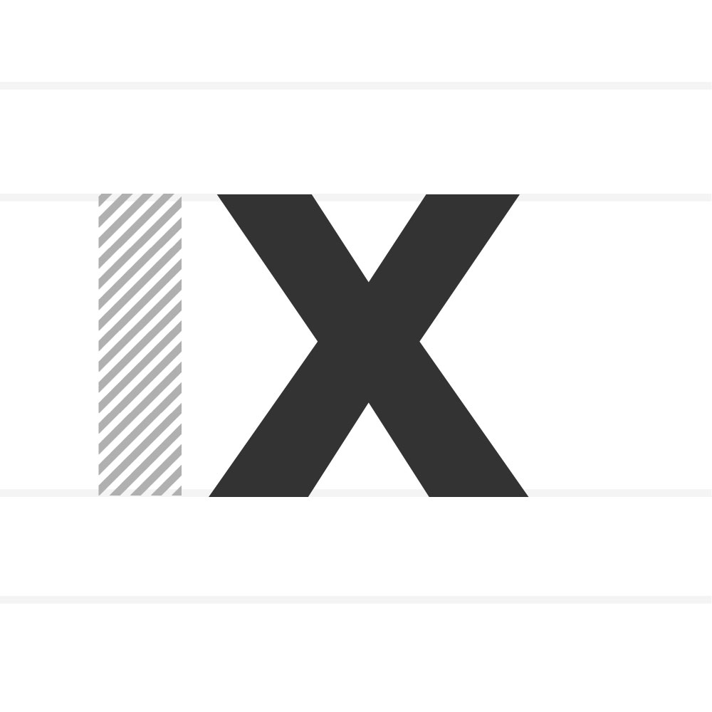
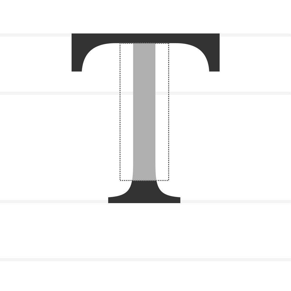
Stem
The main, vertical or diagonal stroke of a letterform, such as the straight lines in an M or the diagonal line in an N.
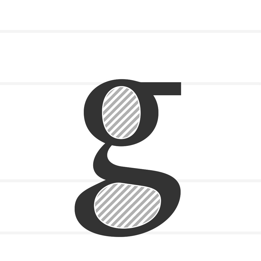
Counter
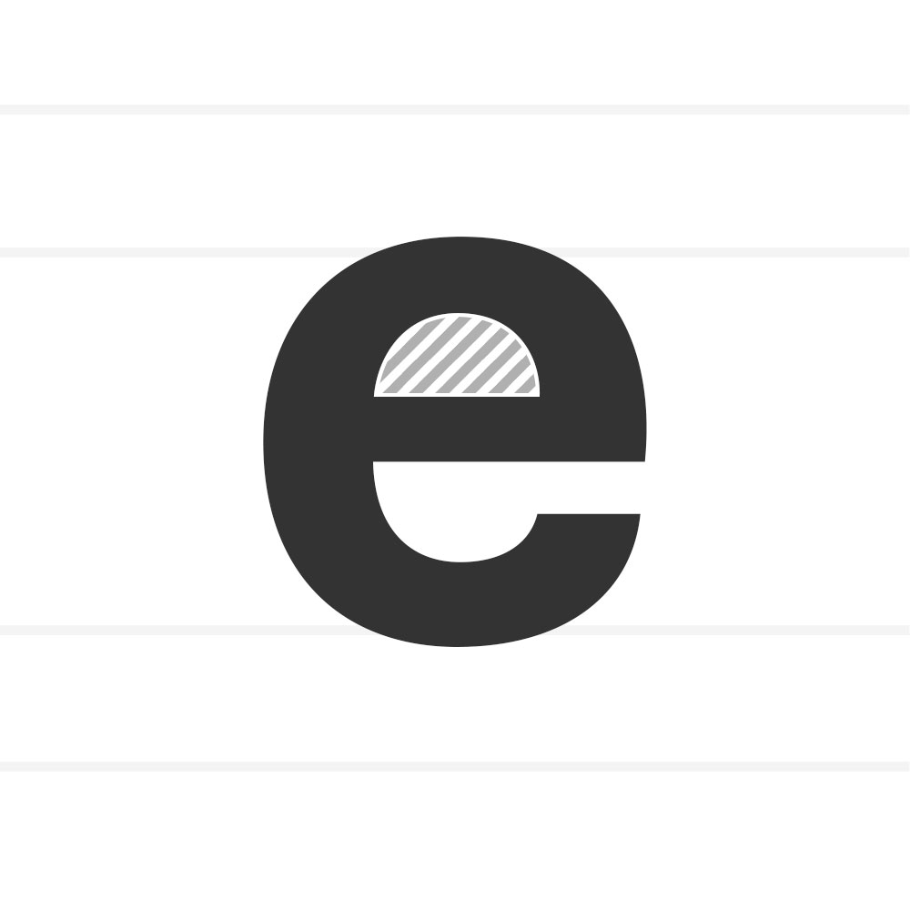
The enclosed or partially enclosed space within a letter (o, e, a).
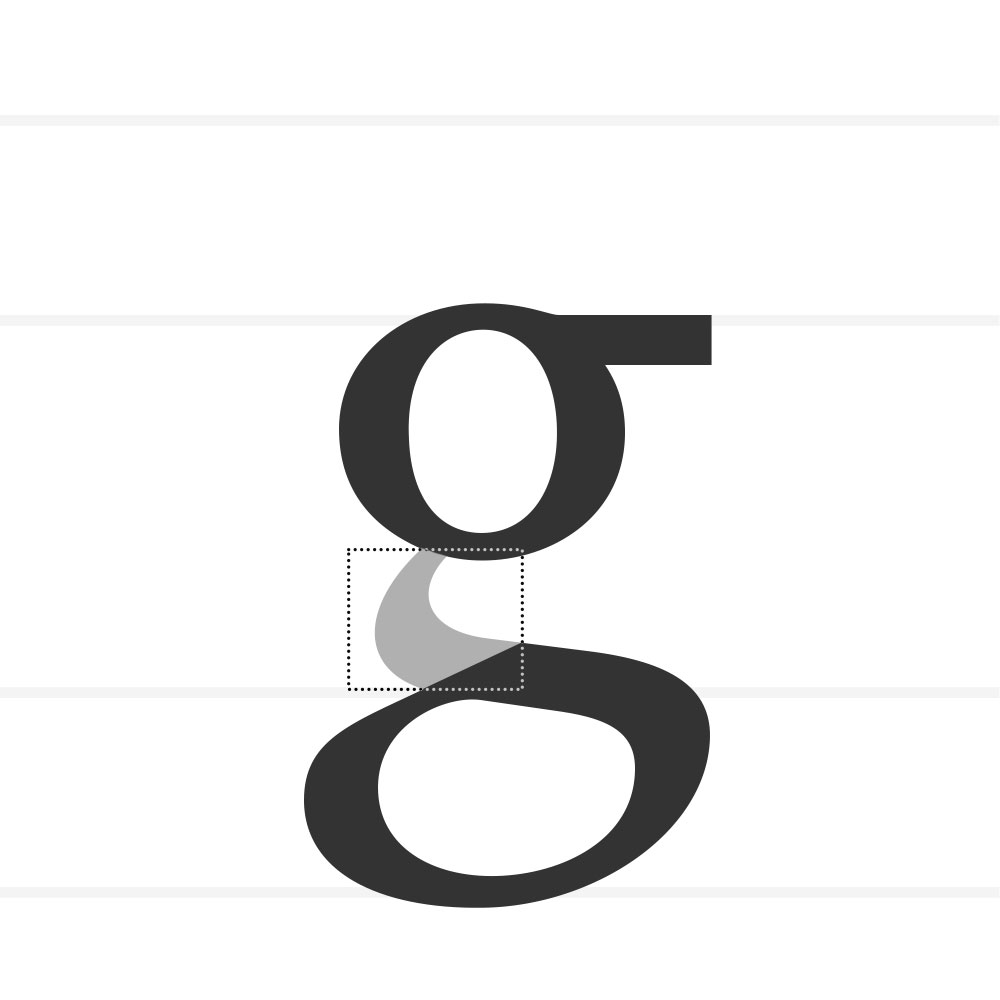
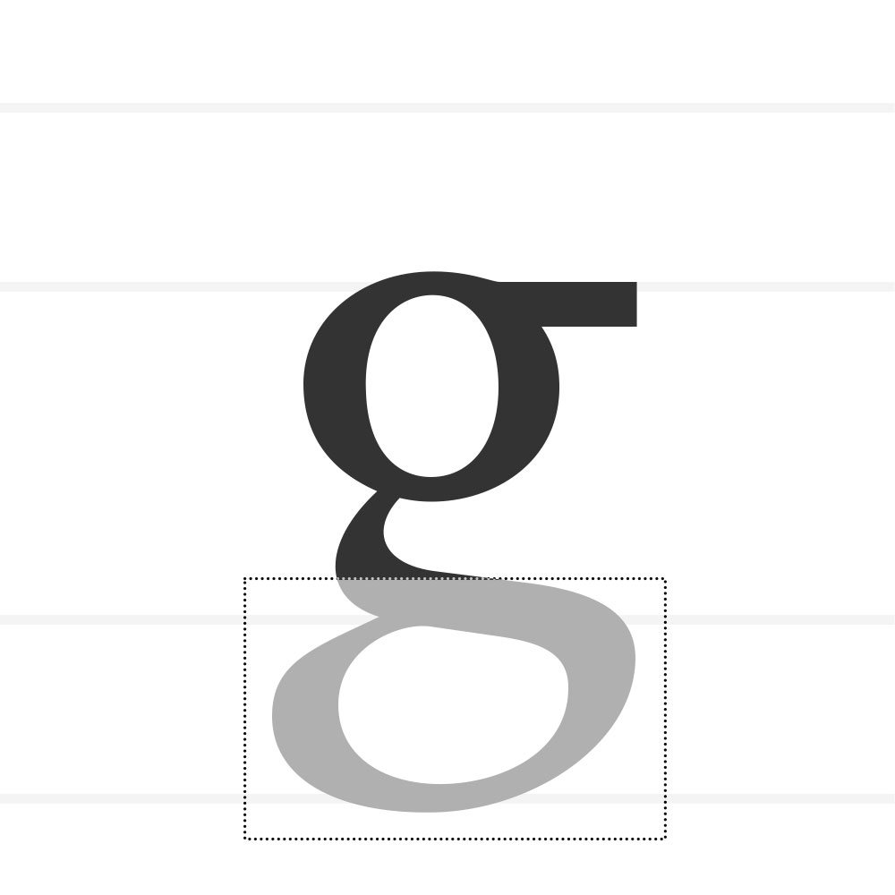
Loop
The lower enclosed counter of a double-storey g.
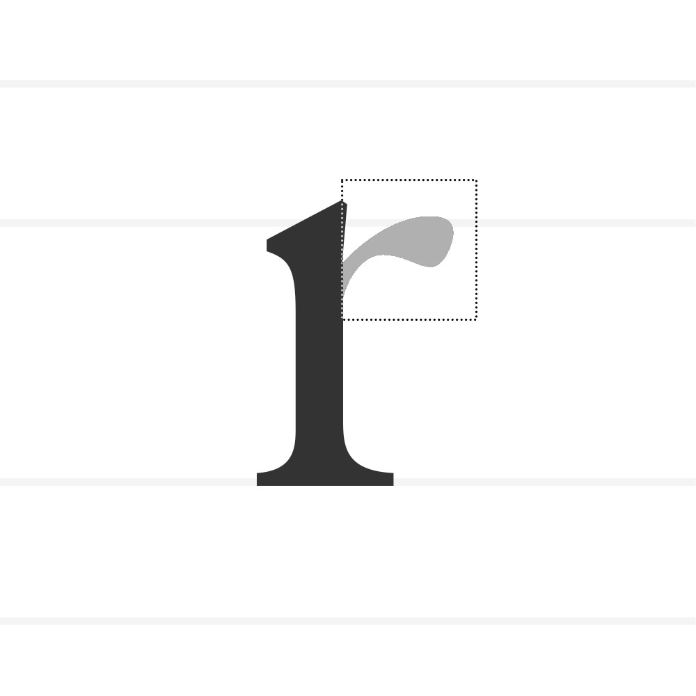
Hook
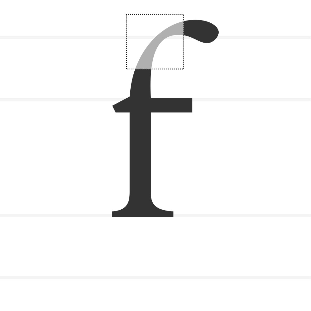
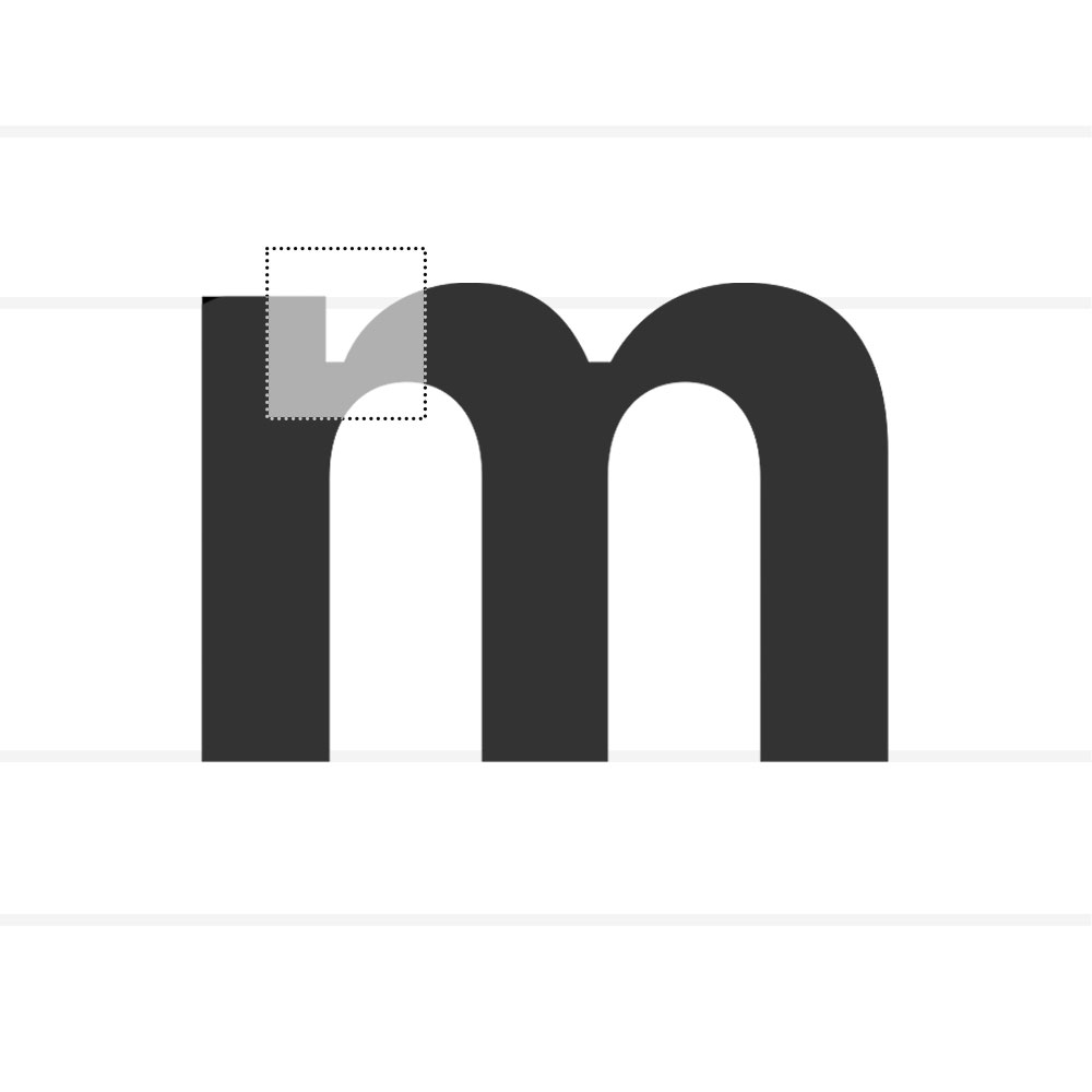
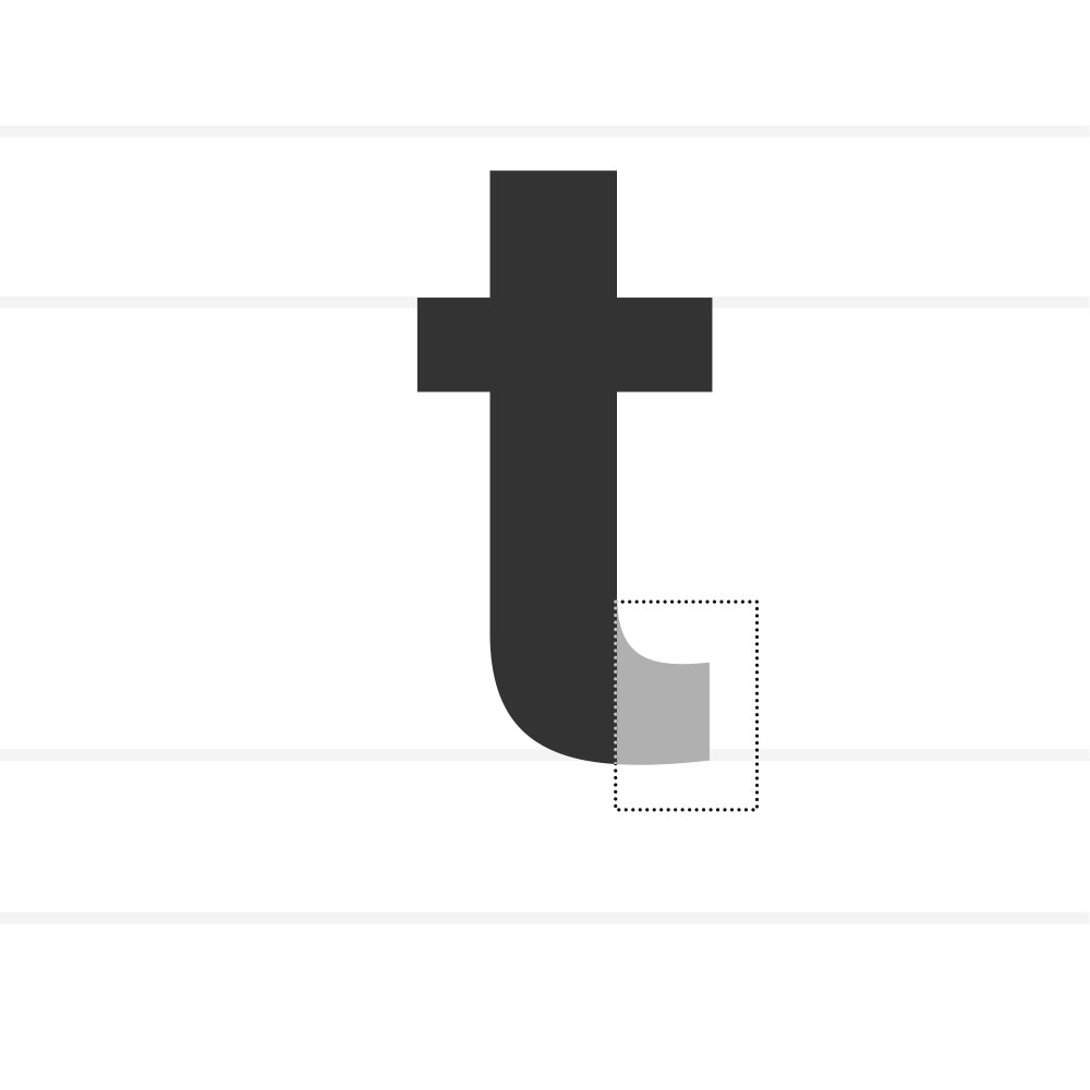
A curved, protruding stroke as seen in f, j, or r.
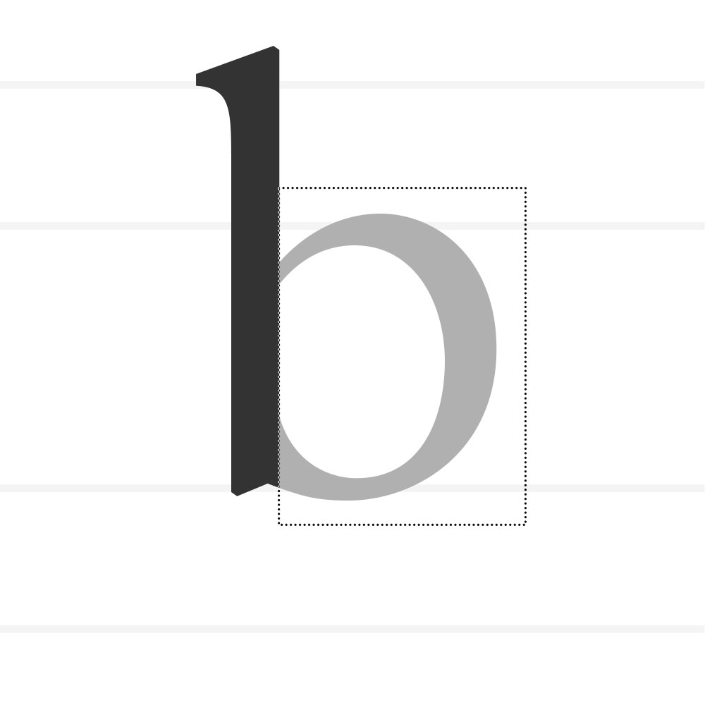
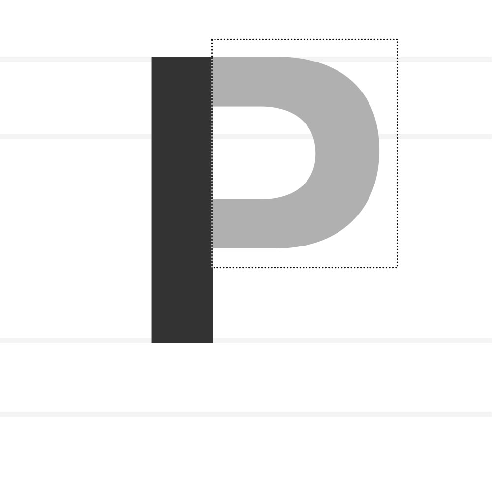
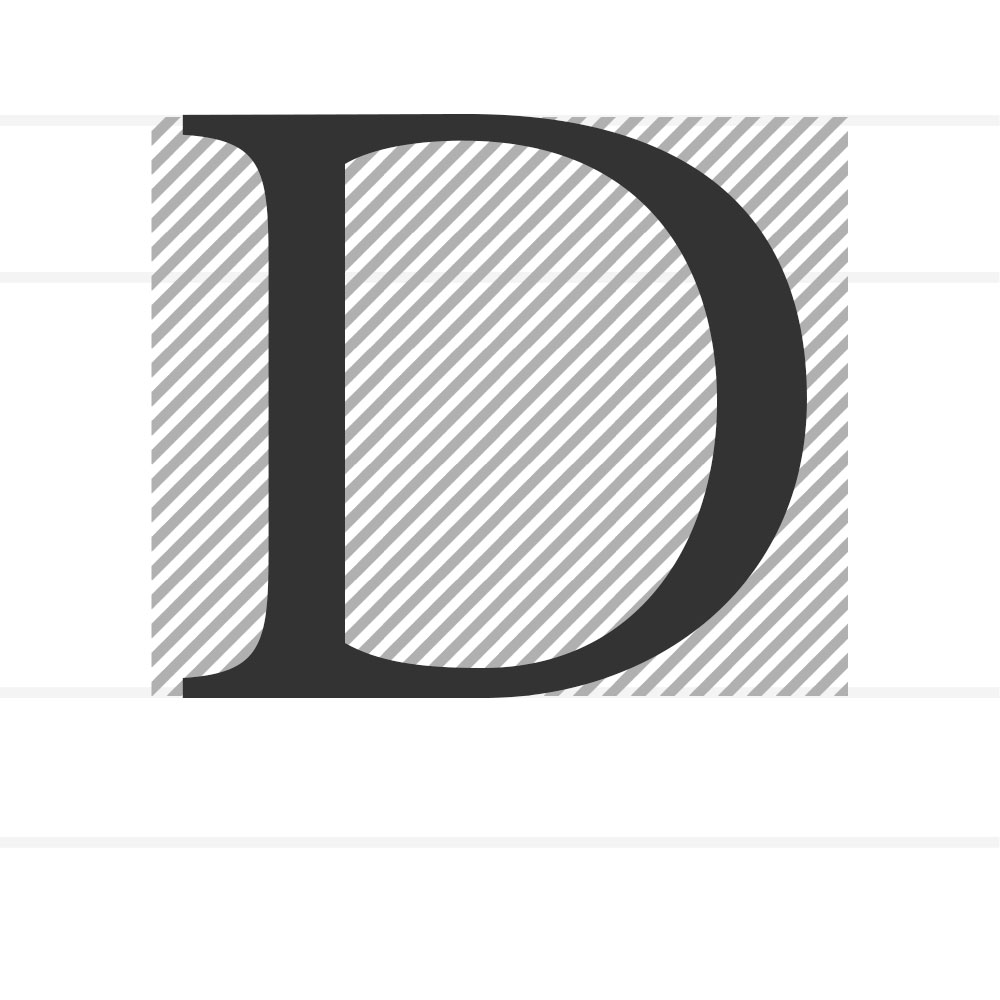
Bowl
The curved stroke that encloses a counter (a, b, d).
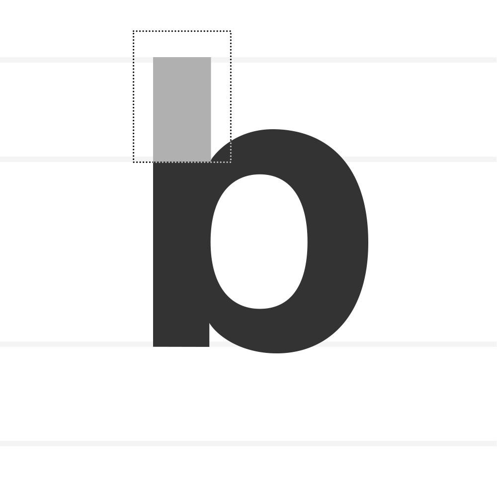
Ascender
The part of a lowercase letter that extends above the x-height (b, d, h).
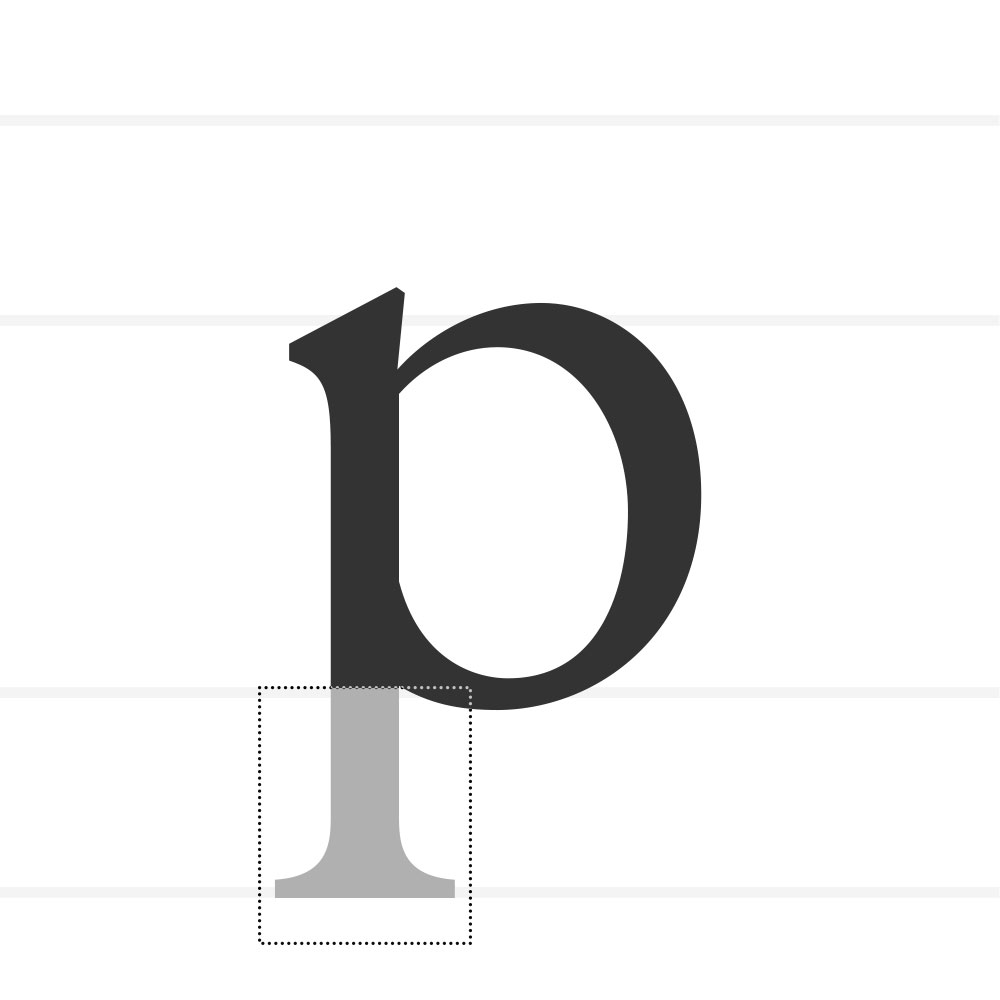
Descender
The part of a lowercase letter that extends below the baseline (as in g, p, y).
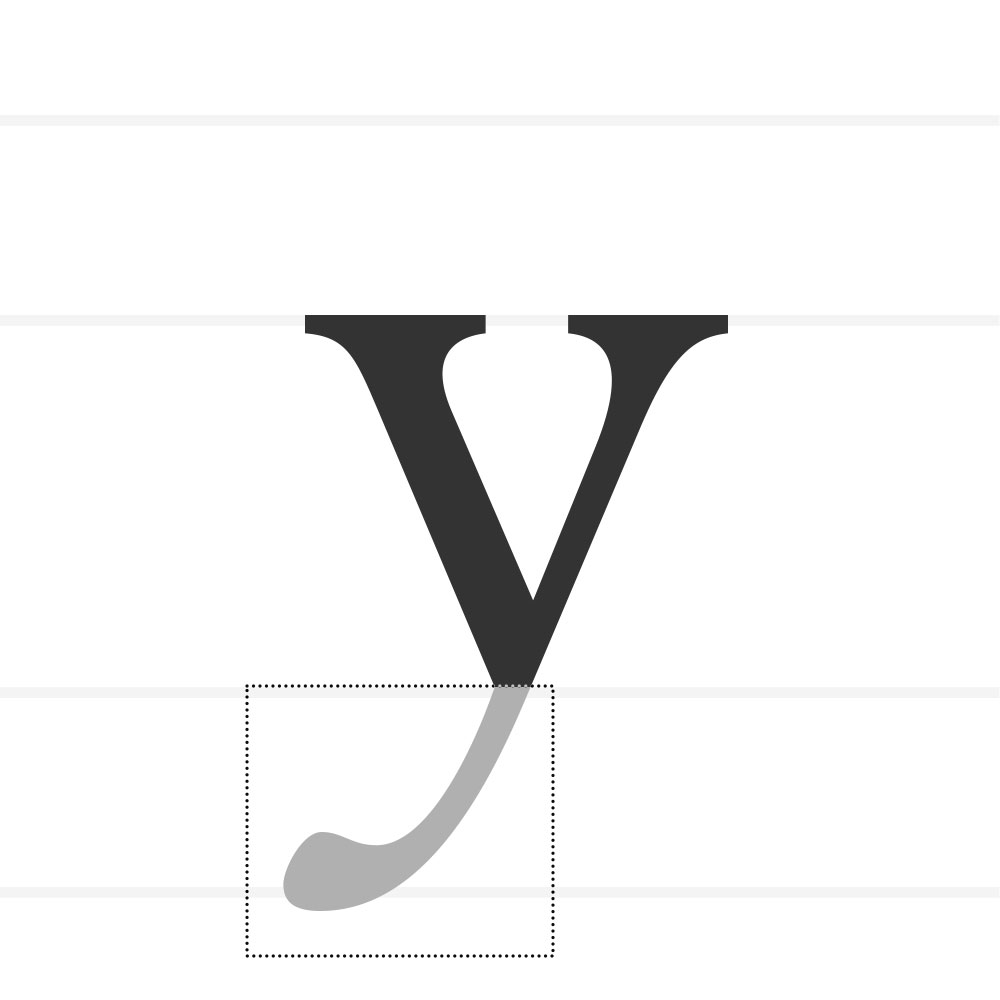
Tail
A descending, decorative stroke often extending from a main stroke (as in Q, R, y, g).
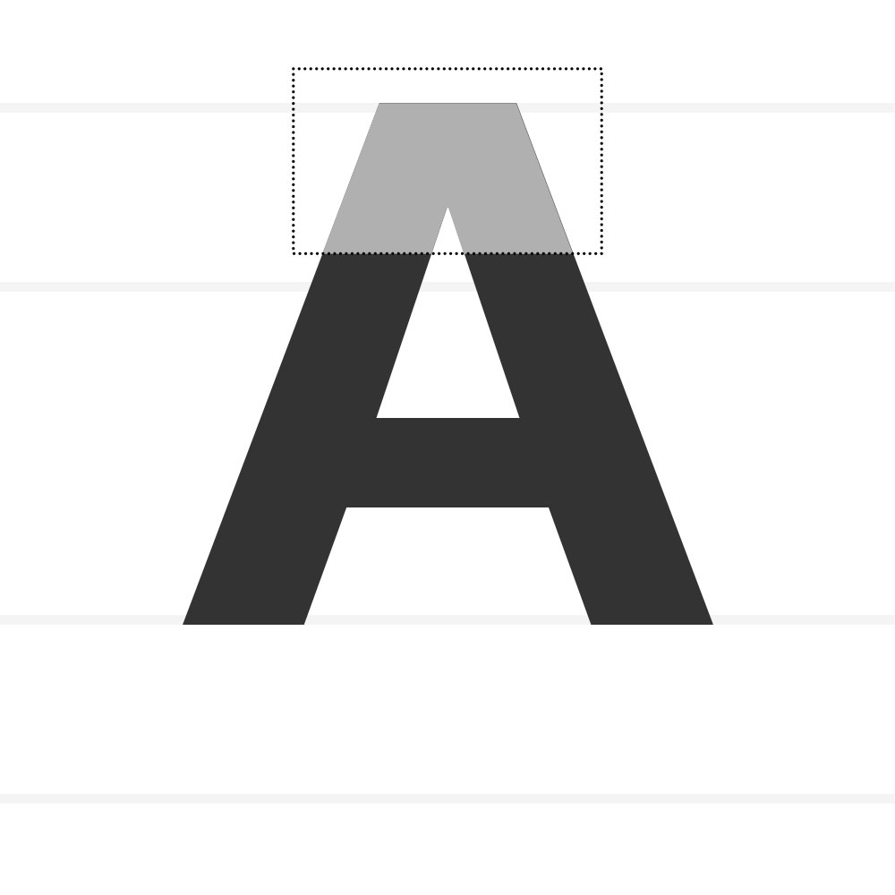
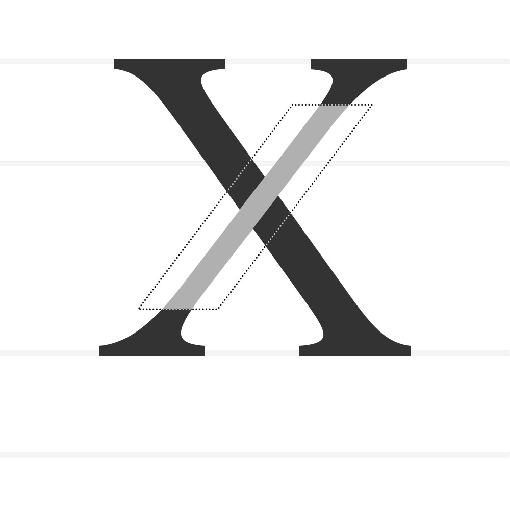
Apex – Where two strokes meet at the top of a letter (e.g., A).
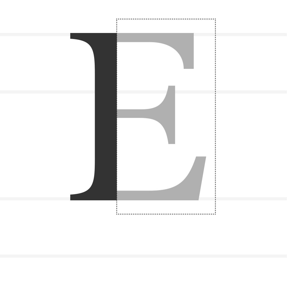
Arm – A horizontal or upward-sloping stroke that is attached at one end only (e.g., E, T).
Ascender – The part of a lowercase letter that rises above the x-height (e.g., b, h).
Aperture – The opening of a partially enclosed counter (e.g., c, e).
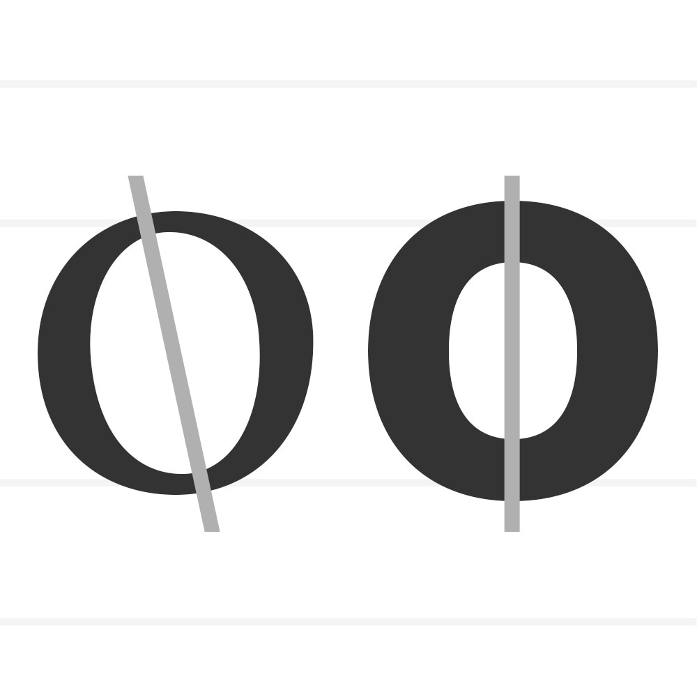
Axis – The angle of stress in a curved stroke, visible in letters like o.
Ball Terminal – A rounded terminal, often teardrop-shaped.
Baseline – The invisible line on which most letters sit.
Beak – A sharp, pointed serif at the end of a stroke.
Bowl – A curved stroke that fully encloses a counter (e.g., o, b).
Bracket – The curved/tapered connection between a serif and a stem.
Cap Height – The height of capital letters measured from the baseline.
Counter – The enclosed (or partially enclosed) space within a letter (e.g., o, a).
Cross Stroke – A horizontal stroke crossing a vertical stroke (e.g., t, f).
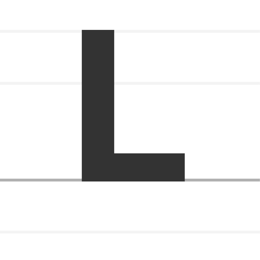
Crossbar – The horizontal stroke in letters. Also known as a Bar. The (usually) horizontal stroke across the middle of uppercase A and H.
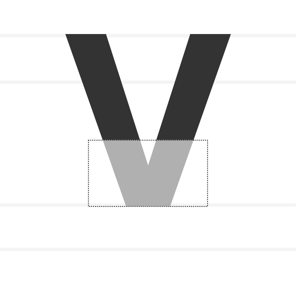
Crotch – The interior angle where two strokes meet (e.g., V, Y).
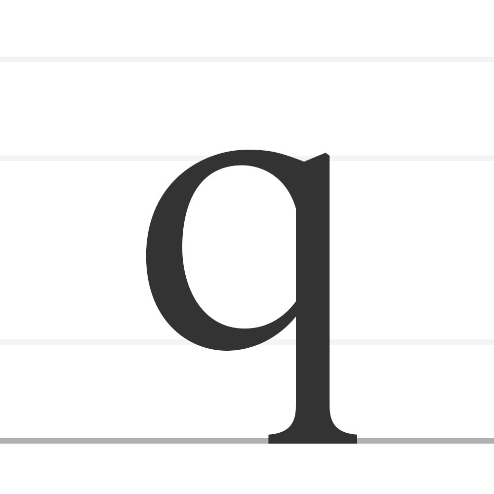
Descender - The part of the letters that extends below the baseline (eg., p, q).
Descender Line - The invisible line marking the lowest point of the descenders within a font.
Diacritic - A ancillary mark or sign added to a letter.
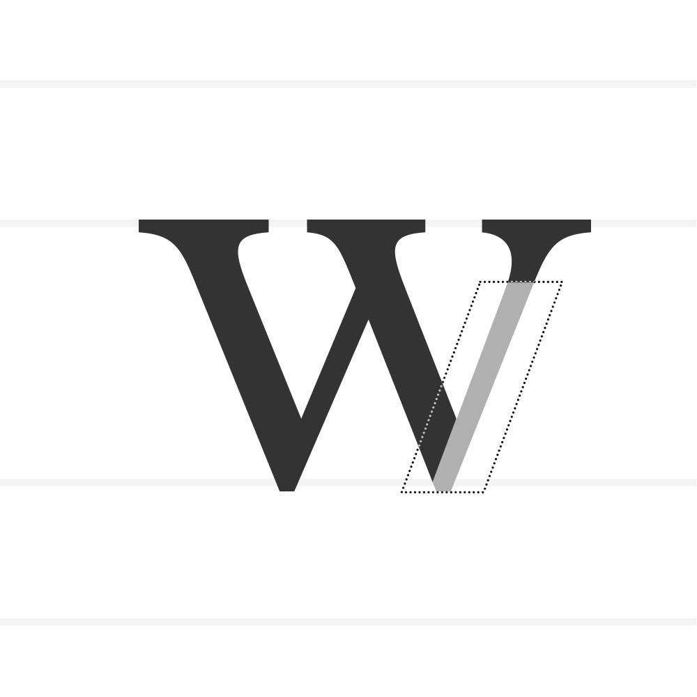
Diagonal Stroke – A slanted stroke found in letters like N, V, Z.
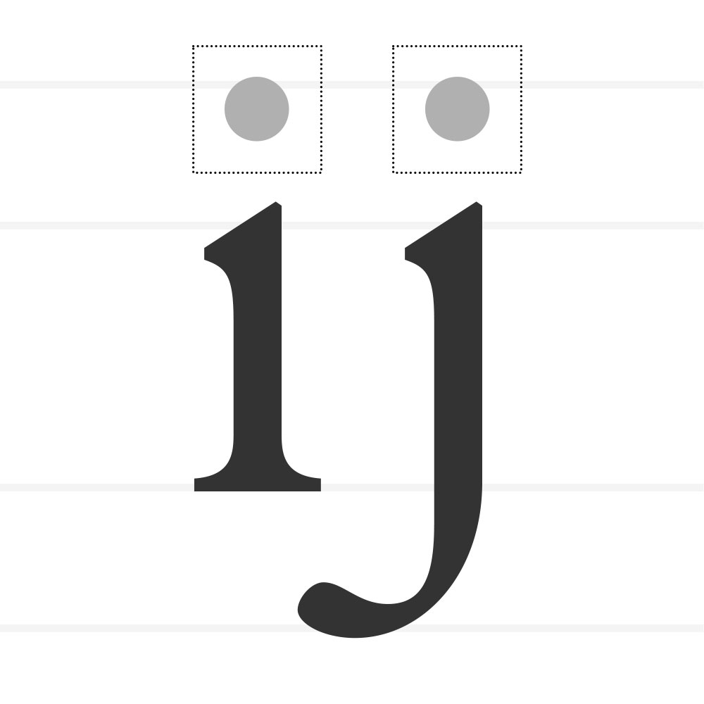
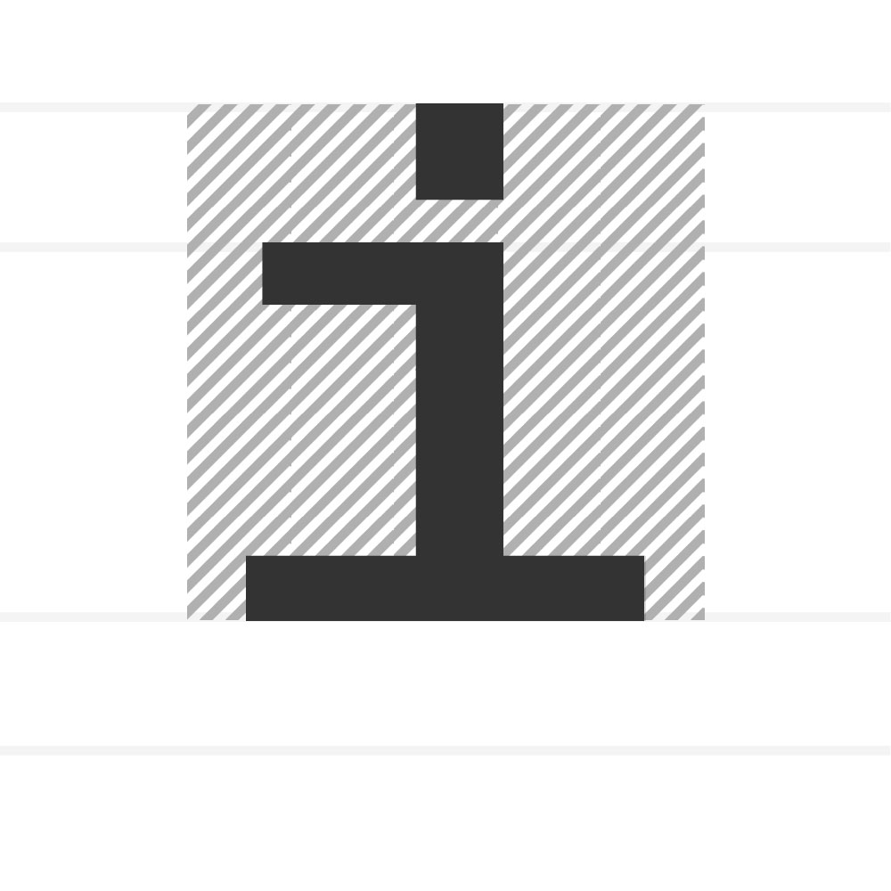
Dot / Tittle – The mark above i and j.
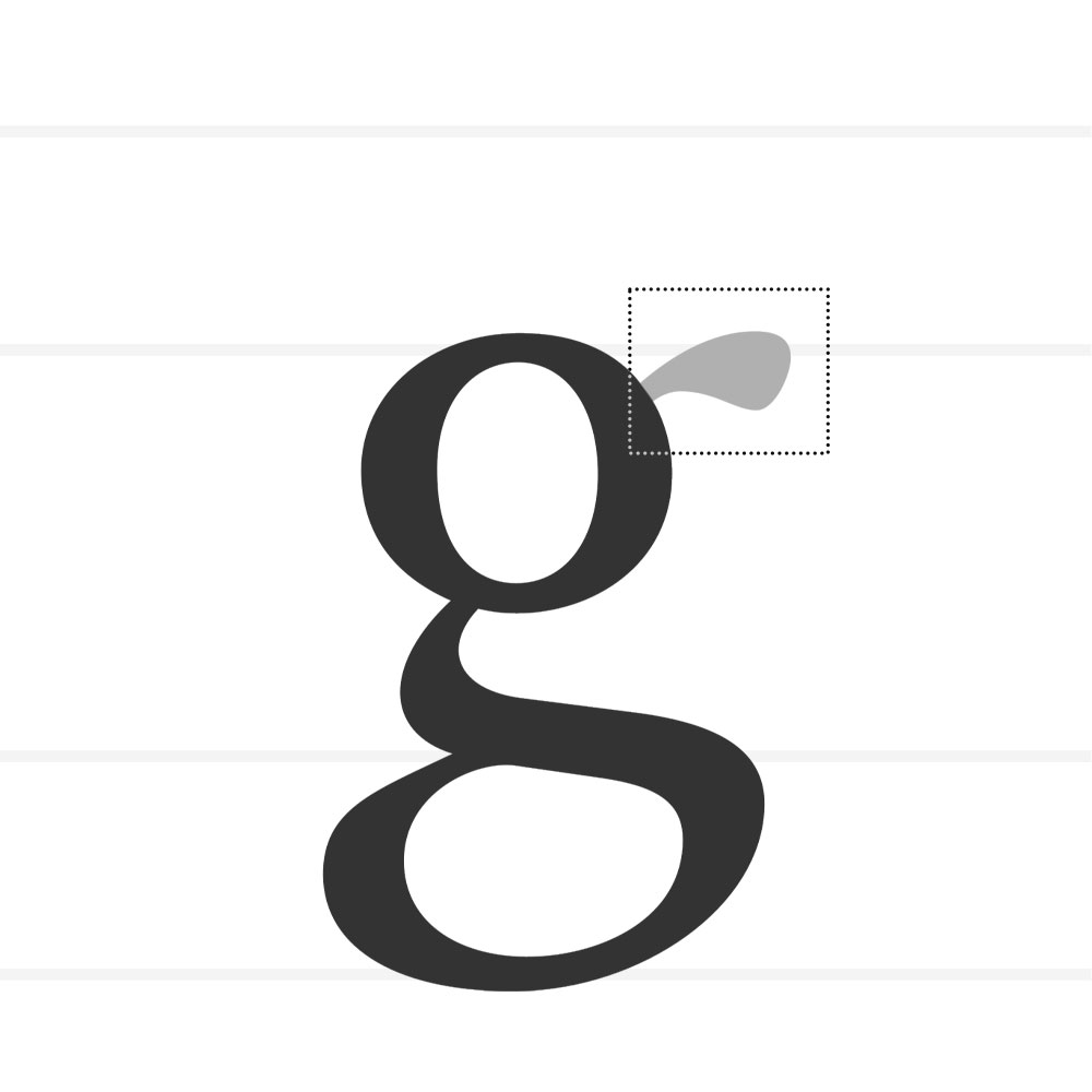
Ear – A small projecting stroke, usually on a g or r.
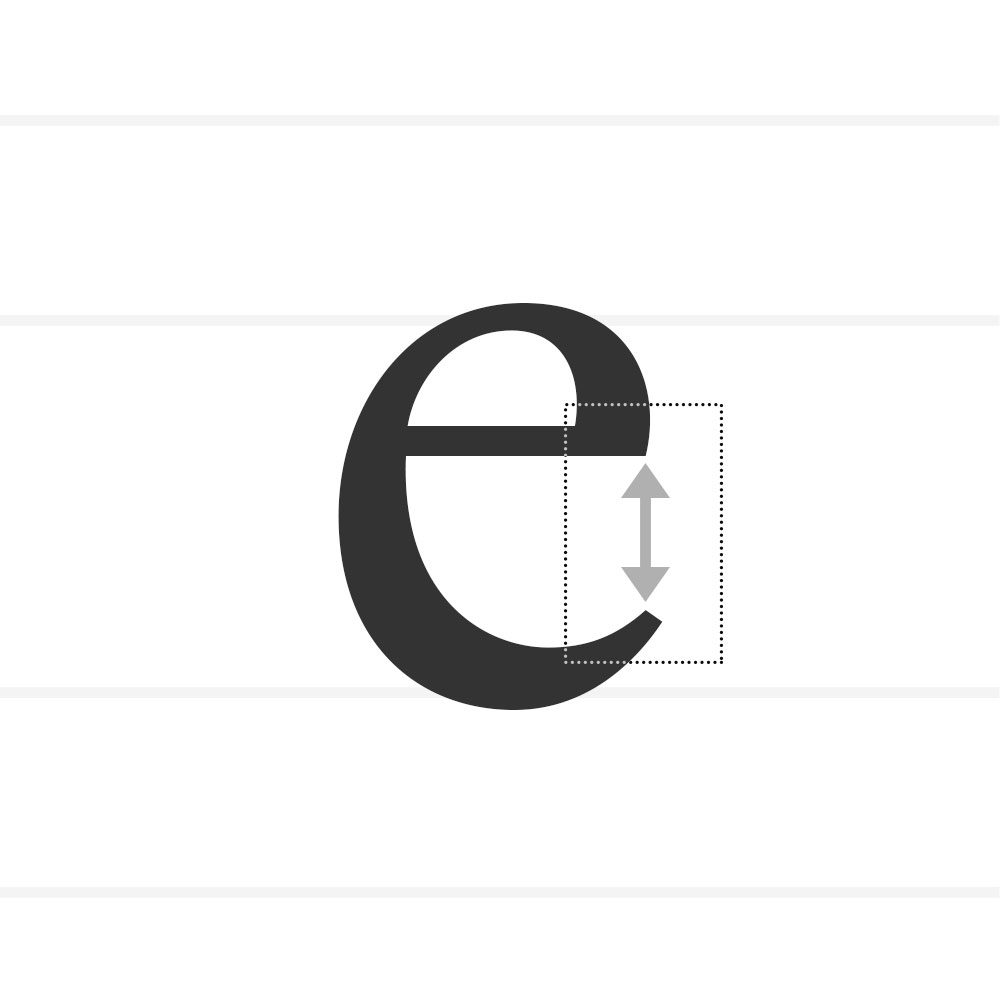
Eye – The enclosed counter of the lowercase e.
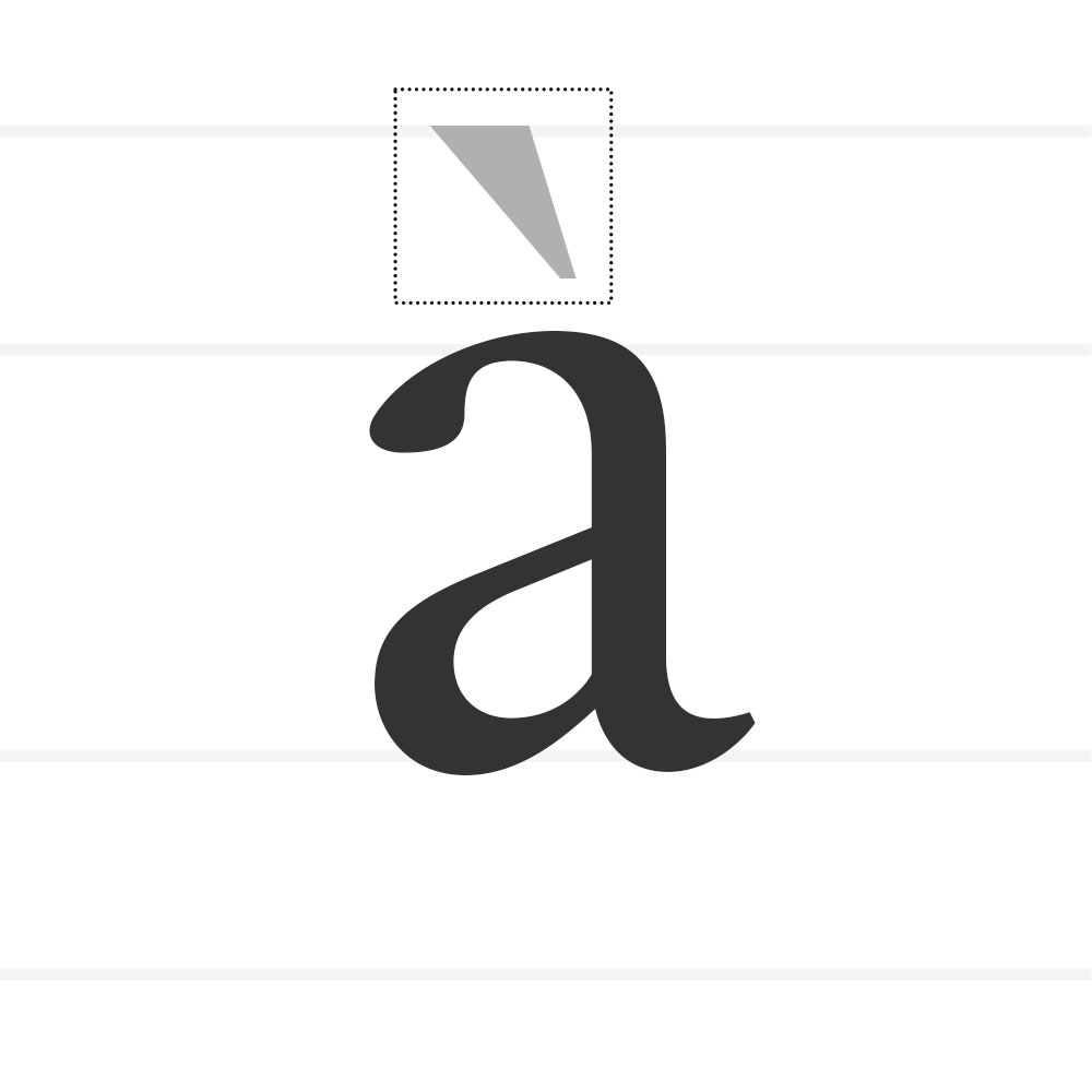
Finial - A tapered or curved end. The part of a letter known as a finial is usually a somewhat tapered curved end on letters such as the bottom of C or e or the top of a double-storey a.
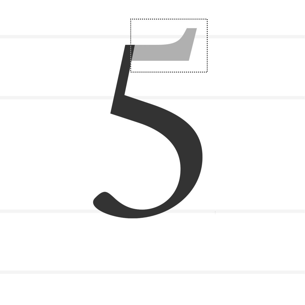
Flag - The horizontal stroke present on the numeral 5.
Foot – The bottom of a serif or stem resting on the baseline.
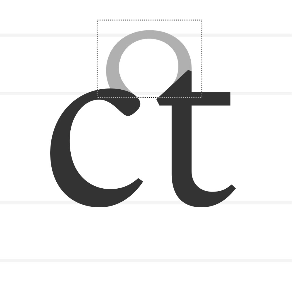
Gadzook – The decorative stroke connecting characters in a ligature.
Hook – A curved, protruding stroke (e.g., f, j).
Hairline – The thinnest stroke within a typeface.
Ink Trap - A small cut in a corner to prevent ink spread and improve clarity at small sizes.
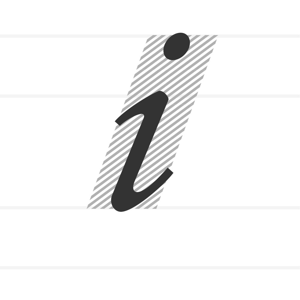
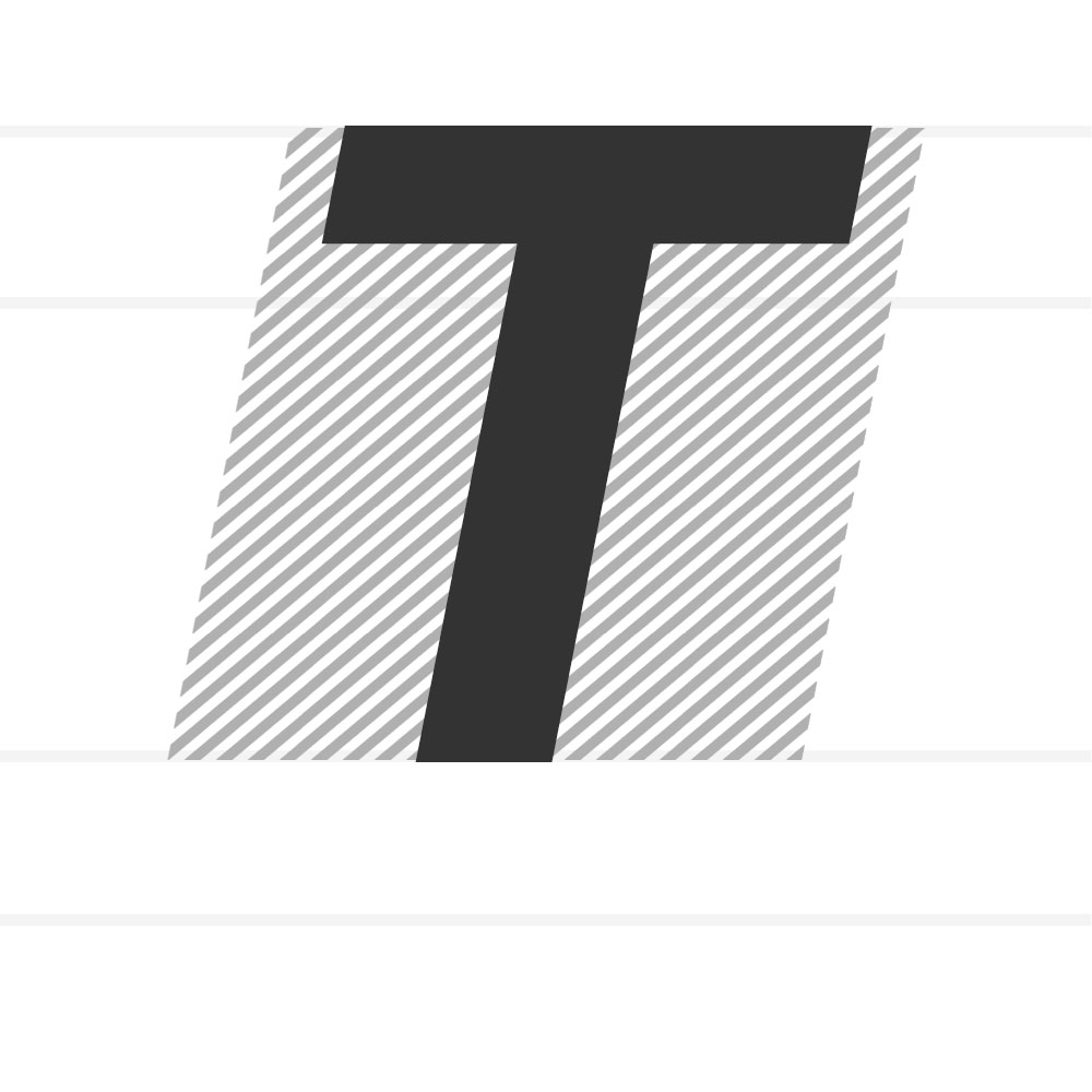
Italic – A slanted style of a typeface, originally based on cursive handwriting, designed to provide emphasis or contrast within text.
r
=
Joint – The point where a stroke connects to a stem (e.g., r, p).
k
=
Junction – The place where two strokes meet or cross (e.g., k, n).
R
=
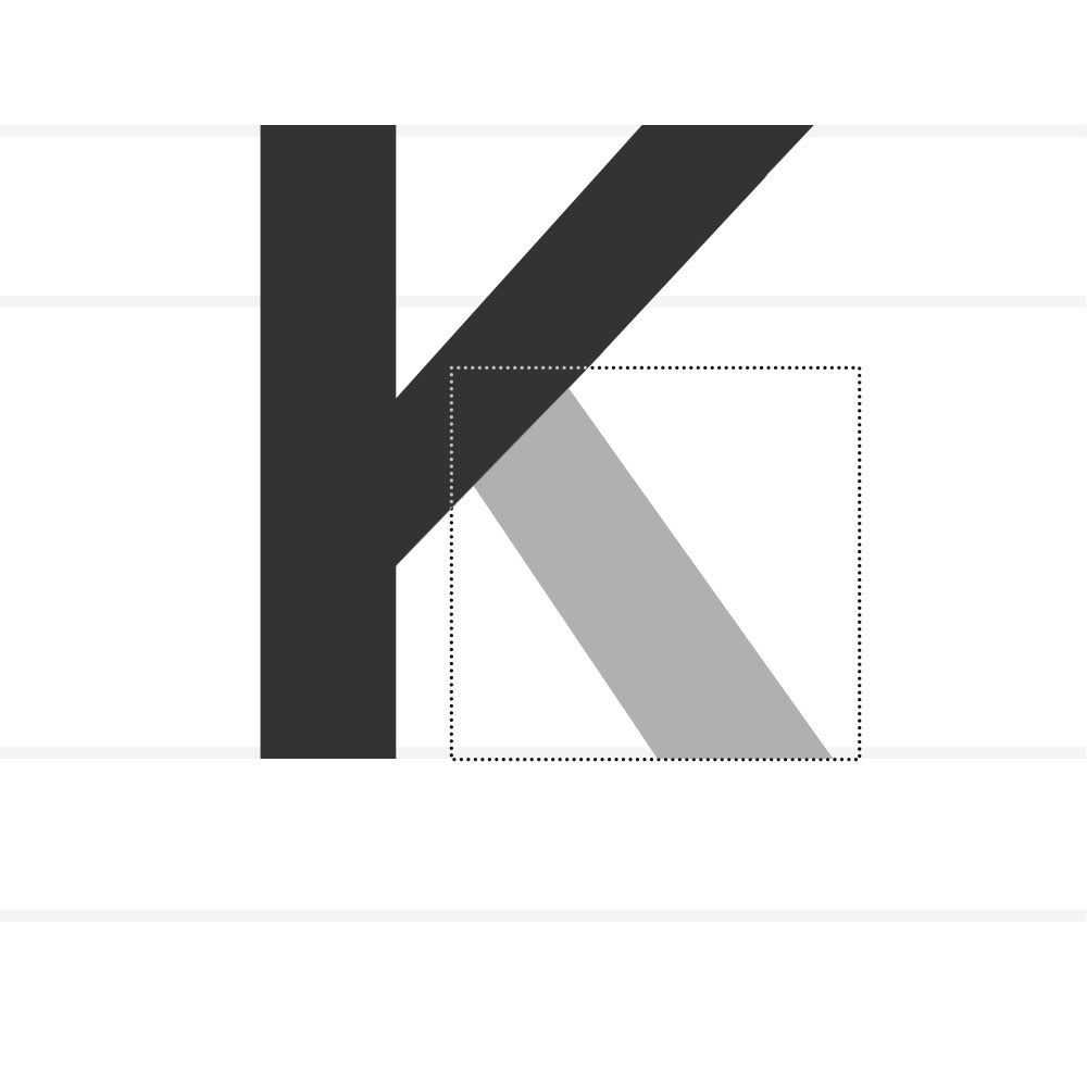
Knee – The curved or angled part of a stroke that leads into a leg (e.g., k, R).
Leg – A short downward stroke that is attached at one end (e.g., K, R, Q).
Ligature – Two or more letters joined into a single glyph (fi, ct).
Link – The connecting stroke between the upper and lower bowls of a double-storey g.
Lobe - A rounded projecting stoke attached to the main structure of a letter.
Loop – The lower closed counter of a double-storey g.
Lowercase - The smaller form of letters in a typeface.
Mean Line - The imaginary line marking the top of the main body of lowercase letters, excluding ascenders. The space between the baseline and the midline defines the x-height.
Monospaced - A type style in which every character occupies the same horizontal width. Originally used for typewriters and code for alignment and readability.
Oblique - A slanted version of a typeface created by mechanically skewing the upright forms rather than redrawing them. Unlike italics, obliques retain the original letter structures with minimal shape changes.
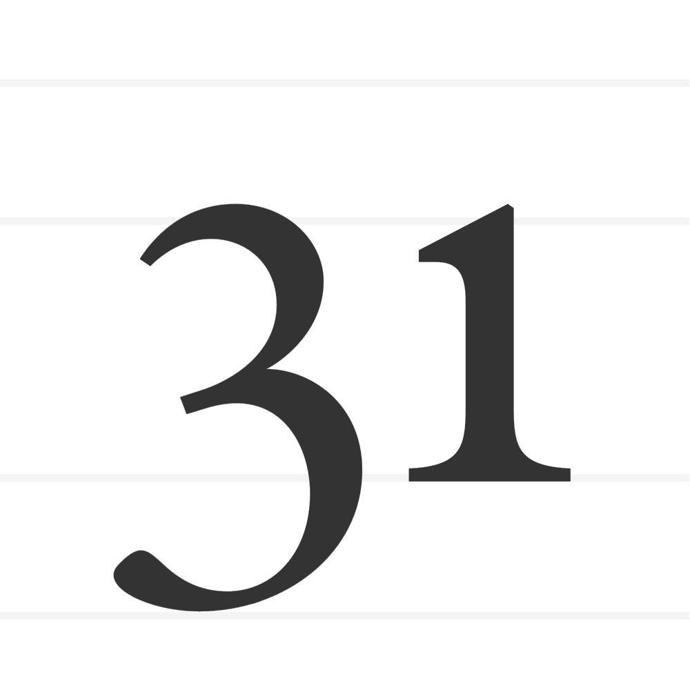
Oldstyle Figures - Numerals designed with varying heights and alignments, featuring ascenders and descenders that harmonize with lowercase text.
Overshoot – The part of round or pointed letters that extends beyond baseline or cap height for optical balance.
Serif – A small projecting stroke added to the ends of a main stroke.
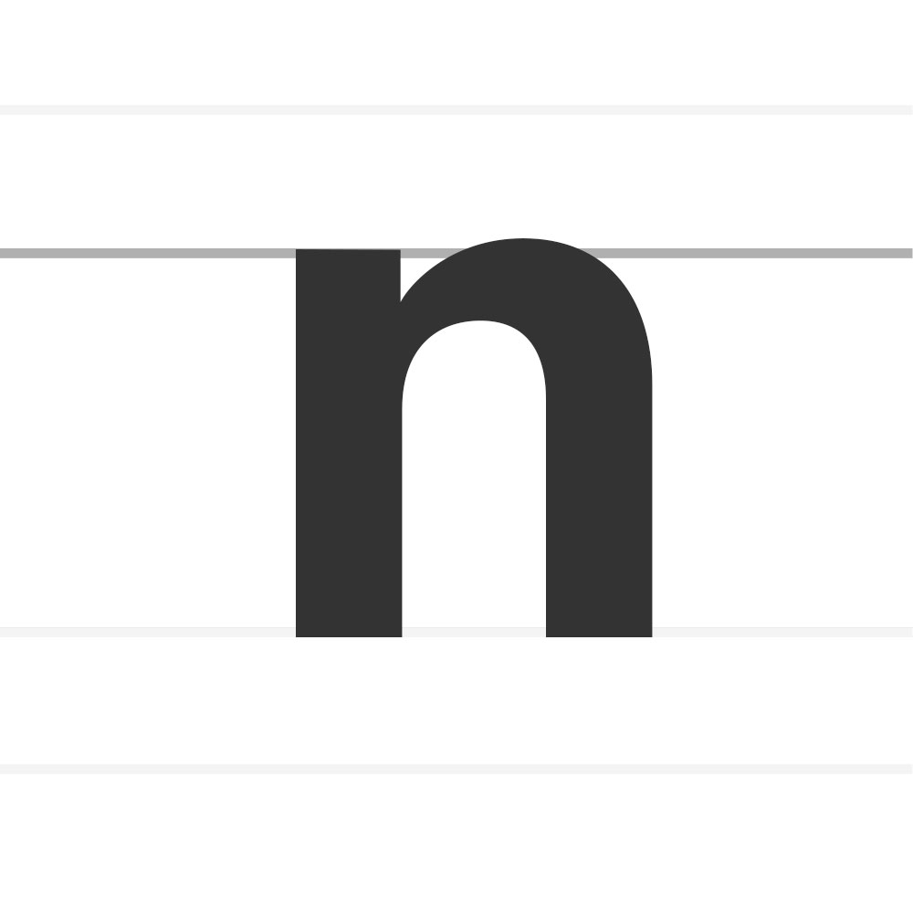
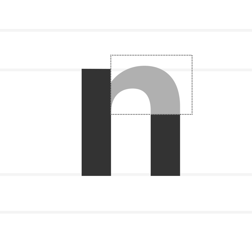
Shoulder – A curved stroke that joins a stem (e.g., n, m, h).
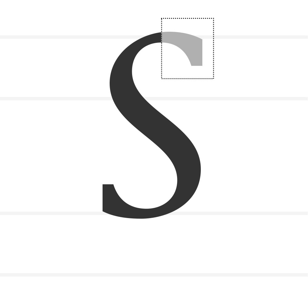
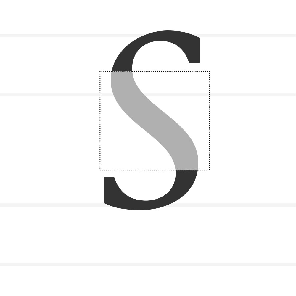
Spine – The central curved stroke of S.
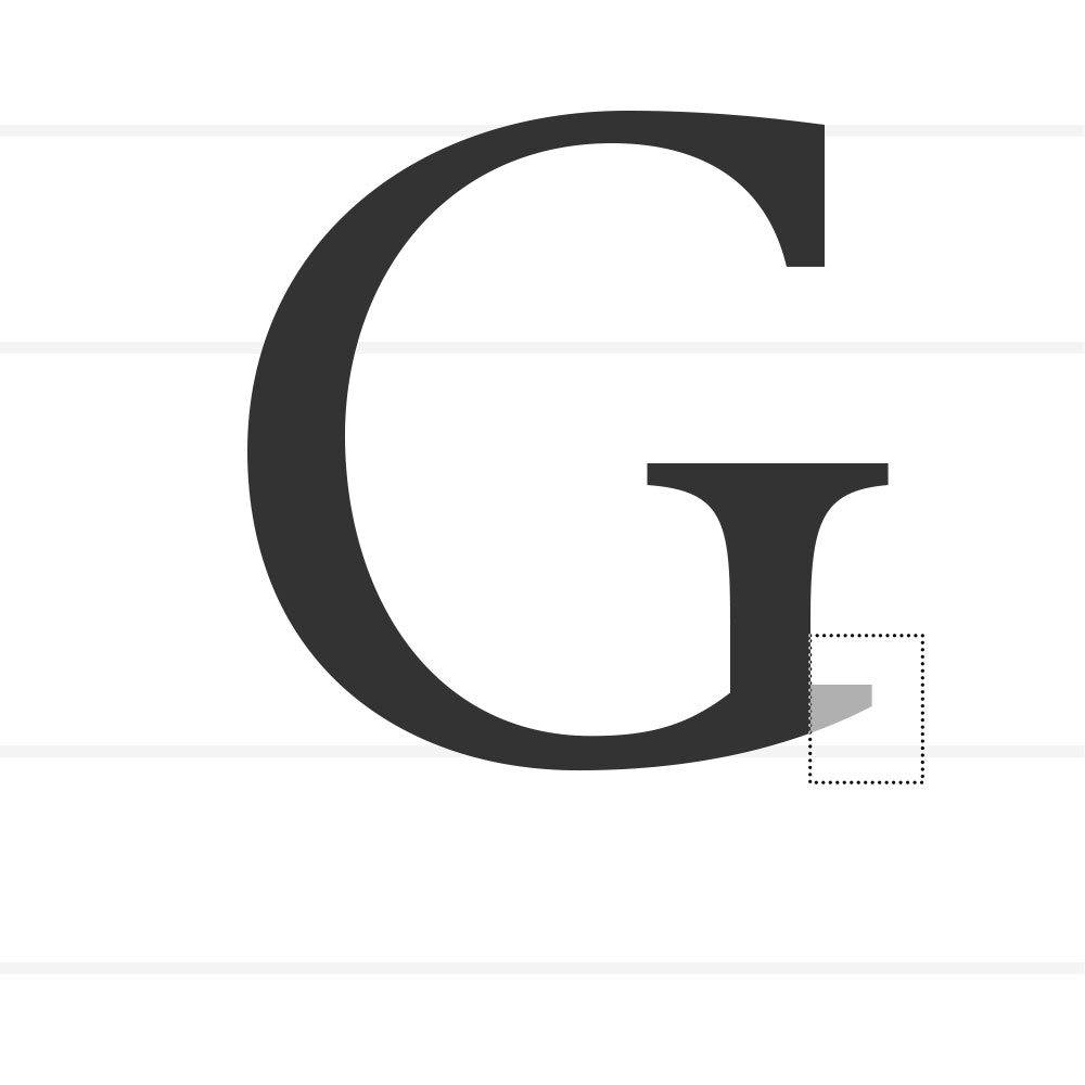
Spur – A small projection off a main stroke (e.g., G).
Stem – A main vertical stroke in a letterform.
Stroke – A primary line or mark of a letterform.
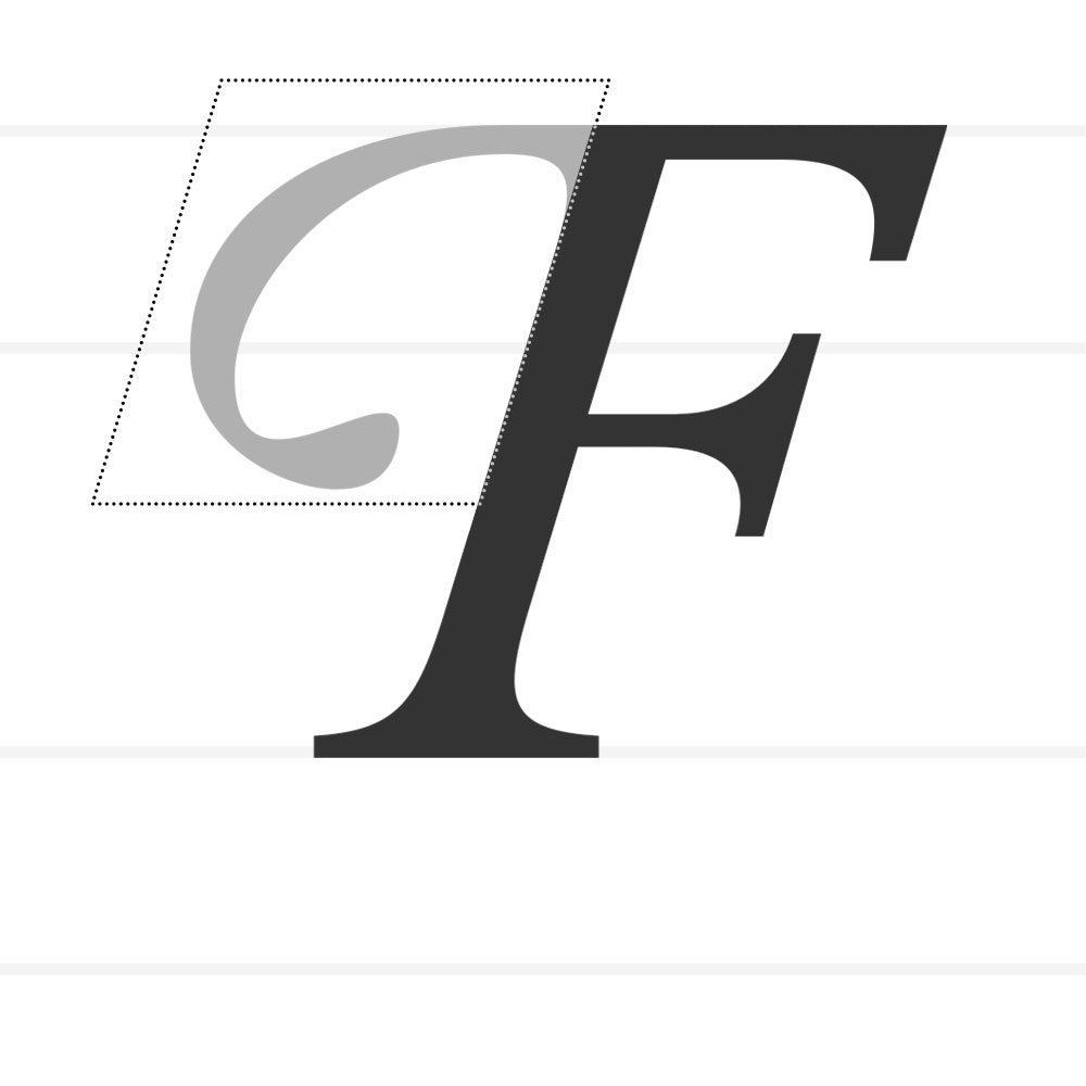
Swash - A flourish addition replacing a terminal or serif.
Tail – A descending, often decorative stroke (e.g., Q, R, y).
Terminal – The end of a stroke that has no serif. Can be ball, wedge, teardrop, flat, etc.
Tittle – The dot above i or j (duplicate wording of “dot”).
Uppercase — Capital letters.
Vertex — The point at the bottom of a letter where two strokes meet (as in V or W).
x-Height – The height of lowercase letters, based on the x.
1. What is Type Design
2. Anatomy of Letterforms
3. Contrast
4. Balance
5. Spacing
Letters as Components, Not Pictures
Harmony and Contrast
Letters don’t exist in isolation. They live in words, sentences, and paragraphs. The moment you type a word, every shape begins to interact — spacing, rhythm, counterspace, optical weight — all become part of one continuous system.

Each letter contributes to a shared structure — a skeleton of proportions, angles, and rhythm. You’re not designing a beautiful “a” or a perfect “g” — you’re designing how “a” and “g” relate to “n,” “o,” “e,” “r” and every other glyph in the system. For example: If your n has a tall, narrow rhythm, your o can’t suddenly be wide and heavy — it breaks the system.If your verticals are thick and your diagonals are thin, that logic must stay consistent across the alphabet.You’re creating a visual grammar, not just a gallery of forms.
Harmony and Contrast Systems
Type design balances harmony (everything feels part of the same family) with contrast (enough variation to feel human and alive). The genius of good type lies in that equilibrium — every letter feels distinct, yet none feels out of place. So when you’re adjusting a curve or spacing a pair, you’re not fixing that one shape — you’re maintaining the conversation between shapes. The letter “n” teaches the rhythm. The letter “o” sets the curve logic. The letter “h” and “d” define proportion and contrast. Together, they become your system’s DNA.
Harmony and Contrast
Letters don’t exist in isolation. They live in words, sentences, and paragraphs. The moment you type a word, every shape begins to interact — spacing, rhythm, counterspace, optical weight — all become part of one continuous system.

Each letter contributes to a shared structure — a skeleton of proportions, angles, and rhythm. You’re not designing a beautiful “a” or a perfect “g” — you’re designing how “a” and “g” relate to “n,” “o,” “e,” “r” and every other glyph in the system. For example: If your n has a tall, narrow rhythm, your o can’t suddenly be wide and heavy — it breaks the system.If your verticals are thick and your diagonals are thin, that logic must stay consistent across the alphabet.You’re creating a visual grammar, not just a gallery of forms.
Harmony and Contrast Systems
Type design balances harmony (everything feels part of the same family) with contrast (enough variation to feel human and alive). The genius of good type lies in that equilibrium — every letter feels distinct, yet none feels out of place. So when you’re adjusting a curve or spacing a pair, you’re not fixing that one shape — you’re maintaining the conversation between shapes. The letter “n” teaches the rhythm. The letter “o” sets the curve logic. The letter “h” and “d” define proportion and contrast. Together, they become your system’s DNA.
Harmony and Contrast
Letters don’t exist in isolation. They live in words, sentences, and paragraphs. The moment you type a word, every shape begins to interact — spacing, rhythm, counterspace, optical weight — all become part of one continuous system.

Each letter contributes to a shared structure — a skeleton of proportions, angles, and rhythm. You’re not designing a beautiful “a” or a perfect “g” — you’re designing how “a” and “g” relate to “n,” “o,” “e,” “r” and every other glyph in the system. For example: If your n has a tall, narrow rhythm, your o can’t suddenly be wide and heavy — it breaks the system.If your verticals are thick and your diagonals are thin, that logic must stay consistent across the alphabet.You’re creating a visual grammar, not just a gallery of forms.
Continue Lesson One