Sketch, Over and Over Again
Designing a typeface starts long before software. It begins with pencil, paper, and your ability to see letters as shapes, systems, and decisions. This lesson walks you through the first sketches. The foundation of every type family.
1. Warm-Up: 30-Second Letters
Materials: Pencil, paper, timer.
‍
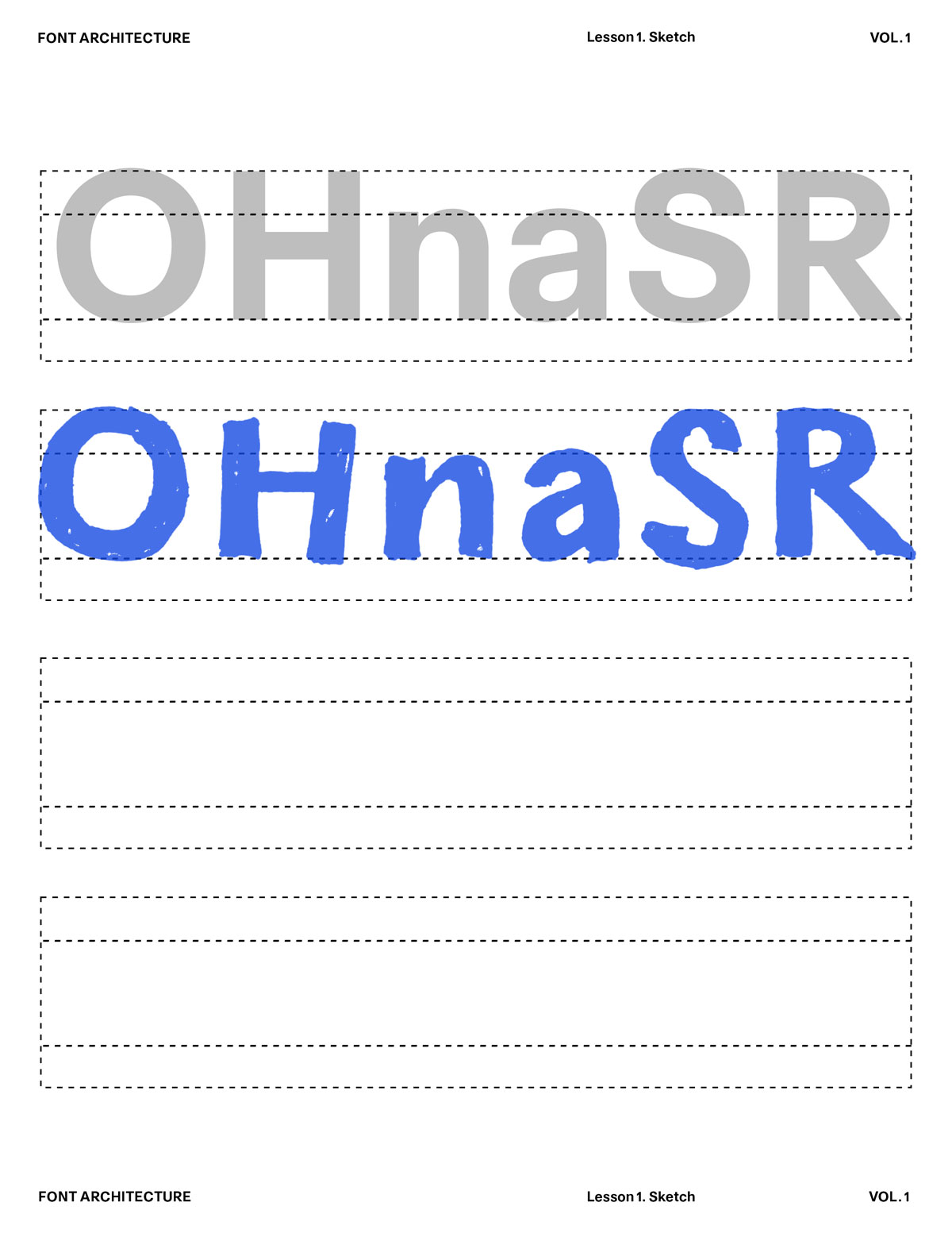
Instructions: Draw each of these letters in 30 seconds or less:

These are the control characters.
Don’t erase. Don’t correct. Just react.
O, H, n, a, S, R
Goal: Unlock rhythm. Trust your eye.
2. Shape Mapping
Over the printed typeface. Trace lightly over the letters with a pencil.
Then draw the underlying shapes you see:

"O" oval/circle
"H" straight verticals + crossbar
"n" stem + shoulder
"a" → bowl + stem
"S" → spine + terminals
"R" → stem + bowl + leg
Goal: Understand that every letter comes from modular forms.
3. Skeleton Drawing
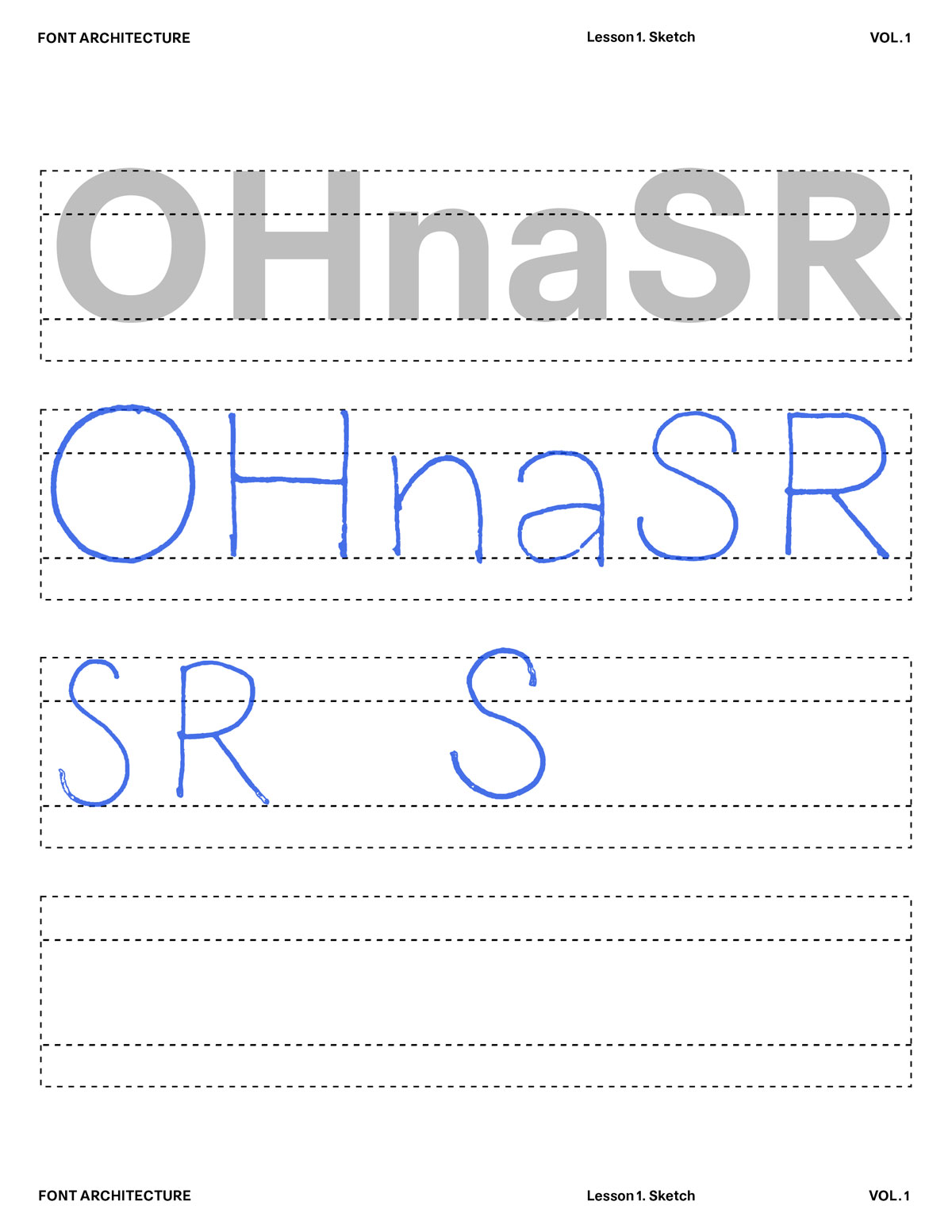
On a blank sheet, draw each letter using single stroke skeletons (no thickness)
O, H, n, a, S, R
"O" as a 1-line loop, "S" as a continuous curve, "R" as a straight vertical, a loop, and a flick
‍
Then redraw them with weight — thick/think contrast or monoline.
Let the skeleton tell the story.

4. Style Shift
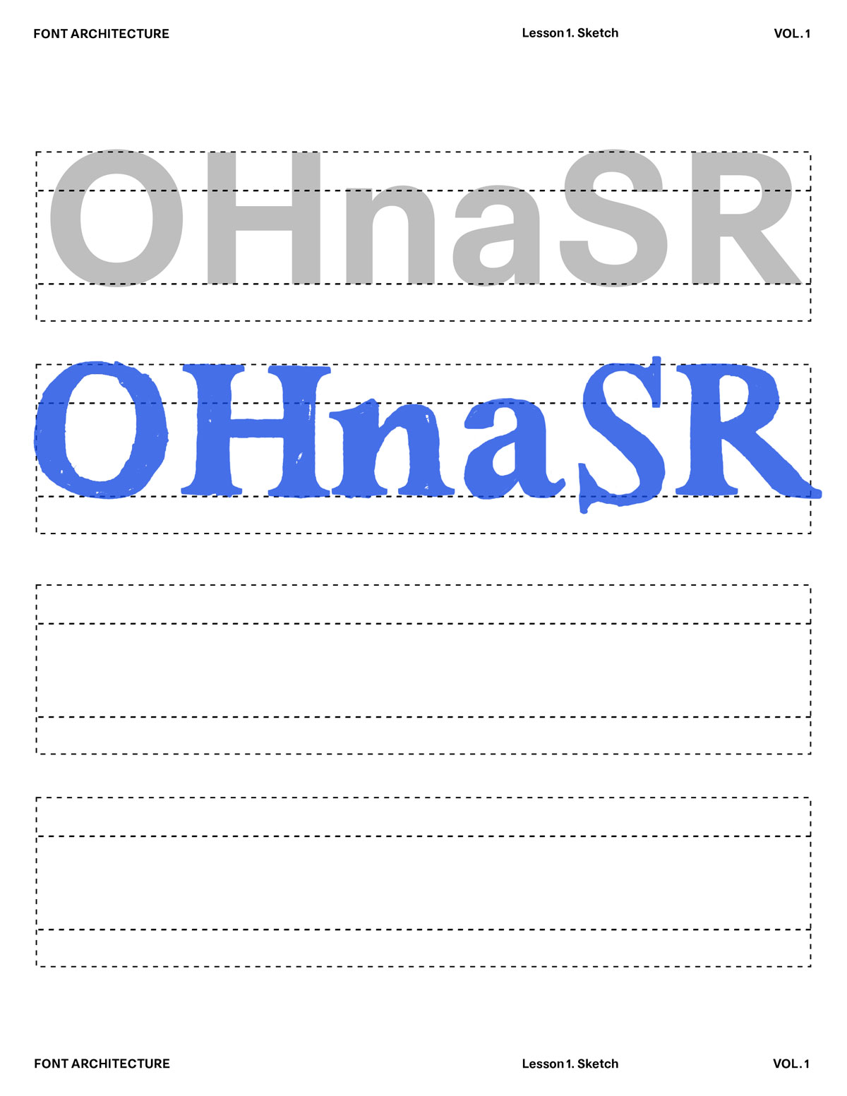
Take your skeleton set and redraw it three ways:

Grotesk → neutral, simplified
Serif → add serifs, vary contrast
Experimental → break a rule (overshoot, offset spine, stretched bowl, weird contrast)
Goal: Understand how style emerges from the same skeleton.
5. Letter Family Lineup
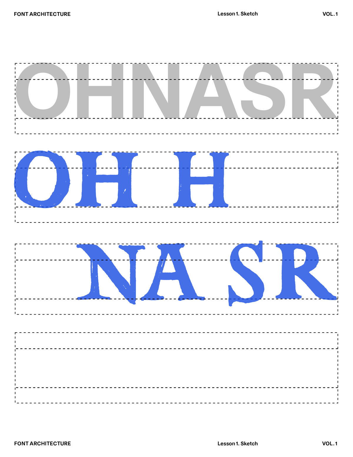
Create a 6-letter mini font:
O, H, N, A, S, R
Draw them in a row. Then check:

Are the verticals the same thickness?
Do curves feel like the same family?
Is spacing consistent?
Does the style hold across shapes?
‍
Circle what feels “off”, those become your next sketches.
Goal: Understand how style emerges from the same skeleton.
6. Micro-Refinement (5 Minutes Only)
Set a 5-minute timer.
Fix only: Overshoot, Alignment, Stem thickness, Curve smoothness

Do not redraw everything.
You’re practicing refinement, not restarting.
7. Post-Sketch Reflection
Quick notes:
‍
What did you learn about your natural drawing tendencies?
Which shapes were easiest?
Which shapes were hardest?
What style emerged without trying?

Your instincts are the starting point of your typeface.

NEXT UP — MODULE 2
Build upon these sketches over the month.
Rework them, refine them, break them and rebuild them.

Module 1 is about learning to see type; Module 2 is about learning to shape it. Next month, we’ll dive deeper into the craft: Developing the Full Character Set. How to self-critique your letters with clarity. Understanding spacing, rhythm, and internal logic. Refining your shapes in preparation for digitization.

You’ll learn how each adjustment changes the entire voice of a typeface. Module 2 turns your early ideas into a working system. Keep your pencils moving. Your first typeface is already taking form.