Horizontal Logic in Uppercase Type Design

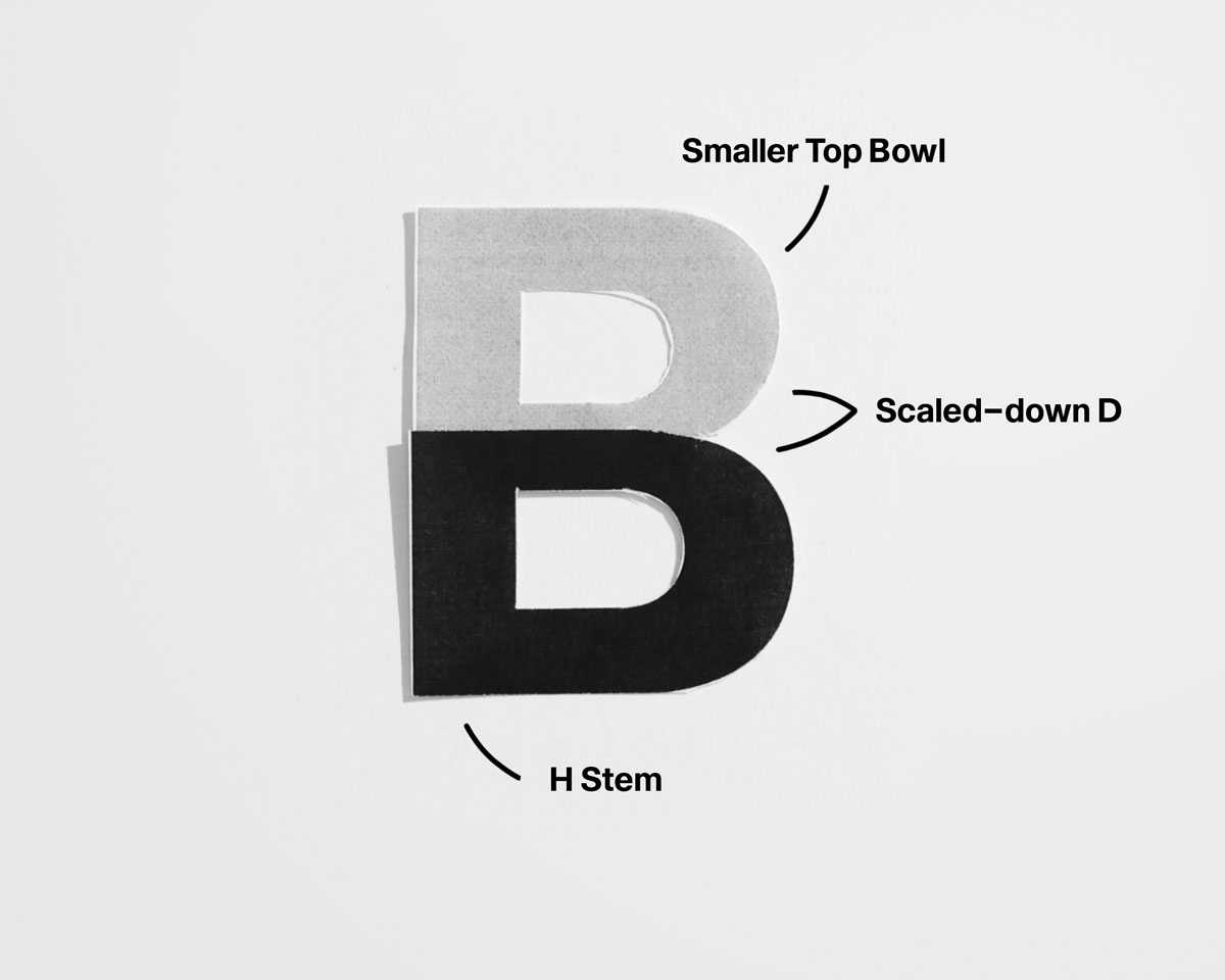
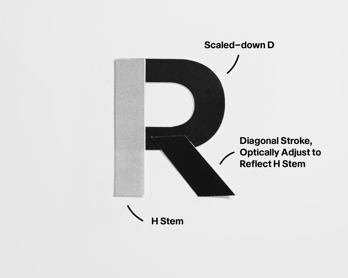
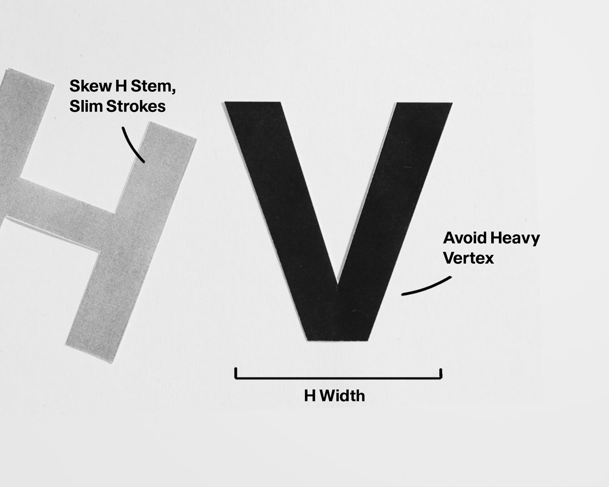
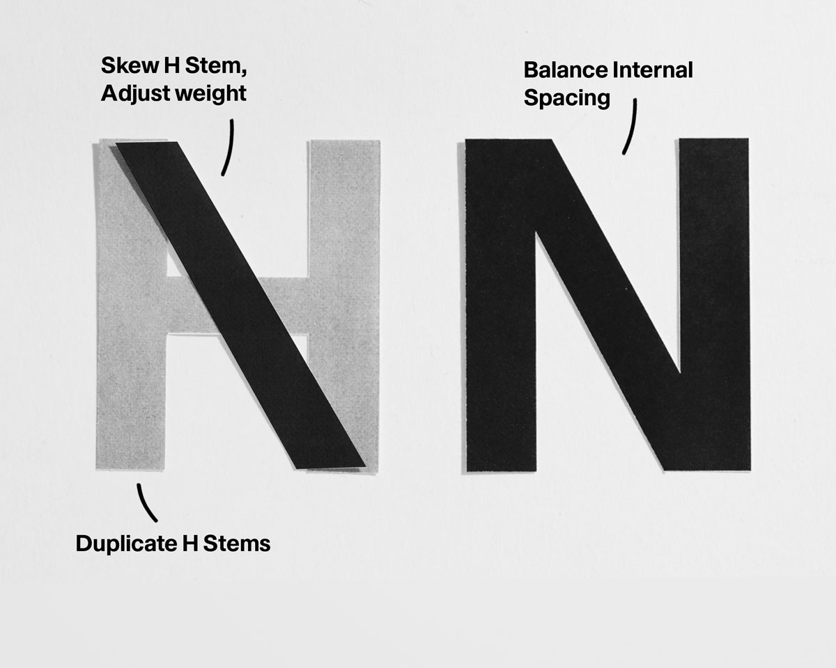
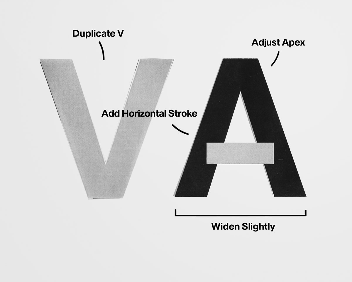
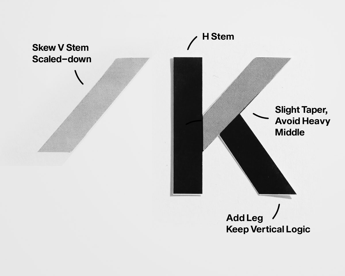
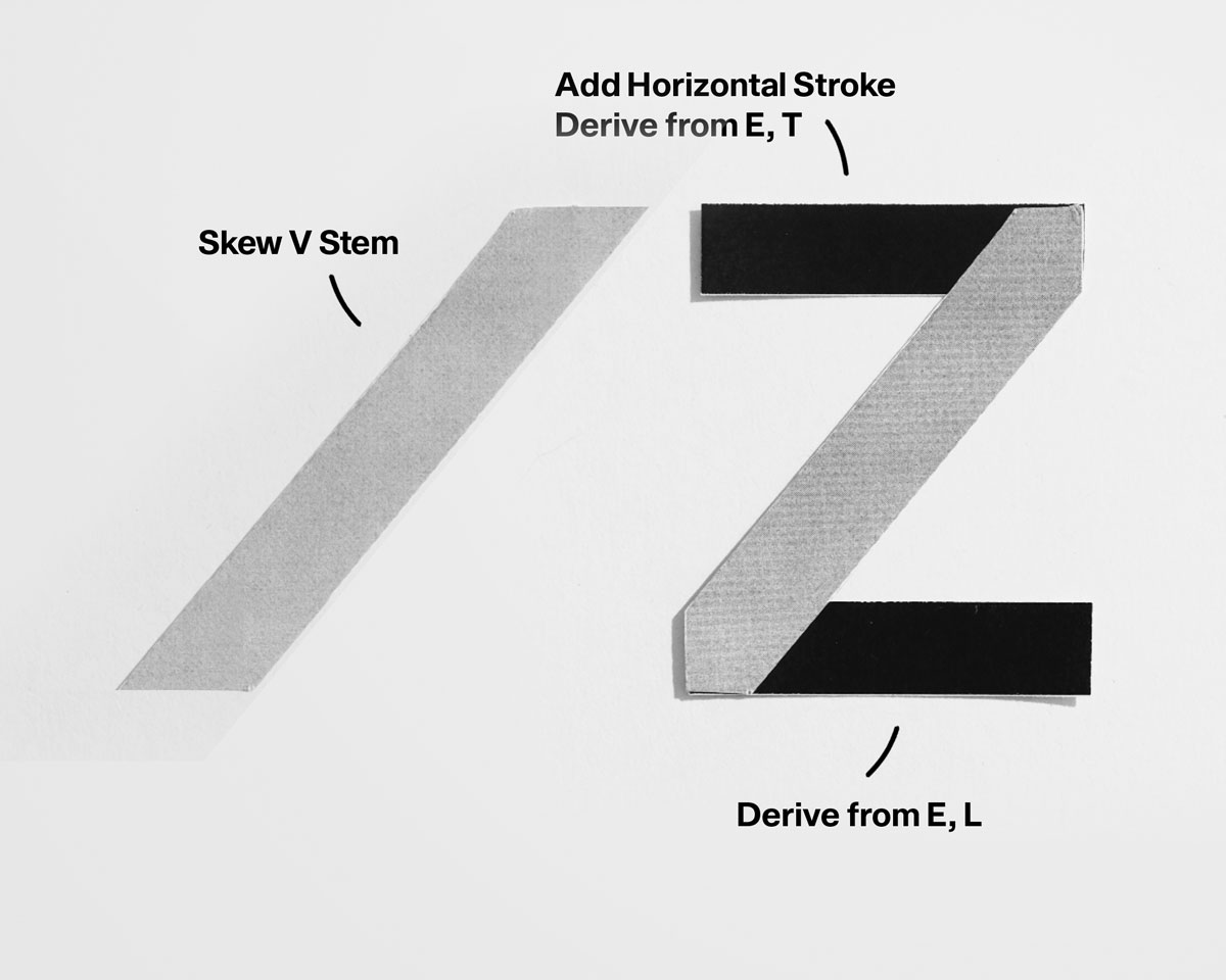
Let’s develop further from the base characters established in Lesson One. As previously mentioned, H is chosen as the foundational letter because it answers the most fundamental question in type design: what is the structure of this typeface? H defines vertical stem weight, establishes the relationship between verticals and horizontals, and sets internal spacing that will repeat across the uppercase system. With this decision in place, we can begin building the first letterforms. At this stage, the goal is not variety but verification, testing whether the system holds when structure is repeated and modified. By resolving these relationships early, we create a stable framework that allows all subsequent letters to emerge consistently, rather than being solved individually.
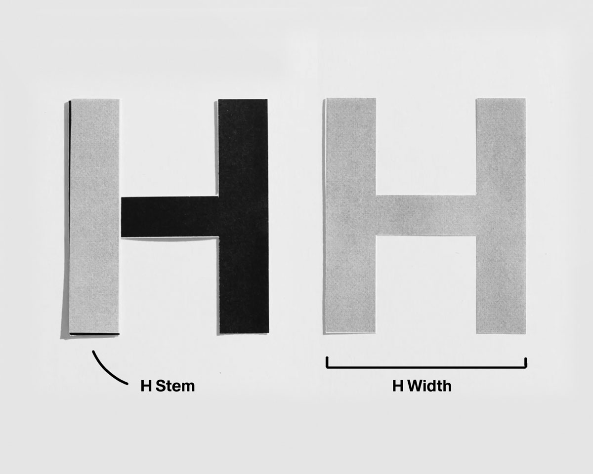
• Establish vertical stem weight.
• Set horizontal stroke logic.
• Balance internal spacing.
• Set horizontal stroke logic.
• Balance internal spacing.
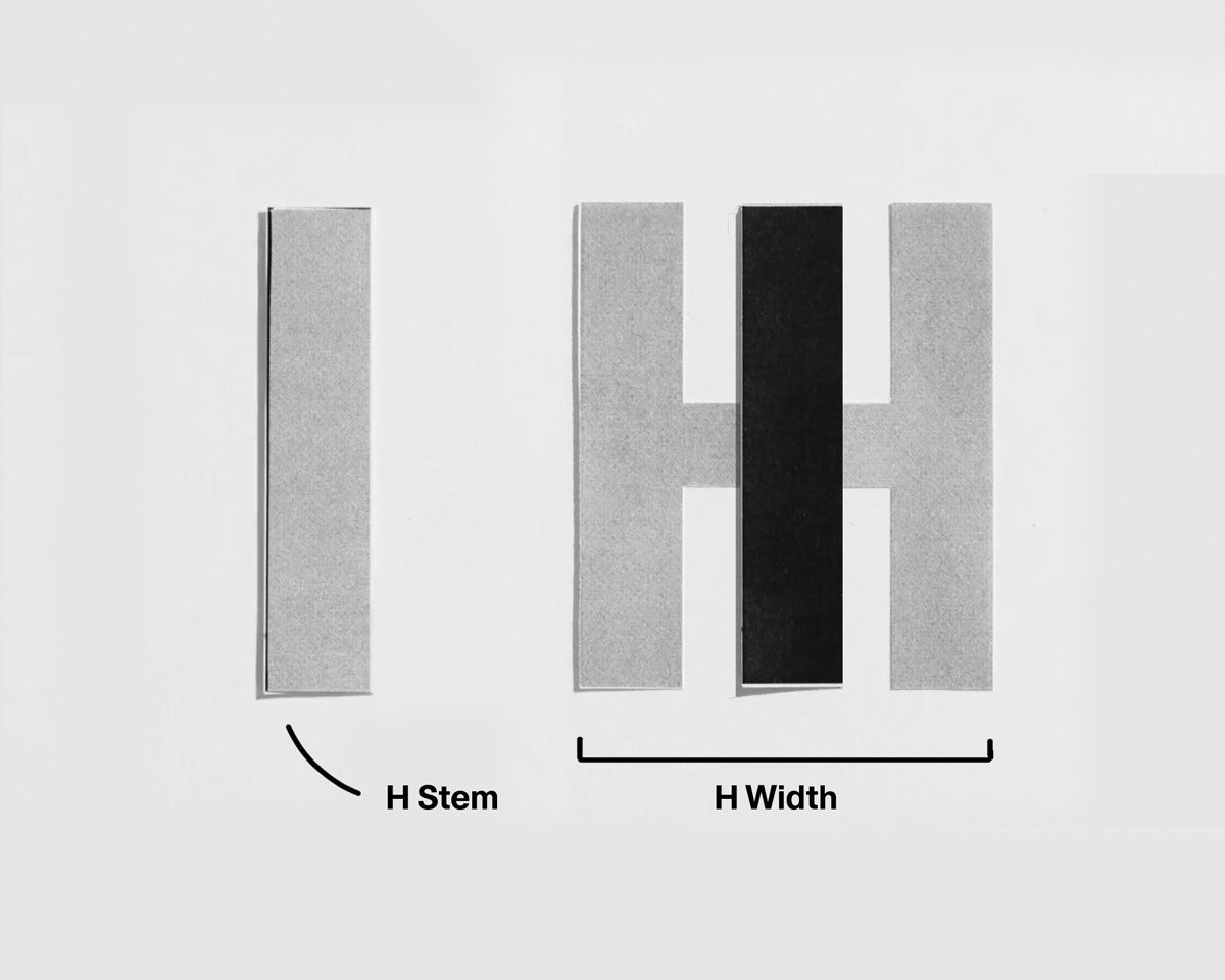
• Use H’s stem logic.
• Keep proportions equal
• Avoid unnecessary terminals.
• Keep proportions equal
• Avoid unnecessary terminals.
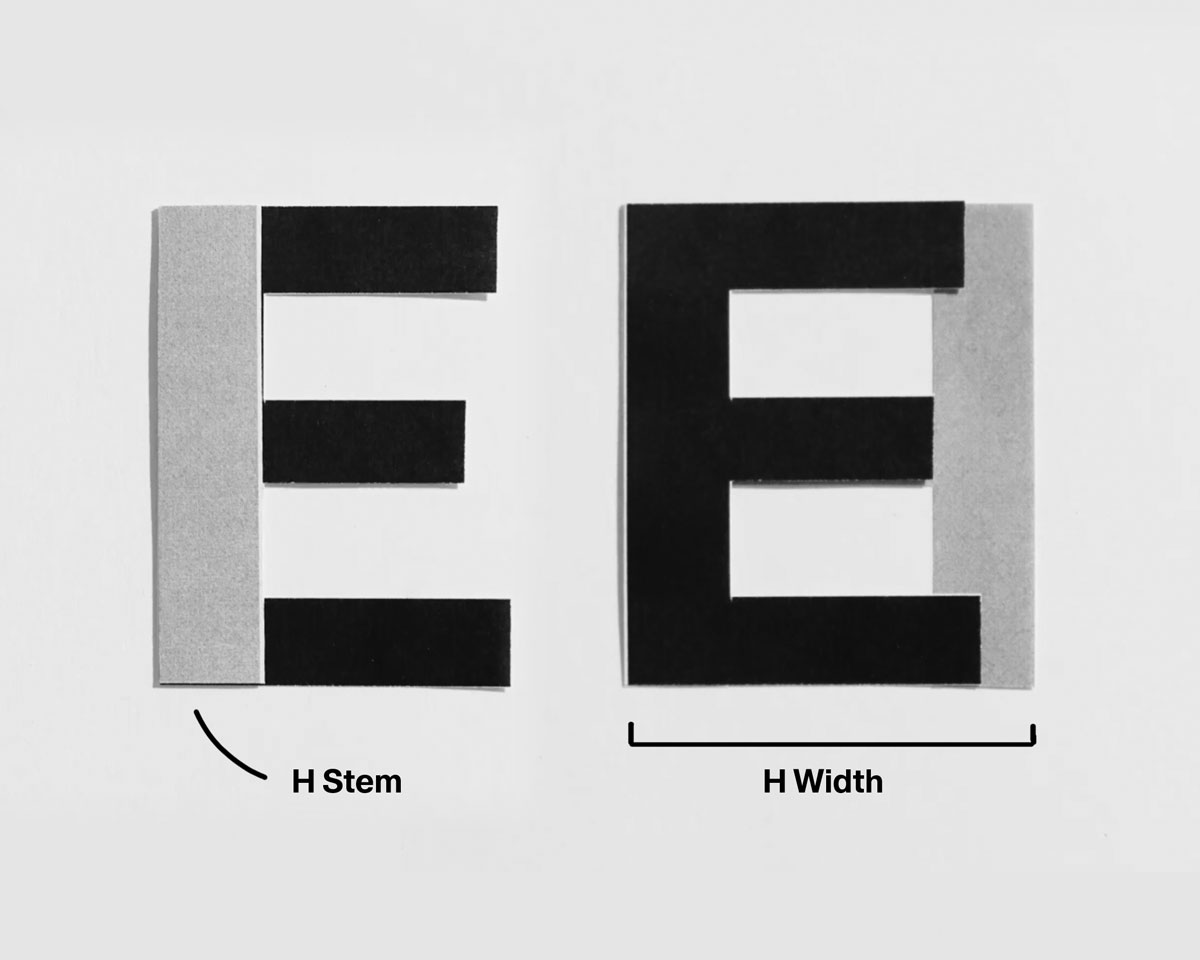
• Derive from H.
• Use three horizontals with hierarchy.
• Shorten the middle arm slightly.
• Use three horizontals with hierarchy.
• Shorten the middle arm slightly.
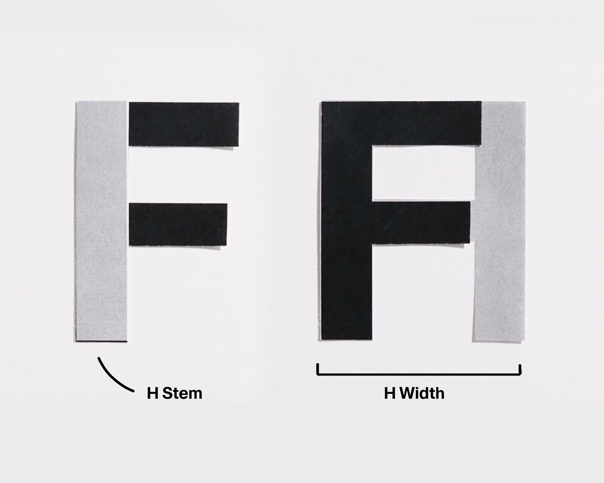
• Derive from E.
• Remove the lower arm.
• Maintain stem dominance.
• Remove the lower arm.
• Maintain stem dominance.
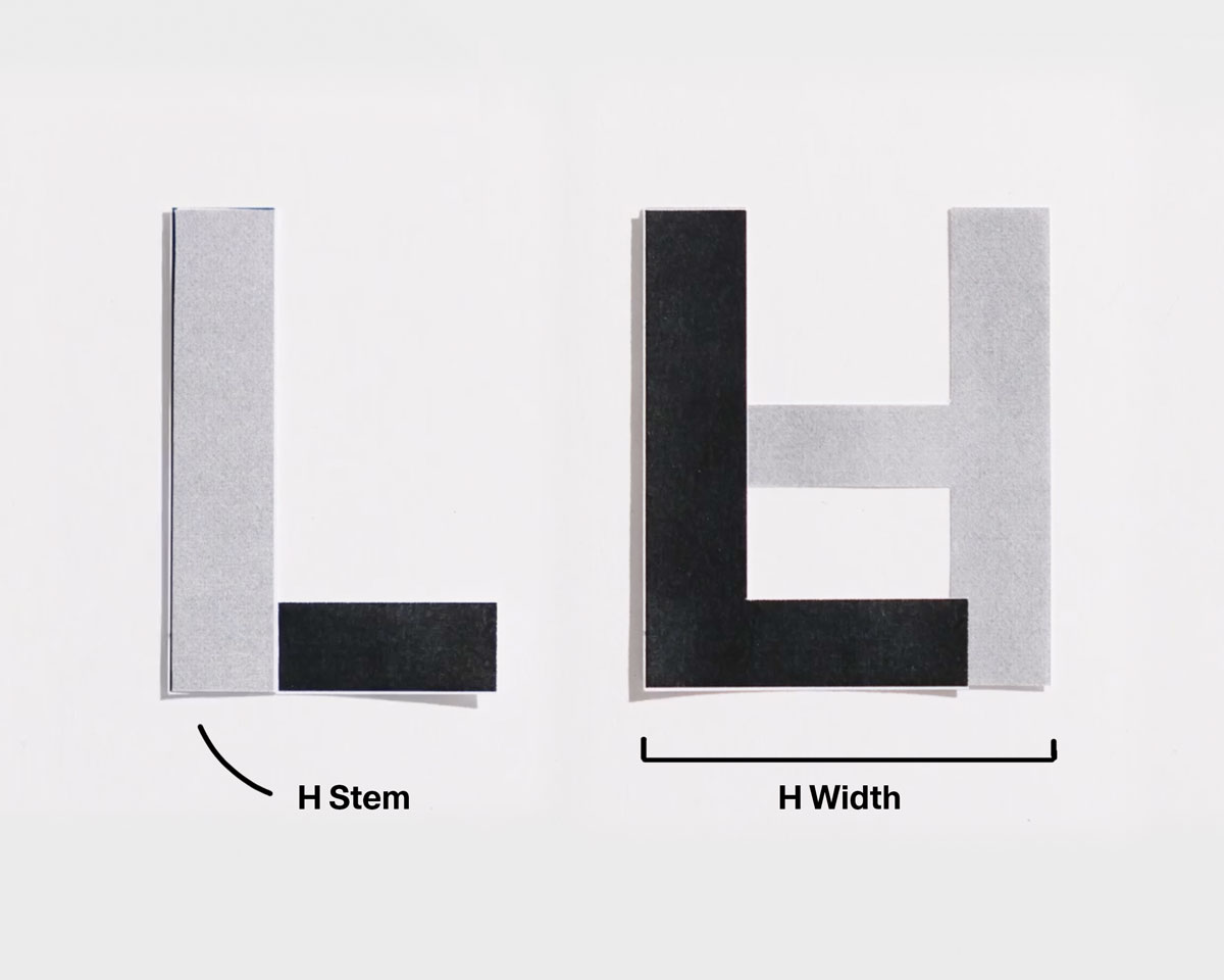
• Derive from E.
• Shorten baseline slightly.
• Keep vertical dominant.
• Shorten baseline slightly.
• Keep vertical dominant.
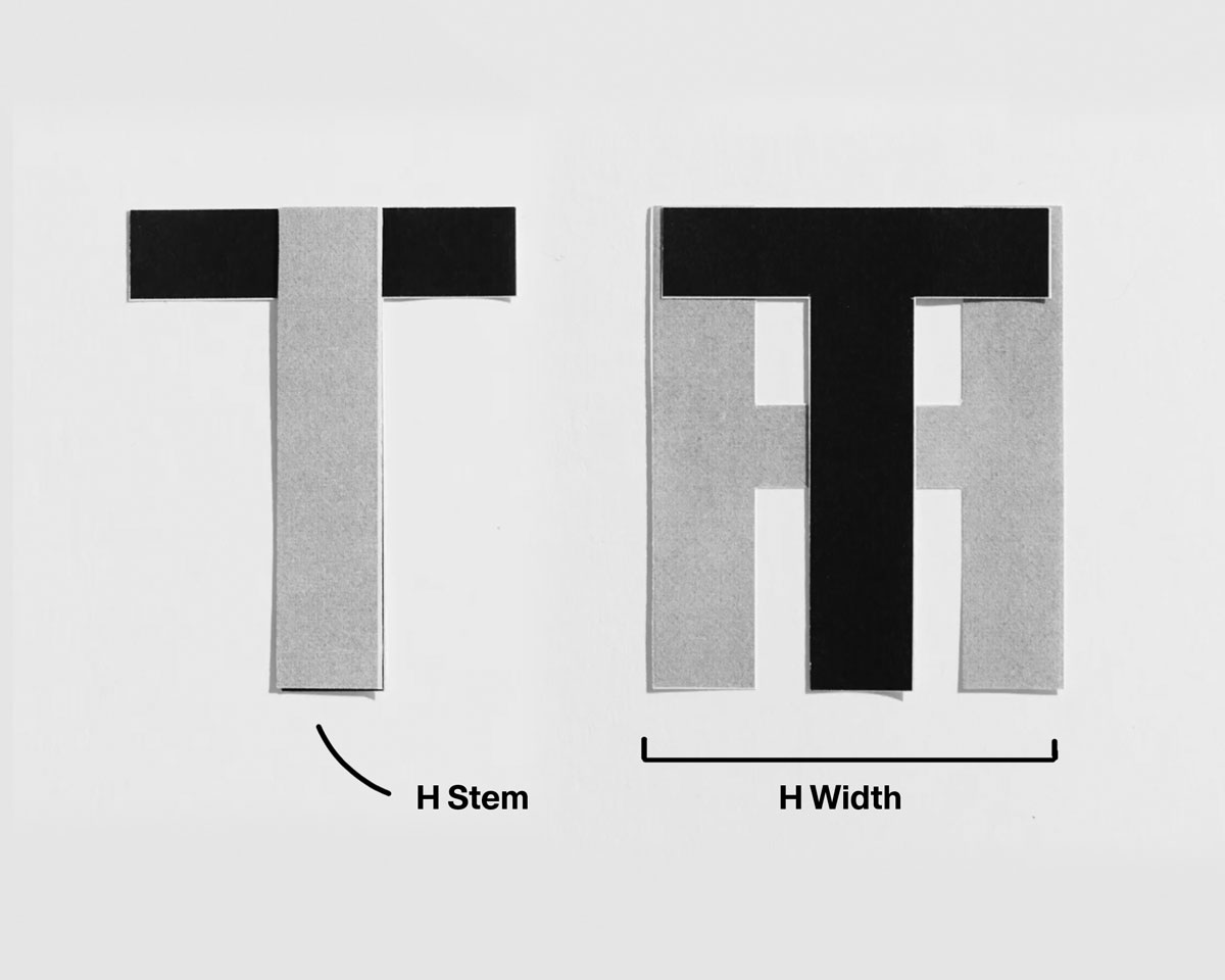
• Use H’s vertical logic.
• Add a wide horizontal crossbar.
• Keep the crossbar optically lighter.
• Add a wide horizontal crossbar.
• Keep the crossbar optically lighter.
Common Problems to Watch For:
☐ Vertical stems inconsistent in weight
☐ Crossbars placed geometrically instead of optically
☐ Uneven spacing between verticals
☐ Horizontal strokes appearing heavier than stems
☐ E or F feeling darker than H
Lock vertical stem weight first. Place crossbars optically before adjusting spacing or weight.
☐ Vertical stems inconsistent in weight
☐ Crossbars placed geometrically instead of optically
☐ Uneven spacing between verticals
☐ Horizontal strokes appearing heavier than stems
☐ E or F feeling darker than H
Lock vertical stem weight first. Place crossbars optically before adjusting spacing or weight.