<
LOWERCASE
>
One Optical Rule at a Time
This section explores the construction of the lowercase alphabet through shared forms and optical logic. By working in groups; shoulders, curves, bowls, diagonals, and so on we establish rules that carry across the entire system. The goal is not to draw perfect letters, but to create a lowercase that reads evenly, flows naturally, and holds together under repetition. The shoulder is the curved transition from a vertical stem into an arching form. In lowercase type, the shoulder defines rhythm more than any other feature. A consistent shoulder creates a consistent voice.
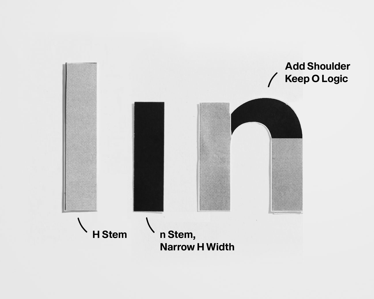
• Set stem weight and shoulder curve.
• Keep the shoulder smooth and restrained.
• Balance the counter optically.
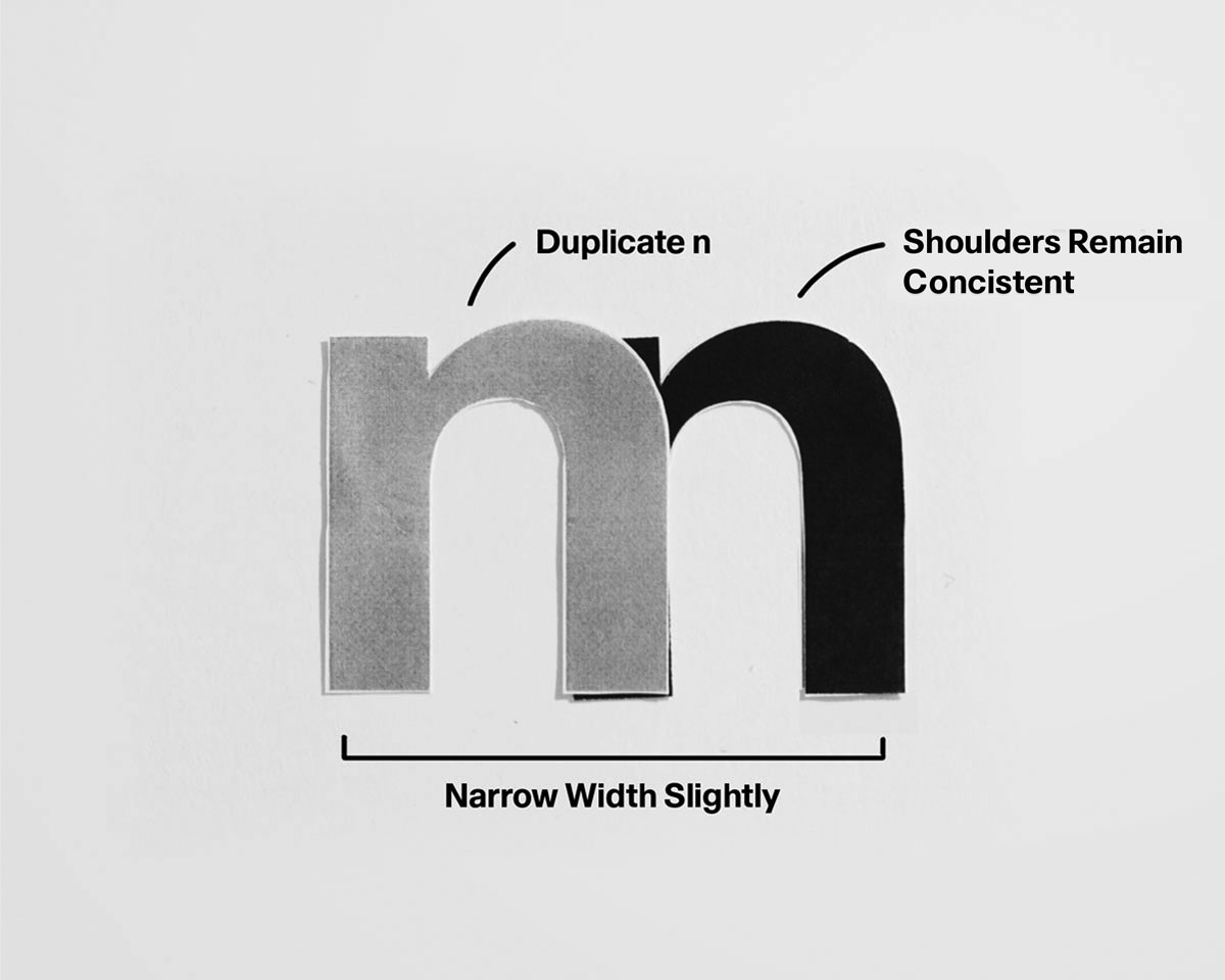
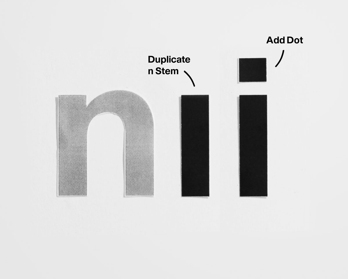
• Repeat n’s structure—no new shapes.
• Use identical stems and shoulders.
• Correct darkness with spacing, not weight.
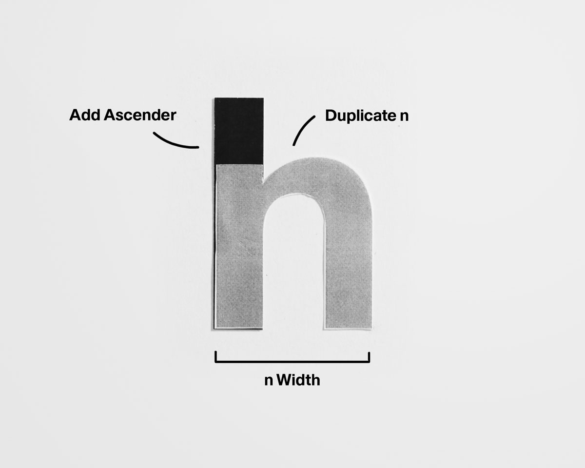
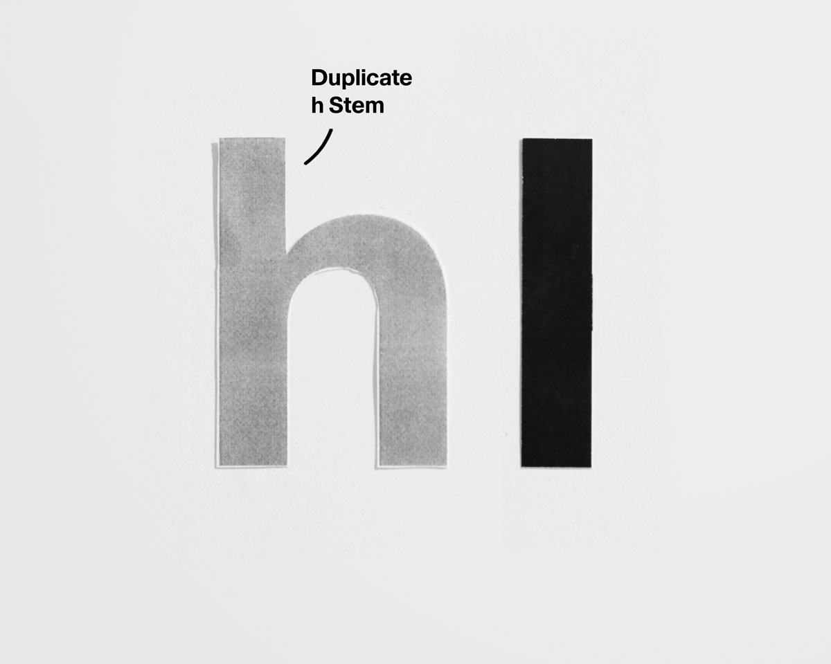
• Extend n’s stem to ascender height.
• Keep shoulder logic unchanged.
• Maintain consistent stem weight.
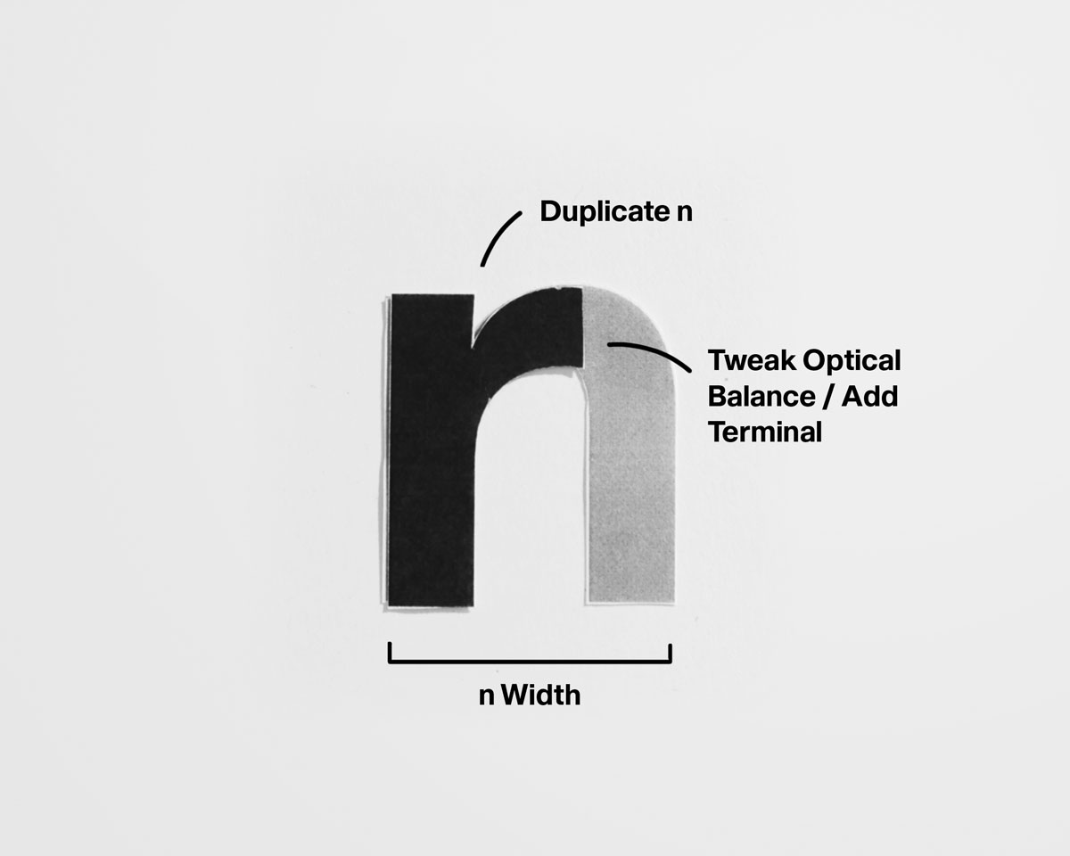
• Reduce n without redrawing.
• Keep stem and shoulder entry identical.
• Keep the exit short and controlled.
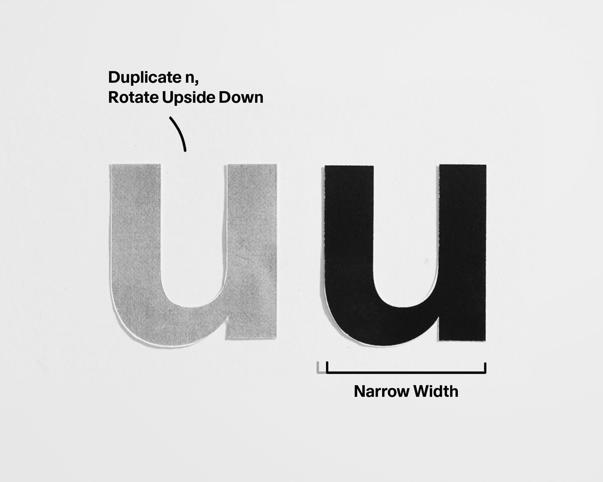
• Match stem weight to n.
• Mirror n’s shoulder tension at the bottom.
• Avoid sagging or flattening curves.
Common Problems to Watch For

☐ Shoulders changing shape
☐ Uneven spacing between stems
☐ r feeling weak or accidental
☐ u flattening at the bottom
☐ m appearing darker than n

Correct the shoulder before adjusting anything else.
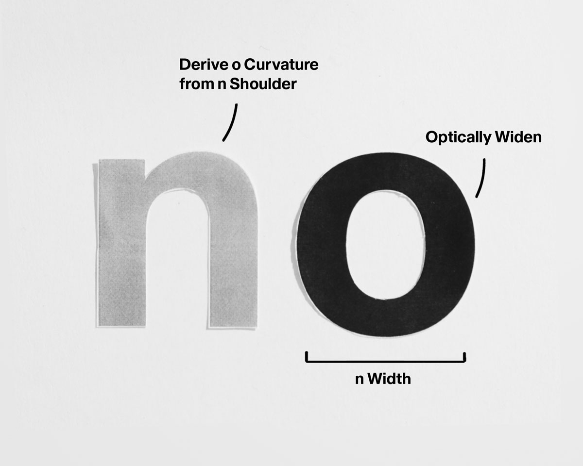
Lowercase Curves
Curved letters amplify every earlier decision in the typeface. If stem weight or spacing is unstable, curves will immediately feel bloated, uneven, or disconnected from the rest of the system. By introducing curves only after establishing shoulders and vertical logic, you remove structural guesswork and can focus fully on optical balance. How weight flows, how counters breathe, and how each curve relates back to the core forms you’ve already defined.
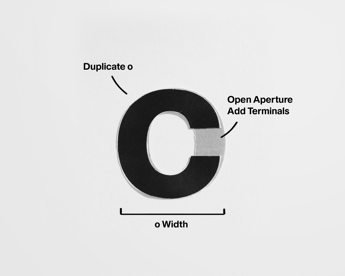
• Avoid perfect circles.
• Flatten slightly top and bottom.
• Balance weight evenly around the form.
• Open o without weakening weight.
• Keep terminals balanced.
• Avoid collapsing the aperture.
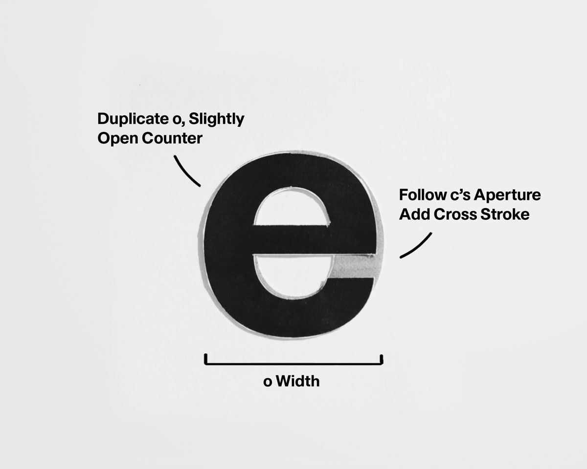
• Derive from o with a restrained cross stroke.
• Keep the aperture open.
• Prevent darkening at the join.
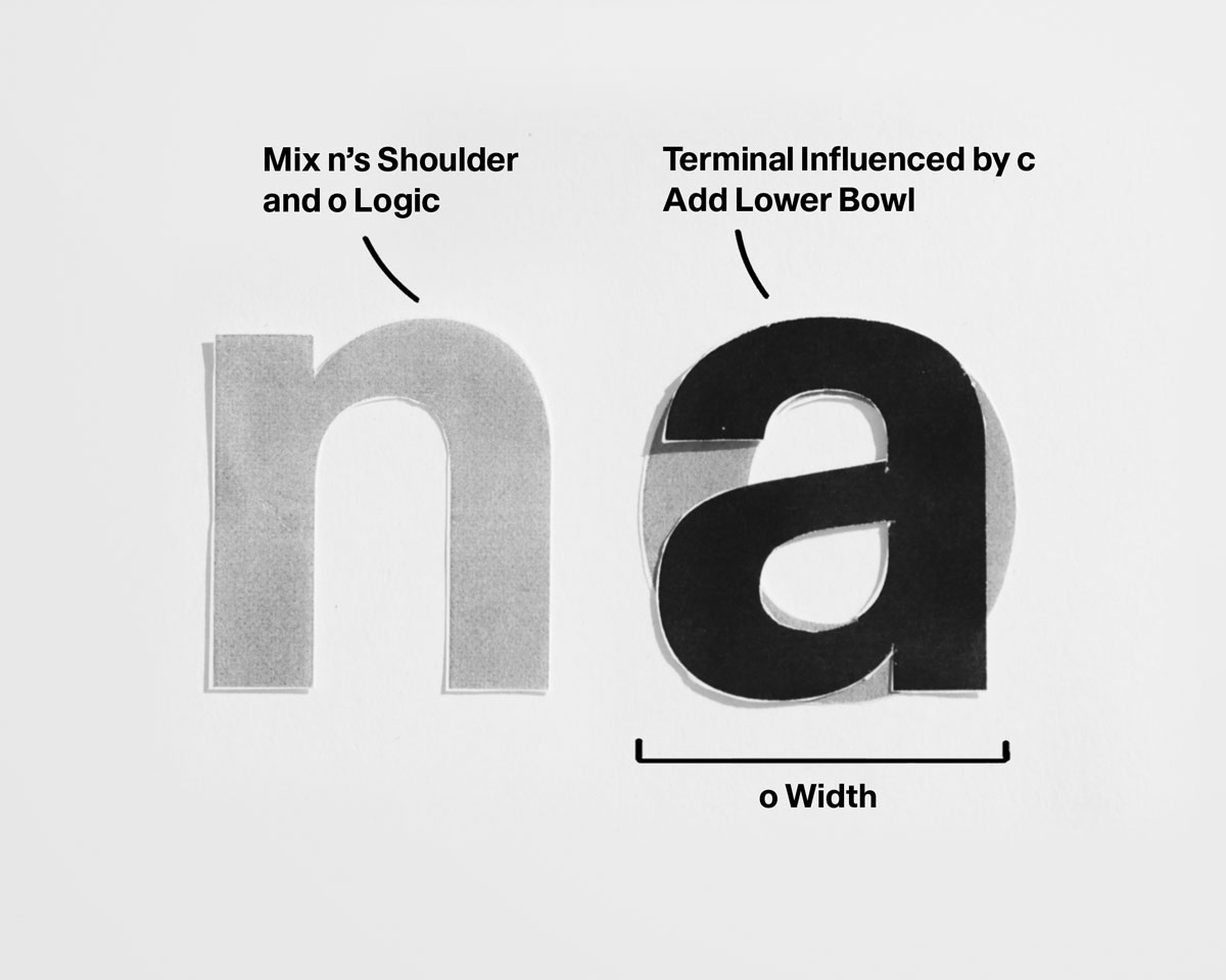
• Build from o plus n logic.
• Keep the join clean and quiet.
• Avoid sharp or pinched connections.
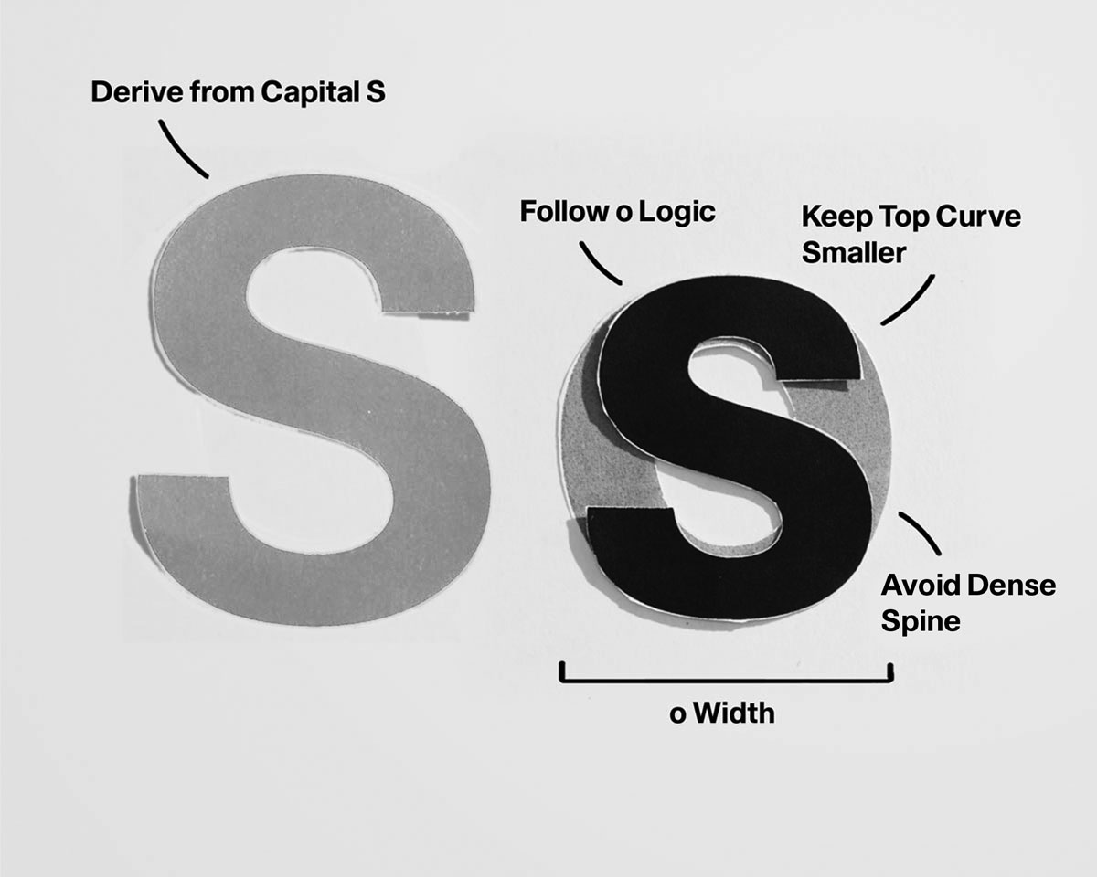
• Balance top and bottom curves asymmetrically.
• Thin through the middle.
• Maintain consistent curve tension.
Common Problems to Watch For:

‍
☐ Curves built from perfect geometry
☐ Inconsistent curve tension across letters
☐ Uneven or collapsing counters
☐ Closed apertures reducing clarity
☐ e or s appearing darker than o

Establish curve tension and counter shape first. Open apertures before adjusting stroke weight.
Vertical Extensions
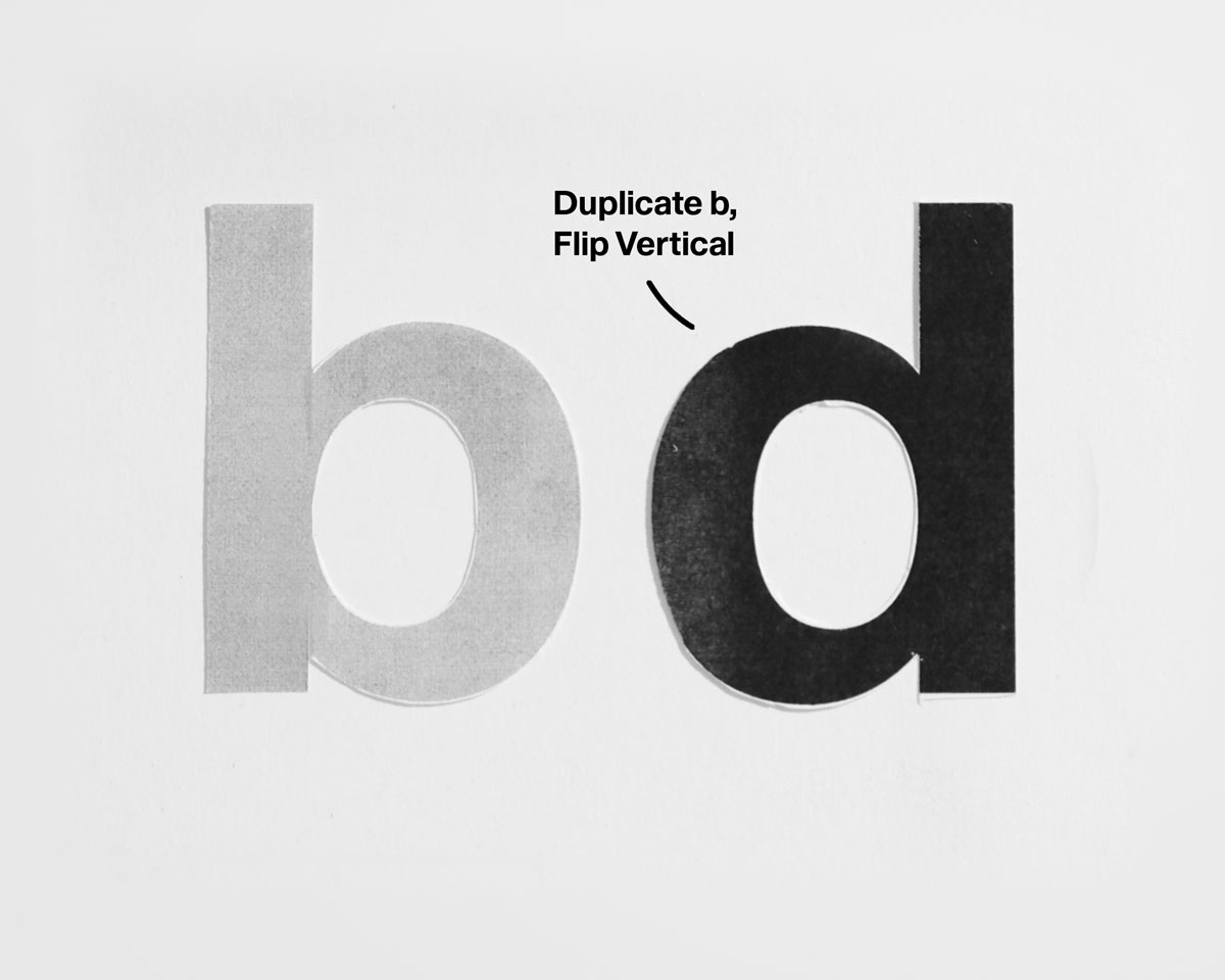
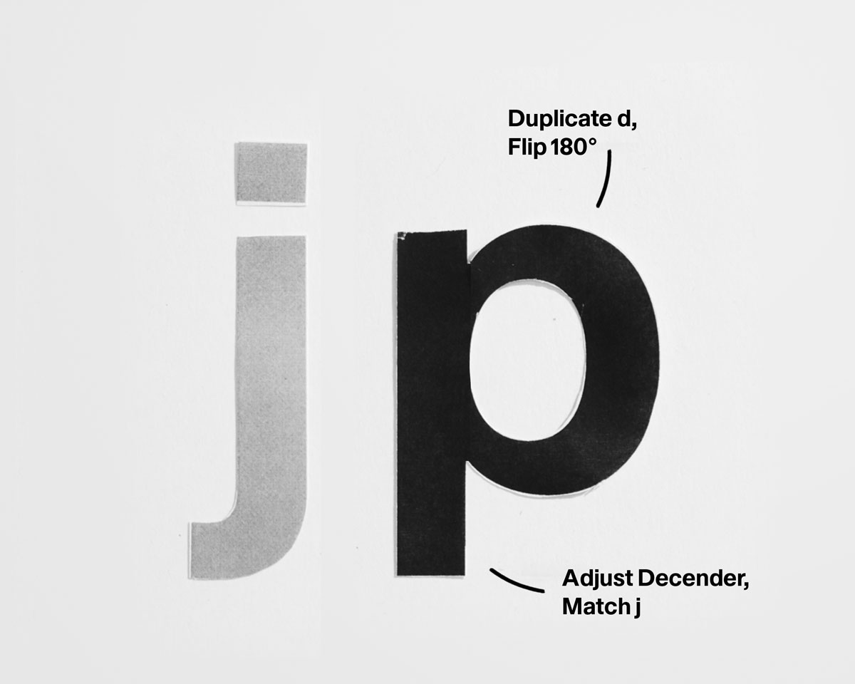
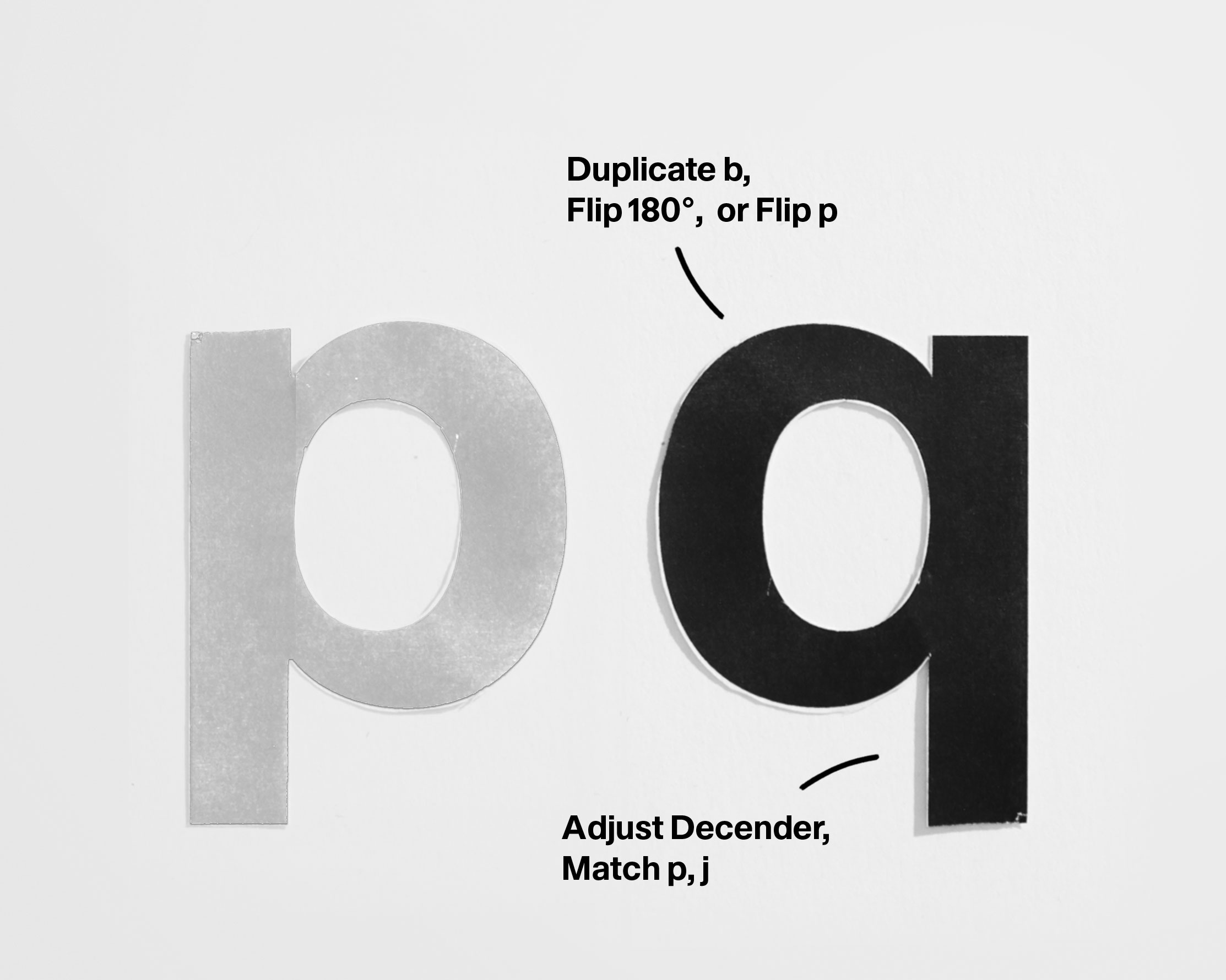
With curve tension and counter logic established, students now learn how bowls attach to stems and how rotation and mirroring can generate multiple letters from a single structure. These letters reinforce the principle that lowercase design is largely an act of reuse.
• Use the same stem as n.
• Place the dot centered optically, not mathematically.
• Keep dot size proportional and quiet.
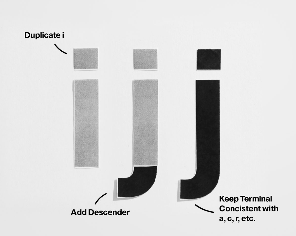
• Match i’s stem and dot logic.
• Extend the descender with restraint.
• Balance dot placement against the descender.
• Match stem weight to n.
• Extend cleanly to ascender height.
• Avoid tapering or character drift.
Common Problems to Watch For:
‍
☐ Stem weight inconsistent with n / h
☐ Ascender and descender lengths misaligned
☐ Dot placement disrupting rhythm
☐ j feeling heavier or wider than i

Lock stem weight and spacing first. Place dots optically after setting vertical rhythm.
Shouldered / Bowl Forms
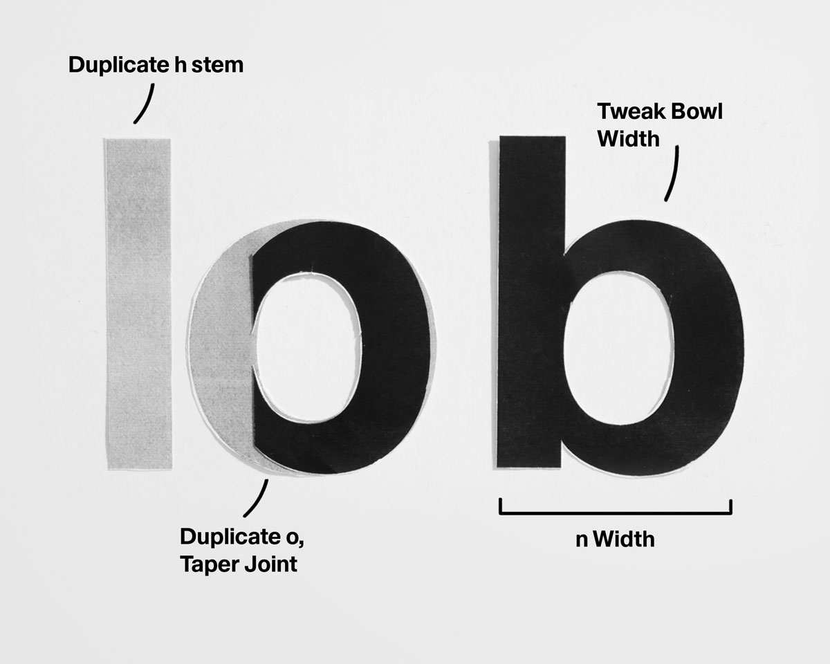
• Combine h stem and o.
• Keep bowl joint consistent with n.
• Balance top-heavy weight optically.
• Invert b’s structure vertically.
• Match stem weight.
• Keep bowl curvature even and controlled.
• Extend stem downward to descender.
• Match bowl shape to b.
• Prevent crowding at the baseline.
• Invert p’s structure horizontally.
• Match bowl shape to d.
• Keep descender consistent.
Common Problems to Watch For:
‍
☐ Bowls not derived from o / n logic
☐ Vertical stems inconsistent in weight
☐ Counters too closed or uneven
☐ Misaligned joins between stem and bowl
☐ p / q descenders breaking rhythm

Establish stem and bowl relationships first. Fix counter shape before adjusting stroke weight.
Structural Additions

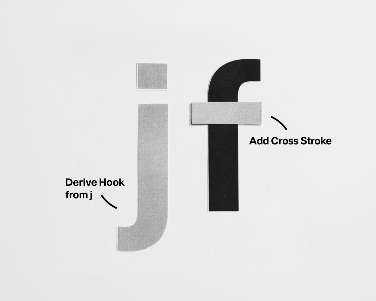
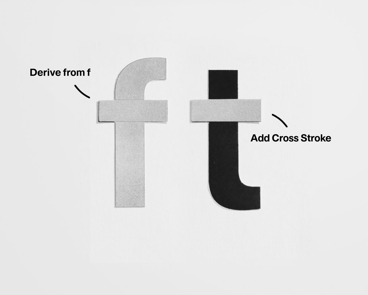
• Add curved ascender.
• Add hook derived from j.
• Extend crossbar slightly further right.
• Extend slightly above x-height.
• Place crossbar optically, not centered.
• Match terminal to c, e, r, etc.
• Derive the upper form from o / a logic.
• Keep the link and lower bowl restrained.
• Balance the descender for rhythm, not symmetry.
Common Problems to Watch For:
‍
☐ Diagonals overpowering the vertical stem
☐ Crossbars placed geometrically instead of optically
☐ Overhangs colliding with neighbouring letters
☐ Inconsistent terminal logic
☐ Uneven rhythm across the lowercase line
☐ f, t, g feeling darker than n

Stabilize the vertical system first. Resolve crossbars and overhangs before adjusting stroke weight.
Diagonals
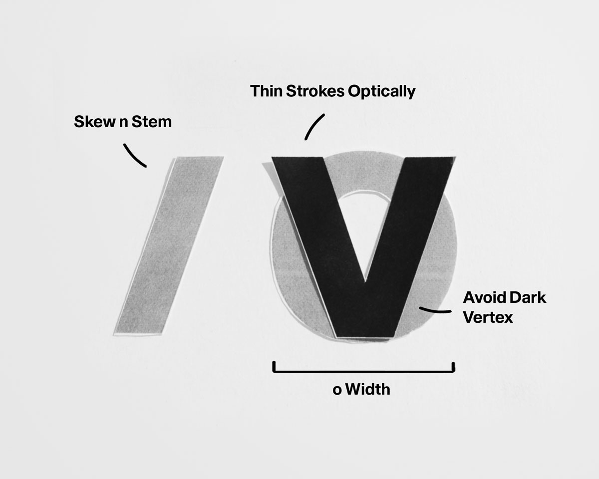
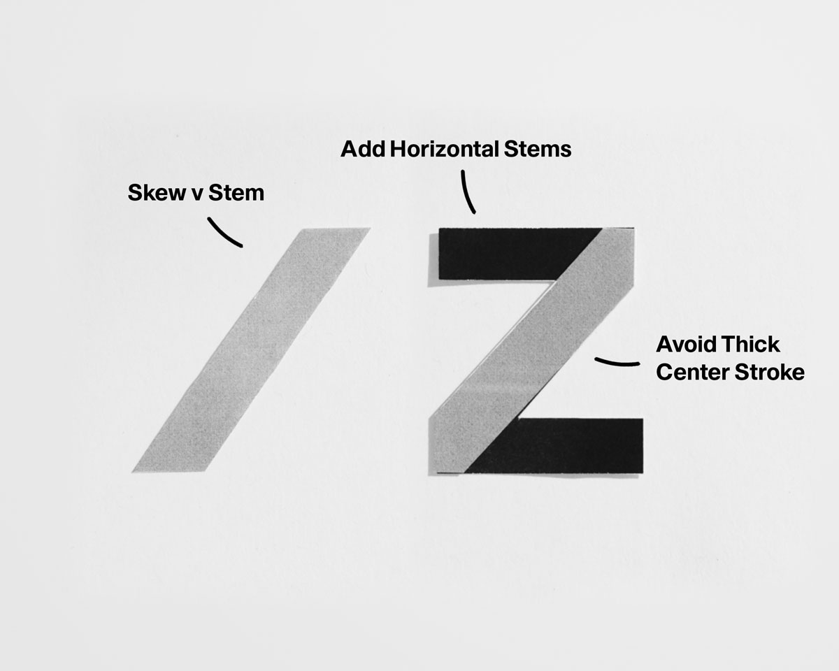
• Set diagonal angle for the system.
• Thin strokes optically.
• Keep the bottom vertex sharp but stable.
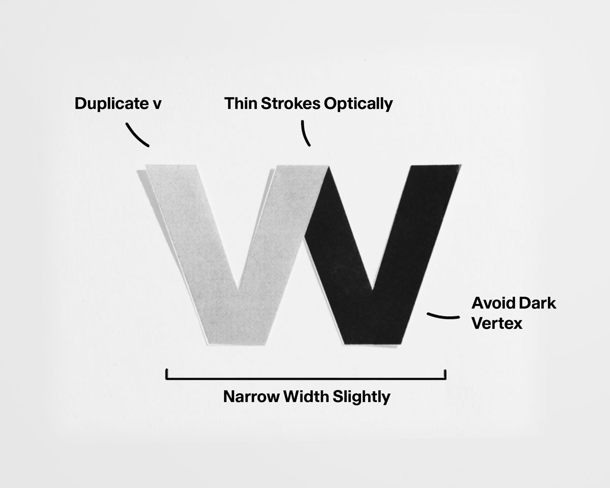
• Repeat v with controlled spacing.
• Keep inner counters open.
• Avoid excessive width.
• Cross diagonals at the optical center.
• Thin strokes at the intersection.
• Keep both diagonals equal in weight.
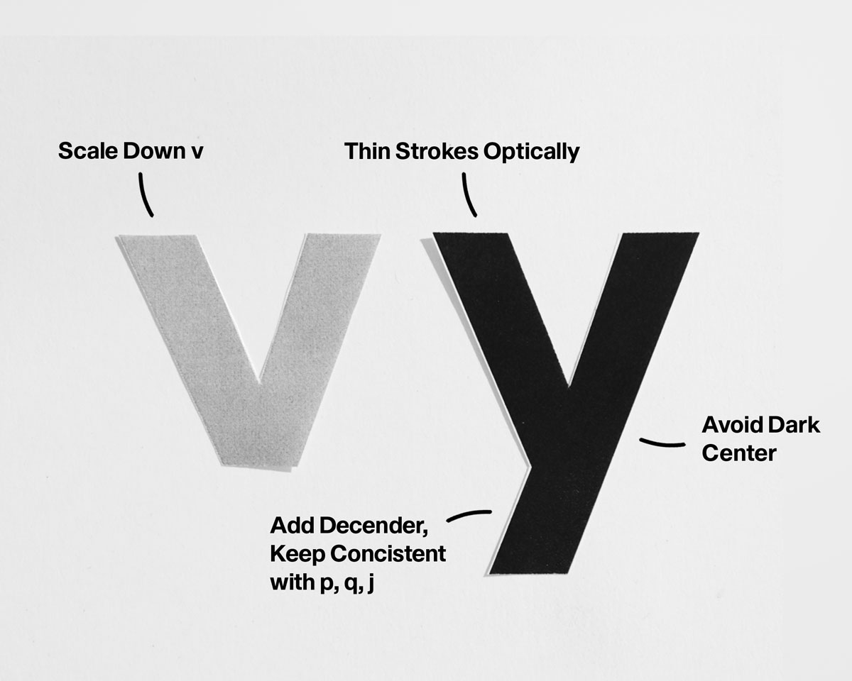
• Build the upper form from v.
• Extend the descender cleanly and diagonally.
• Keep descender weight optically lighter.
• Balance horizontal and diagonal strokes.
• Avoid heavy terminals.
• Maintain rhythm across direction changes.
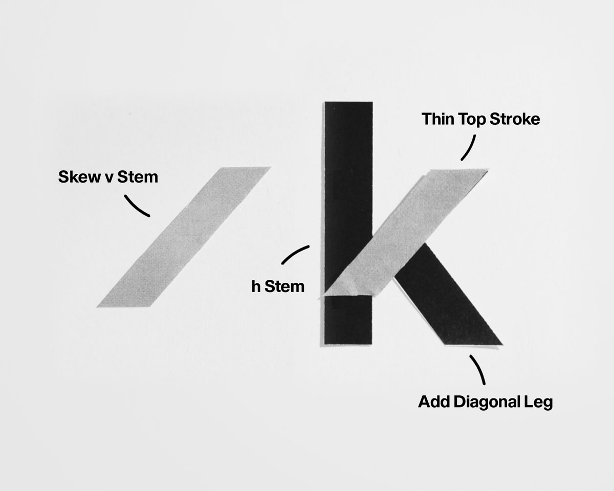
• Anchor with a vertical stem.
• Attach diagonals using v’s angle.
• Prevent visual heaviness at the join.
Common Problems to Watch For:
‍
☐ Diagonals appearing heavier than verticals
☐ Inconsistent diagonal angle across letters
☐ Dark intersections at joins or crossings
☐ Bottom vertices too sharp or too blunt
☐ Descenders breaking diagonal rhythm (y)
☐ z disrupting overall texture

Establish diagonal angle and optical thinning first. Resolve intersections and vertices before adjusting spacing or weight.
Continue Lesson Two