Module 2
Words have Meaning, Type has Spirit.
Paula Scher
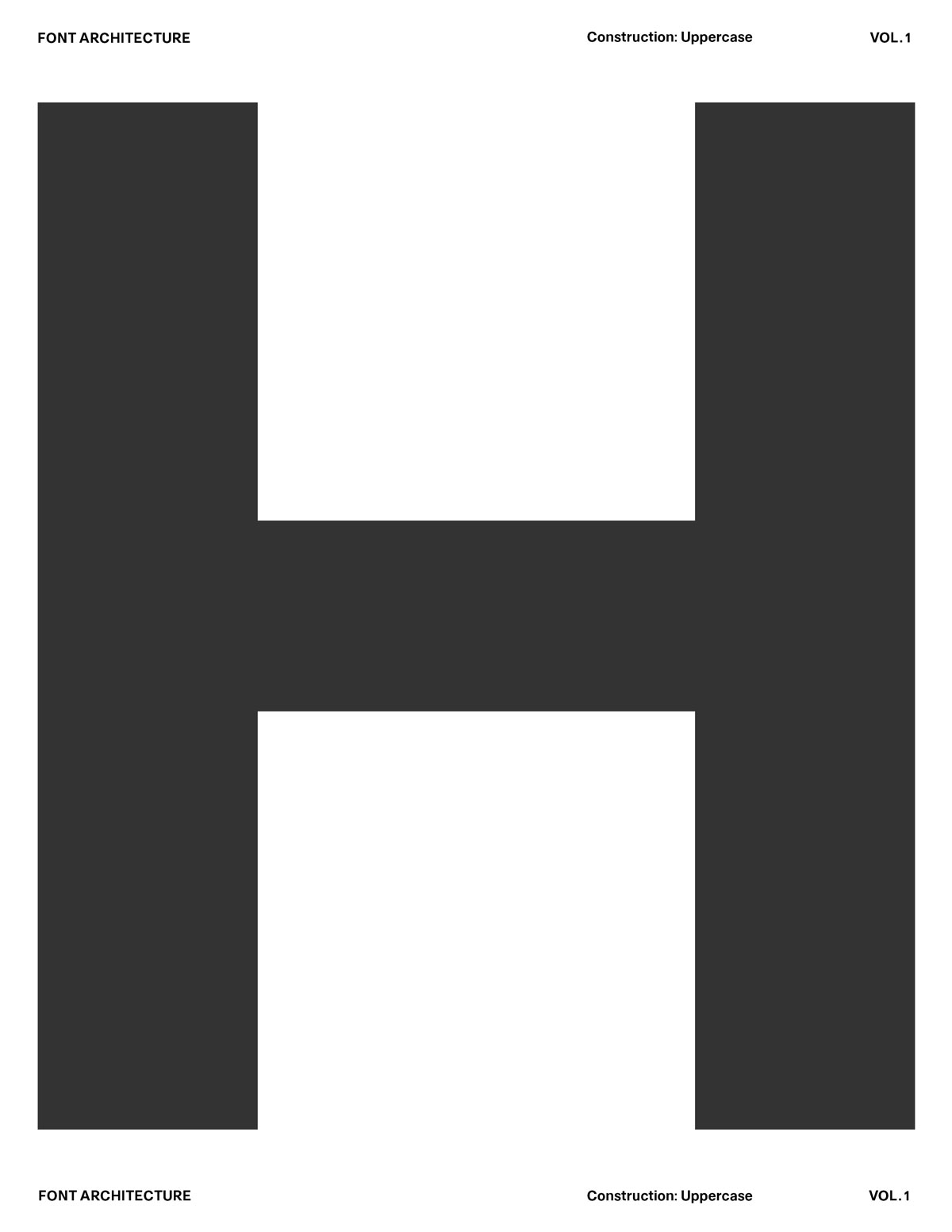
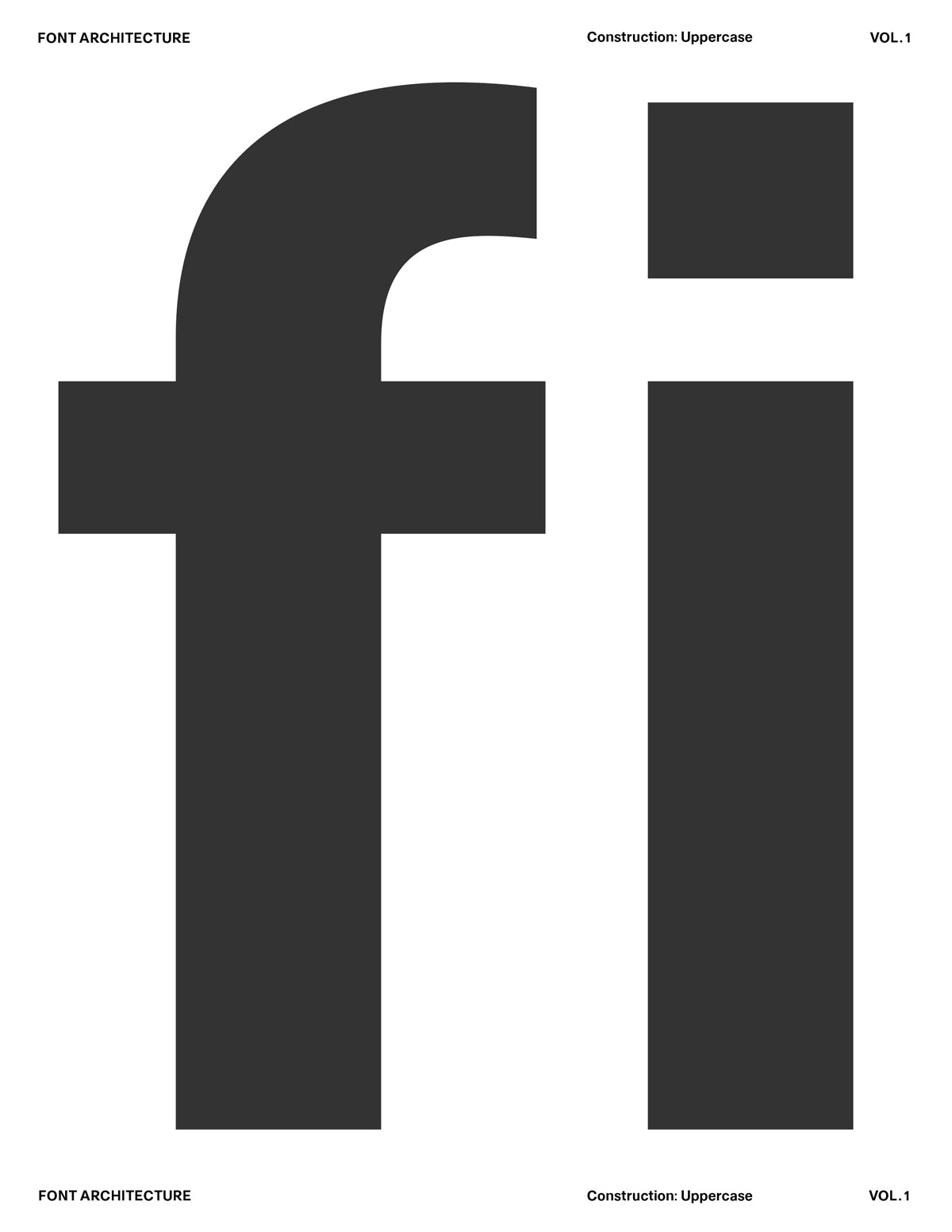
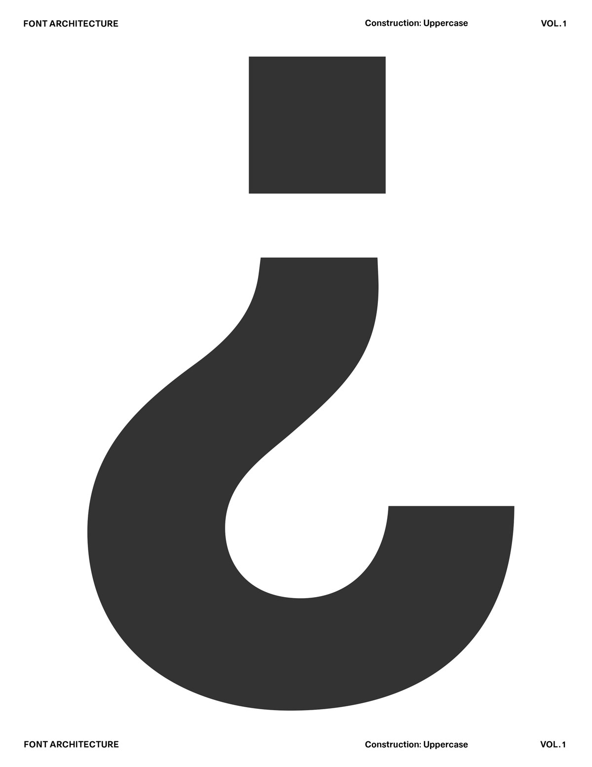
Type design is an inherently personal and nuanced practice, shaped through constant trial and error. Progress is made by adding and subtracting gradual, stretching and compressing structures, and repeatedly returning to forms with fresh eyes. This slow process of adjustment and contemplation reveals endless possibilities of opportunities to bend conventions, break rules, and develop new, expressive forms. Yet within most typefaces, a small set of underlying principles quietly holds everything together. By identifying these shared foundations, we can group related decisions and use duplication as a tool to define the values, rhythm, and voice of the font as a whole.
What You'll Need?
This module continues our physical practice by decoding how forms are built, letter by letter. The goal is not perfection, but understanding. Explore structure, test repetition, and build intuition through drawing each letter.
1. Pencil or Fineliner - A soft pencil (HB–2B) or a thin fineliner for clean, confident strokes. Sketch lightly, iterate freely.

2. Eraser - Use it if you need it, but try sketching without relying on corrections (for now). The looseness is part of the process.

3. A4 Paper / Workbook Sheets - Print the companion worksheets for each module to draw, test ideas, and explore type concepts directly on paper. Grids, baselines, caplines, and “draw here” prompts help you focus on structure, not decoration.

4. Ruler or Straightedge - Useful for consistent vertical stems, cap height guides, and spacing tests but not required for every page.

5. Reference Typefaces - Any printed typeface you admire. Study it, trace parts, and compare shapes. This helps train your eye for proportion and rhythm.

6. Optional: Markers or Brush Pens - Great for weight tests, stroke experiments, and exploring contrast.
1. What is Type Design
2. Anatomy of Letterforms
3. Contrast
4. Balance
5. Spacing
Letters as Components, Not Pictures
Harmony and Contrast
Letters don’t exist in isolation. They live in words, sentences, and paragraphs. The moment you type a word, every shape begins to interact — spacing, rhythm, counterspace, optical weight — all become part of one continuous system.

Each letter contributes to a shared structure — a skeleton of proportions, angles, and rhythm. You’re not designing a beautiful “a” or a perfect “g” — you’re designing how “a” and “g” relate to “n,” “o,” “e,” “r” and every other glyph in the system. For example: If your n has a tall, narrow rhythm, your o can’t suddenly be wide and heavy — it breaks the system.If your verticals are thick and your diagonals are thin, that logic must stay consistent across the alphabet.You’re creating a visual grammar, not just a gallery of forms.
Harmony and Contrast Systems
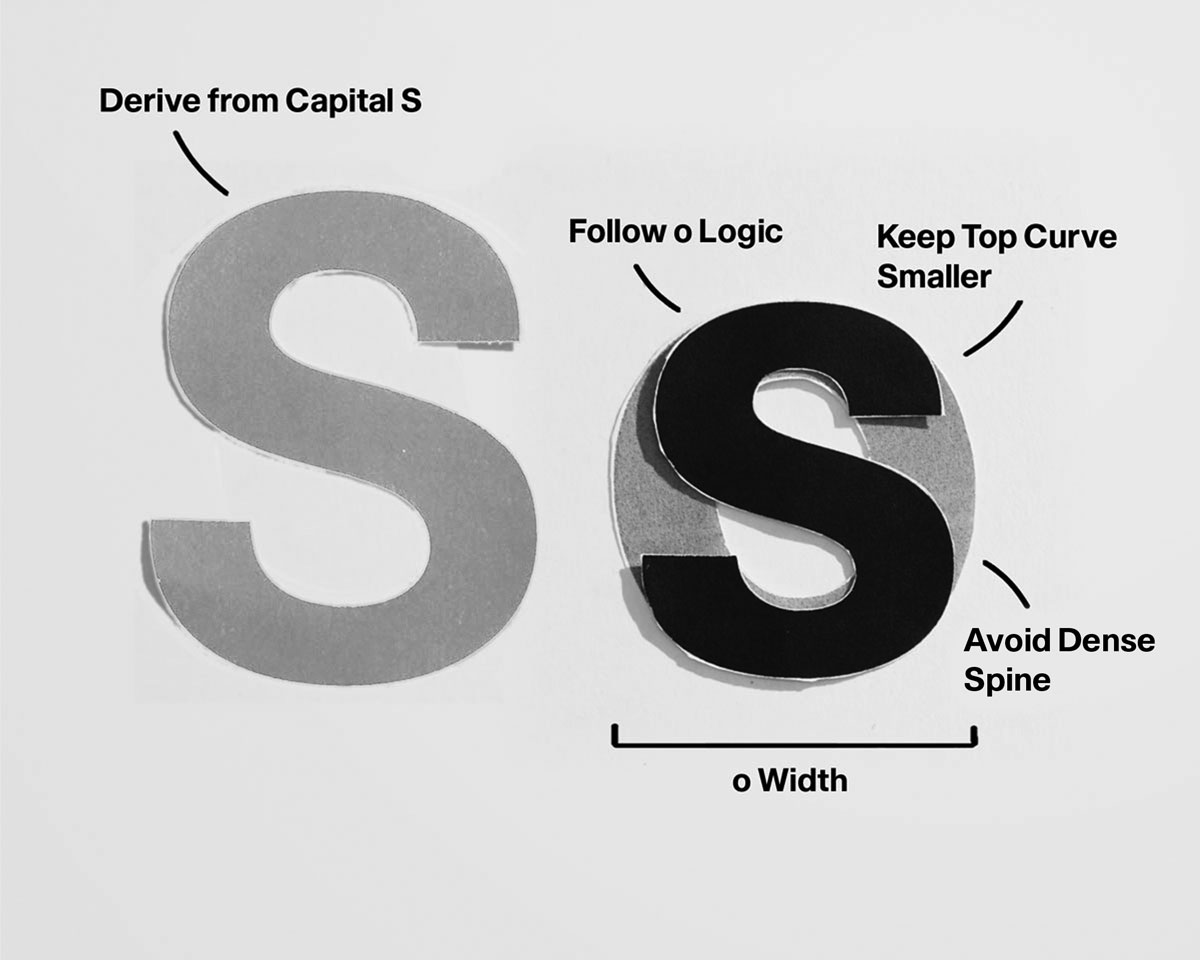
Type design balances harmony (everything feels part of the same family) with contrast (enough variation to feel human and alive). The genius of good type lies in that equilibrium — every letter feels distinct, yet none feels out of place. So when you’re adjusting a curve or spacing a pair, you’re not fixing that one shape — you’re maintaining the conversation between shapes. The letter “n” teaches the rhythm. The letter “o” sets the curve logic. The letter “h” and “d” define proportion and contrast. Together, they become your system’s DNA.
Harmony and Contrast
Letters don’t exist in isolation. They live in words, sentences, and paragraphs. The moment you type a word, every shape begins to interact — spacing, rhythm, counterspace, optical weight — all become part of one continuous system.

Each letter contributes to a shared structure — a skeleton of proportions, angles, and rhythm. You’re not designing a beautiful “a” or a perfect “g” — you’re designing how “a” and “g” relate to “n,” “o,” “e,” “r” and every other glyph in the system. For example: If your n has a tall, narrow rhythm, your o can’t suddenly be wide and heavy — it breaks the system.If your verticals are thick and your diagonals are thin, that logic must stay consistent across the alphabet.You’re creating a visual grammar, not just a gallery of forms.
Harmony and Contrast Systems
Type design balances harmony (everything feels part of the same family) with contrast (enough variation to feel human and alive). The genius of good type lies in that equilibrium — every letter feels distinct, yet none feels out of place. So when you’re adjusting a curve or spacing a pair, you’re not fixing that one shape — you’re maintaining the conversation between shapes. The letter “n” teaches the rhythm. The letter “o” sets the curve logic. The letter “h” and “d” define proportion and contrast. Together, they become your system’s DNA.
Harmony and Contrast
Letters don’t exist in isolation. They live in words, sentences, and paragraphs. The moment you type a word, every shape begins to interact — spacing, rhythm, counterspace, optical weight — all become part of one continuous system.

Each letter contributes to a shared structure — a skeleton of proportions, angles, and rhythm. You’re not designing a beautiful “a” or a perfect “g” — you’re designing how “a” and “g” relate to “n,” “o,” “e,” “r” and every other glyph in the system. For example: If your n has a tall, narrow rhythm, your o can’t suddenly be wide and heavy — it breaks the system.If your verticals are thick and your diagonals are thin, that logic must stay consistent across the alphabet.You’re creating a visual grammar, not just a gallery of forms.
Where We’re Going
Digitizing the Type

‍
Build upon your refined drawings by translating them into digital form. This module is about learning how type behaves on screen as faithfully as it does on paper. You’ll move from sketches to vectors, understanding how curves are constructed, how points influence weight, and how precision affects character.

We’ll focus on building clean outlines, controlling curves, and establishing consistency across the character set. You’ll learn how to evaluate your forms at multiple sizes, adjust spacing digitally, and refine rhythm with intention. Every node, handle, and measurement contributes to the voice of the typeface.

Module 3 transforms your working system into a usable font.
Slow down. Be deliberate.