Lock the Character Set
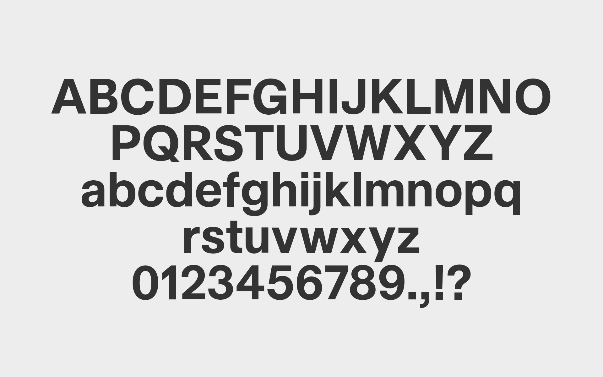
Before export, commit to what your font actually is. This is the moment to stop expanding and start finishing. Every glyph you plan to ship should exist, be intentional, and meet the same quality standard as your best letters. A weak ampersand or rushed accent doesn’t hide; it announces itself. Consistency matters more than size. A smaller, well-resolved character set is always stronger than a bloated one full of apologies.
Top tip:
If a glyph makes you hesitate, it’s not ready. Either fix it or remove it.
If a glyph makes you hesitate, it’s not ready. Either fix it or remove it.