Font Architecture:
Letter by Letter
Module 4
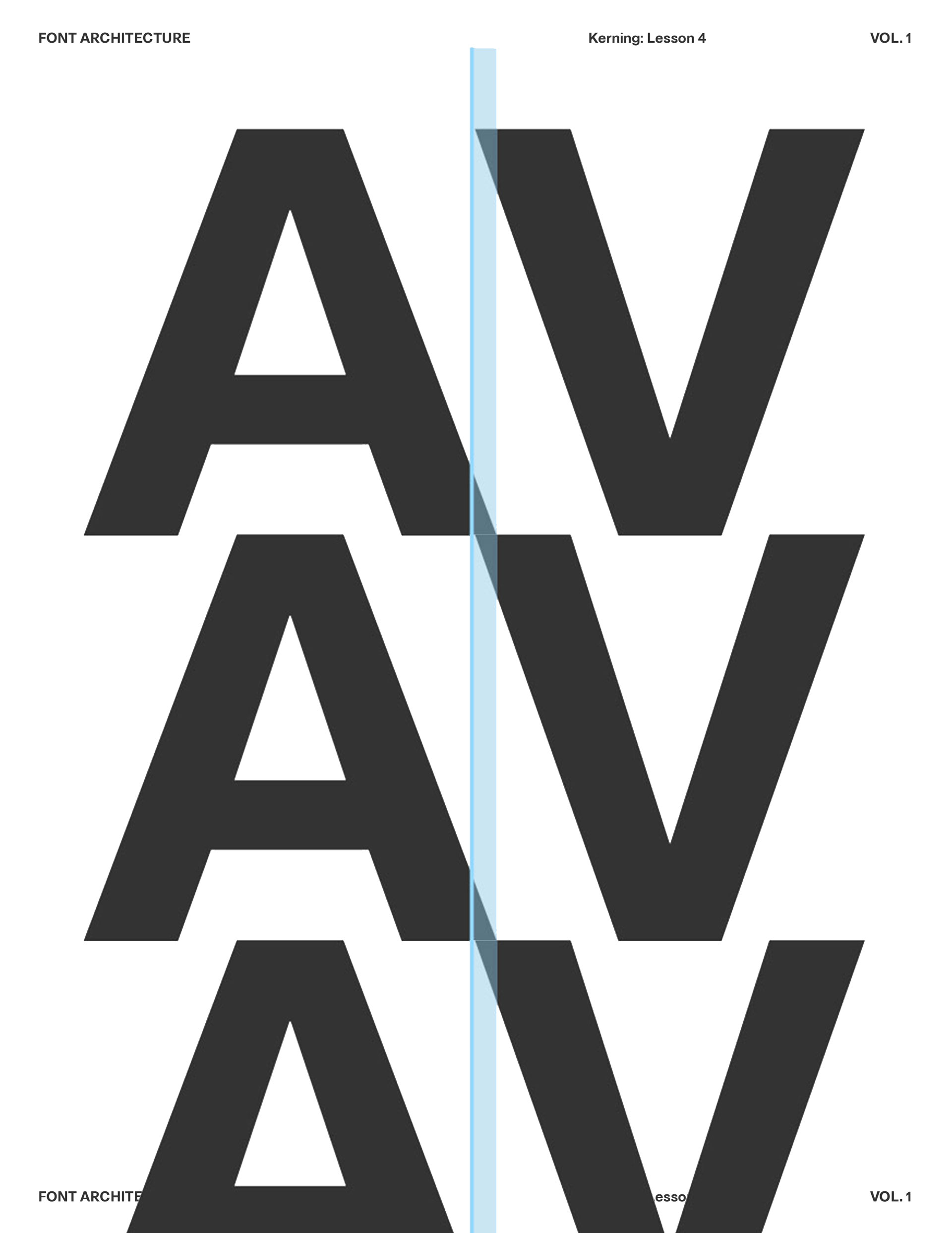
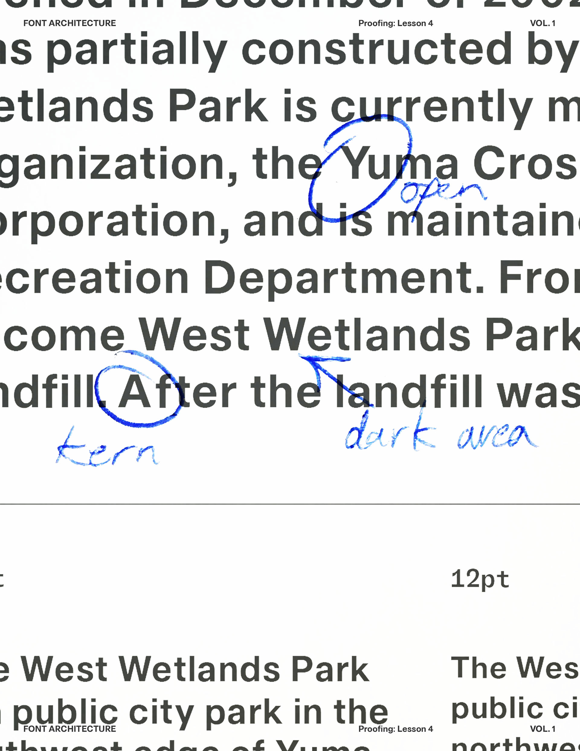
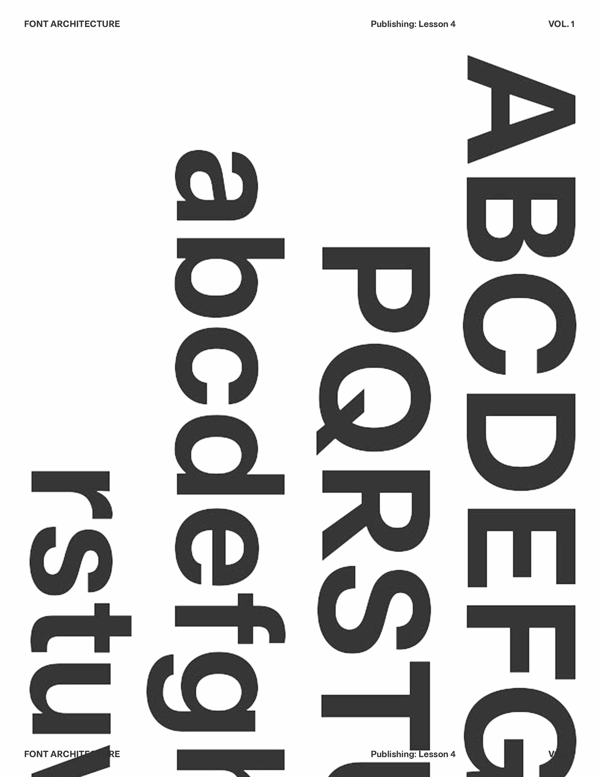
This module isn’t about new ideas; it’s about control. Your typeface should already be digitized with a working character set. Now you refine, correct, and systemize. Spacing, kerning, and previewing in context. Then step outside it. Install the font. Set real paragraphs. Print it. Problems reveal themselves in various mediums. Work slowly and save versions along the way. Revisit decisions with sharper eyes. This stage is quieter; but more demanding. Small adjustments have large effects. The goal is simple; a font that holds together confidently.
What You'll Need?
1. Digitized Core Set Complete: Your A–Z and a–z are drawn, cleaned, and usable. No placeholders, no unfinished outlines. You are refining a system; not filling gaps.

2. Control Characters Feel Stable: H, O,  n, o  are resolved and consistent. Derived letters follow their logic. If these shift, everything shifts.

3. Spacing Basics: Text reads evenly in blocks; not just in short test strings. No obvious dark spots or loose gaps. Kerning is not compensating for weak sidebearings.

4. Technical Confidence in Your Tools: You can navigate your font editor smoothly, adjust metrics in context, export test files, and correct issues without friction.

5. Real-World Testing: Design software such as Photoshop or InDesign to set real paragraphs, headlines, and mixed content. A printer available for physical proofs; paper reveals spacing, weight balance, and rhythm issues that screens often hide.
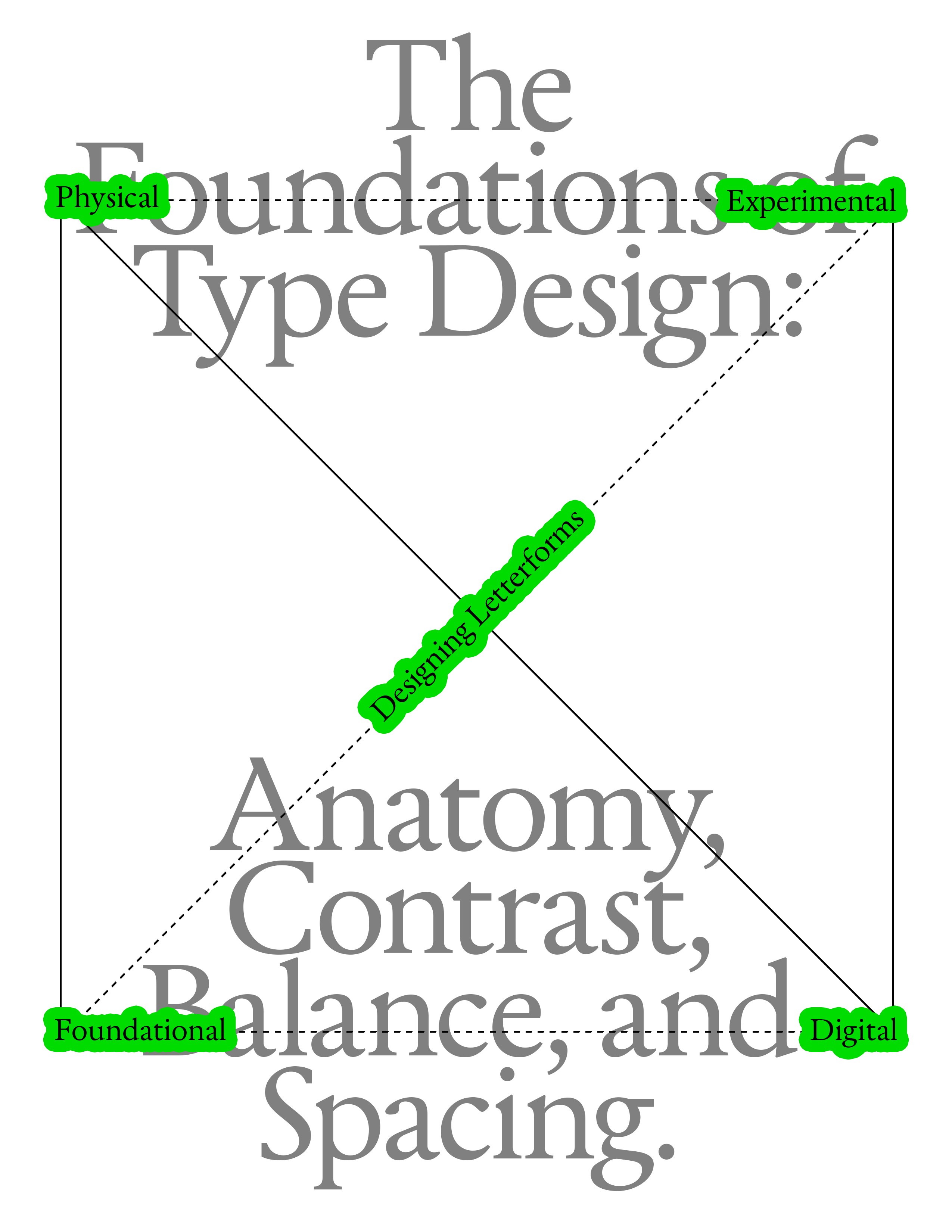
1. What is Type Design
2. Anatomy of Letterforms
3. Contrast
4. Balance
5. Spacing
Letters as Components, Not Pictures
Harmony and Contrast
Letters don’t exist in isolation. They live in words, sentences, and paragraphs. The moment you type a word, every shape begins to interact — spacing, rhythm, counterspace, optical weight — all become part of one continuous system.

Each letter contributes to a shared structure — a skeleton of proportions, angles, and rhythm. You’re not designing a beautiful “a” or a perfect “g” — you’re designing how “a” and “g” relate to “n,” “o,” “e,” “r” and every other glyph in the system. For example: If your n has a tall, narrow rhythm, your o can’t suddenly be wide and heavy — it breaks the system.If your verticals are thick and your diagonals are thin, that logic must stay consistent across the alphabet.You’re creating a visual grammar, not just a gallery of forms.
Harmony and Contrast Systems
Type design balances harmony (everything feels part of the same family) with contrast (enough variation to feel human and alive). The genius of good type lies in that equilibrium — every letter feels distinct, yet none feels out of place. So when you’re adjusting a curve or spacing a pair, you’re not fixing that one shape — you’re maintaining the conversation between shapes. The letter “n” teaches the rhythm. The letter “o” sets the curve logic. The letter “h” and “d” define proportion and contrast. Together, they become your system’s DNA.
Harmony and Contrast
Letters don’t exist in isolation. They live in words, sentences, and paragraphs. The moment you type a word, every shape begins to interact — spacing, rhythm, counterspace, optical weight — all become part of one continuous system.

Each letter contributes to a shared structure — a skeleton of proportions, angles, and rhythm. You’re not designing a beautiful “a” or a perfect “g” — you’re designing how “a” and “g” relate to “n,” “o,” “e,” “r” and every other glyph in the system. For example: If your n has a tall, narrow rhythm, your o can’t suddenly be wide and heavy — it breaks the system.If your verticals are thick and your diagonals are thin, that logic must stay consistent across the alphabet.You’re creating a visual grammar, not just a gallery of forms.
Harmony and Contrast Systems
Type design balances harmony (everything feels part of the same family) with contrast (enough variation to feel human and alive). The genius of good type lies in that equilibrium — every letter feels distinct, yet none feels out of place. So when you’re adjusting a curve or spacing a pair, you’re not fixing that one shape — you’re maintaining the conversation between shapes. The letter “n” teaches the rhythm. The letter “o” sets the curve logic. The letter “h” and “d” define proportion and contrast. Together, they become your system’s DNA.
Harmony and Contrast
Letters don’t exist in isolation. They live in words, sentences, and paragraphs. The moment you type a word, every shape begins to interact — spacing, rhythm, counterspace, optical weight — all become part of one continuous system.

Each letter contributes to a shared structure — a skeleton of proportions, angles, and rhythm. You’re not designing a beautiful “a” or a perfect “g” — you’re designing how “a” and “g” relate to “n,” “o,” “e,” “r” and every other glyph in the system. For example: If your n has a tall, narrow rhythm, your o can’t suddenly be wide and heavy — it breaks the system.If your verticals are thick and your diagonals are thin, that logic must stay consistent across the alphabet.You’re creating a visual grammar, not just a gallery of forms.
Send us your font.
From a working font to a finished typeface; Module 4 is the discipline phase. You’ve done the hard thinking. You’ve built the system. Now it behaves in real layouts, holds at small and large sizes, and exports cleanly. You proofed relentlessly.

Now it's time to share it. We invite you to send us your finished typeface; proof sheets, specimen pages, layout tests, or final exports. Show us your creative work.

Submit Font
Featured in our newletter and socials