The Final Quality Control
Font proofing is the final essential step before releasing a typeface. It verifies that your design survives real use; across systems, sizes, software, and text conditions. Proofing exposes technical, spacing, and rendering problems that rarely appear inside the editor. This is where assumptions are tested and shortcuts are revealed.
Proofing is not simply looking at your letters. It is systematic validation that the font behaves as intended in real contexts; on screen, in print, and across different applications. A well-proofed font displays consistently across operating systems, maintains correct spacing and kerning, maps every character to the correct glyph, and supports OpenType features reliably; ligatures, alternates, and stylistic sets included.
Proofing is not simply looking at your letters. It is systematic validation that the font behaves as intended in real contexts; on screen, in print, and across different applications. A well-proofed font displays consistently across operating systems, maintains correct spacing and kerning, maps every character to the correct glyph, and supports OpenType features reliably; ligatures, alternates, and stylistic sets included.
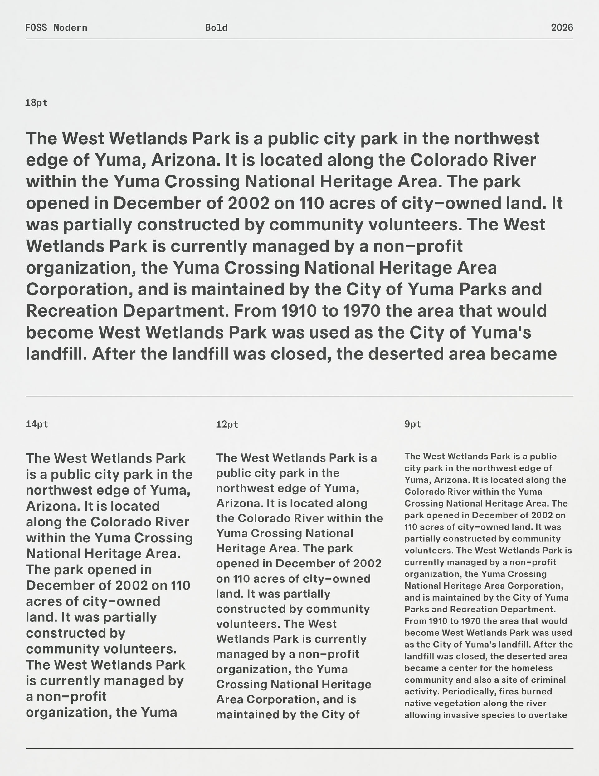
This stage confirms that the font is not just well designed, but dependable.
Why Proofing Matters
Technical errors in a font are not minor inconveniences; they have real consequences. Imagine typing an apostrophe and getting a foot mark instead; or discovering a broken letter pair that disrupts rhythm across an entire paragraph. These issues interrupt reading, undermine professional confidence, and cause failures in real applications and publishing environments.
Proofing exists to prevent this. It ensures your font not only looks good, but behaves correctly; predictably, reliably, and without surprises. A released font should never ask the user to work around it.
Proofing exists to prevent this. It ensures your font not only looks good, but behaves correctly; predictably, reliably, and without surprises. A released font should never ask the user to work around it.
Lowercase Rhythm
minimum common movement among modern momentsnonlinear momentum in numerous normal roomsremember narrow shoulders and open counters
If spacing is uneven, this will break immediately. Judge texture, not words.
Diagonals & Problem Pairs
A vast wave of visual vibration moves away. We avoid awkward AV, VA, WA, and YA collisions. Vector values vary wildly without vigilance.
Watch for triangular white gaps and over-tight joins.
Round + Stem Relationships
Control of contrast creates coherent color. Observe how O meets H, how C meets T. Poor spacing makes rounds drift from verticals.
If O feels farther from H than H from H, adjust upstream.
Mixed Case
Typography Requires Real Discipline.
When Capitals Enter A Sentence, Texture Shifts. If Uppercase Spacing Dominates, Revise Restraint.
When Capitals Enter A Sentence, Texture Shifts. If Uppercase Spacing Dominates, Revise Restraint.
Caps should integrate; not detach.
Overhang Letters
The efficient fly drifts softly beyond the line. A joyful glyph often affects neighbors unfairly. Type safely; overhangs frequently disrupt flow.
Inspect f, j, y, and T carefully.
Punctuation
“Quotation marks reveal discipline.”
Does the apostrophe differ from the prime? Look at commas, periods, and semicolons; closely.
Does the apostrophe differ from the prime? Look at commas, periods, and semicolons; closely.
Check spacing before and after punctuation.
Figures & Currency
In 2026, revenue reached $7,480,950.75.
Forecasts suggest 12–18% growth by 2030. Invoice #00427 remains unpaid.
Forecasts suggest 12–18% growth by 2030. Invoice #00427 remains unpaid.
Check figure alignment, tabular stability, and symbol weight.
Full Paragraph Texture
Typography carries tone through proportion and rhythm. When spacing collapses or kerning overreacts, readers feel instability immediately. Calm spacing allows text to disappear; poor spacing announces itself.
Test at multiple sizes. Print and compare.
Repetition Stress Test
AVAVAVAVAV
ToToToToTo
nnonnonnonno
HHHOHHOHHO
ToToToToTo
nnonnonnonno
HHHOHHOHHO
Repetition removes meaning and exposes structure.
If rhythm fails here, spacing is not finished.
If rhythm fails here, spacing is not finished.
Proofing Workflow
Test Across Platforms and Outputs
A font must be tested beyond the design environment. Proof it on multiple systems; macOS and Windows. Use different applications; InDesign, Word, browsers. Check both screen and print output. Fonts can render differently depending on the rendering engine, and proofing is how those differences are caught and corrected.
Paper vs Screen
Professional proofing does not stop at the screen. Printing reveals things digital previews often hide. It shows true letter texture at different sizes, exposes spacing tension masked by hinting or rasterisation, and makes optical imbalances easier to judge. Always include a printed proof in your workflow. It remains one of the most honest tests a typeface can face.
Check Spacing and Kerning
Proofing is not only visual; it is relational. Spacing and kerning that seem fine in isolated glyphs often break down in extended text or at unfamiliar sizes. Long paragraphs, repeated patterns, and real words expose weaknesses quickly. Proofing surfaces these failures before they reach users.
Check Technical Integrity
Confirm that the font behaves correctly at a basic functional level. Character mapping must be accurate; apostrophes, quotes, and symbols should trigger the correct glyphs every time. All intended glyphs must be present, and OpenType features should behave exactly as designed. If a glyph appears in the wrong context, or fallback boxes appear at all, the font is not technically ready for release.
What to Look For in a Proof
In a proofing session, you are not admiring your work; you are interrogating it. Look for technical failures first; incorrect glyph substitutions, broken OpenType features, missing characters. If a quotation mark swaps incorrectly or a feature fails under pressure, the font is not ready. Then study spacing and kerning in real text; uneven gaps, clashing pairs that only appear in context, paragraphs that run hot and dense or fall apart and feel loose.
Finally, examine rendering behavior; fallback glyphs, platform inconsistencies, weight shifts between applications. These are not minor glitches; they are structural cracks. Document every issue. Fix it in the source files; not as a patch. Export again. Proof again. Iteration is not optional; it is the discipline that turns a draft into a release.
Finally, examine rendering behavior; fallback glyphs, platform inconsistencies, weight shifts between applications. These are not minor glitches; they are structural cracks. Document every issue. Fix it in the source files; not as a patch. Export again. Proof again. Iteration is not optional; it is the discipline that turns a draft into a release.
Top tip:
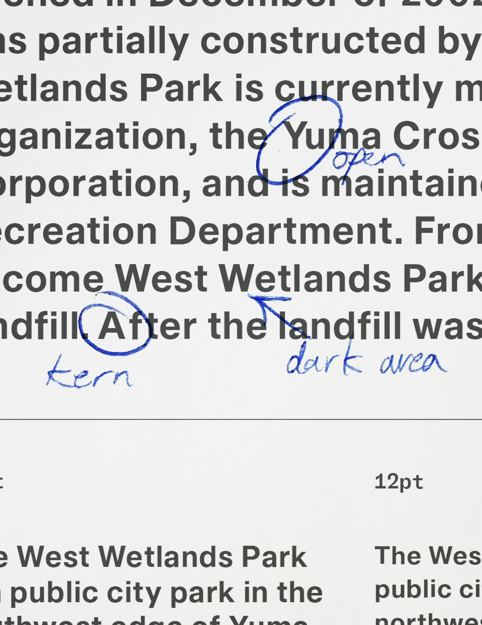
Does the paragraph feel even? Or does it run tight in places and loose in others? Dark spots and gaps signal spacing imbalance.
Does the paragraph feel even? Or does it run tight in places and loose in others? Dark spots and gaps signal spacing imbalance.
Iteration and Confidence
Proofing is not a final checkbox; it is a cycle. One pass is never enough. After every round of fixes, update the proof. Re-test the same strings. Add new ones. Re-print and compare against the previous version. Look for what changed; and what didn’t. Each iteration should reduce noise, not introduce it. If new problems appear, the system is still unstable. A font is ready only when proof after proof reveals nothing new; no surprises, no inconsistencies, no technical cracks. Silence is the signal.
Top tip:
Read your test words quickly and from a distance. If your eye trips or slows down, trust that reaction; your spacing is telling on itself.
Read your test words quickly and from a distance. If your eye trips or slows down, trust that reaction; your spacing is telling on itself.