Font Architecture:
Seeing Type Differently
Why Designing Type Unlocks Creative Freedom
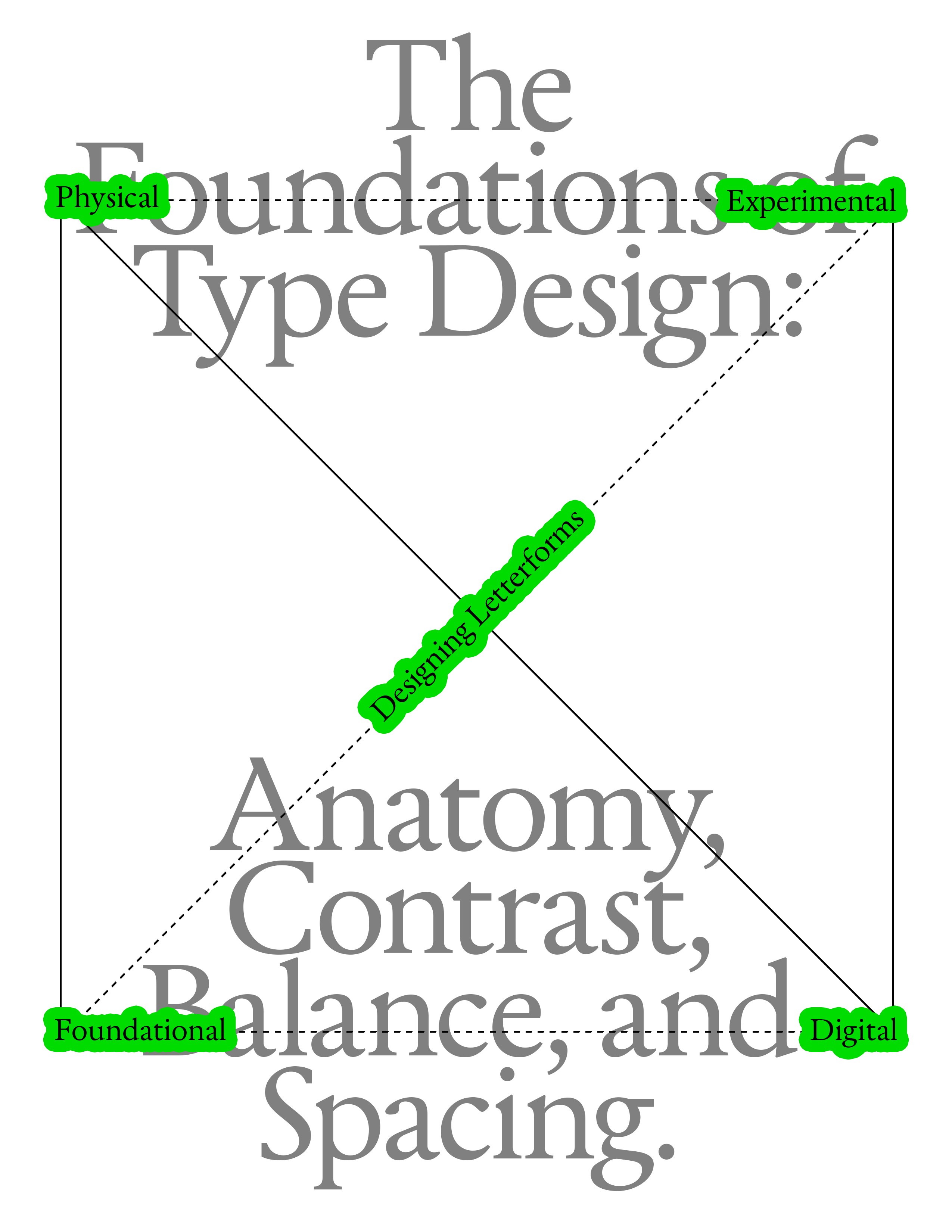
Designing your own typeface is one of the most powerful ways to understand visual design at its core. Every decision a curve, a stem, a counter, a spacing change becomes a lesson in rhythm, structure, balance, and expression. Learning type design sharpens your eye, strengthens your creative instincts, and gives you a tool that is entirely your own. Across this course, you’ll move from sketching basic shapes to building full alphabets, refining spacing, and digitizing your designs with professional tools. You’ll learn how typefaces are constructed, how shapes relate across a system, and how to make confident decisions about weight, contrast, proportion, and style.
What you need?
Minimal Tools. Maximum Exploration. This module is about seeing type differently, learning how letters are built, how shapes balance, how curves behave, and how rhythm emerges. Use these tools to explore, not to perfect. Your sketches are the foundation for every module that follows.
1. Pencil or Fineliner - A soft pencil (HB–2B) or a thin fineliner for clean, confident strokes. Sketch lightly, iterate freely.

2. Eraser - Use it if you need it, but try sketching without relying on corrections (for now). The looseness is part of the process.

3. A4 Paper / Workbook Sheets - Print the companion worksheets for each module to draw, test ideas, and explore type concepts directly on paper. Grids, baselines, caplines, and “draw here” prompts help you focus on structure, not decoration.

4. Ruler or Straightedge - Useful for consistent vertical stems, cap height guides, and spacing tests but not required for every page.

5. Reference Typefaces - Any printed typeface you admire. Study it, trace parts, and compare shapes. This helps train your eye for proportion and rhythm.

6. Optional: Markers or Brush Pens - Great for weight tests, stroke experiments, and exploring contrast.
Module Printouts
↓ Download Module 1 (PDF)
Print the companion worksheets for each module to draw, test ideas, and explore type concepts directly on paper. Perfection isn’t the objective. Exploration is.
1. What is Type Design
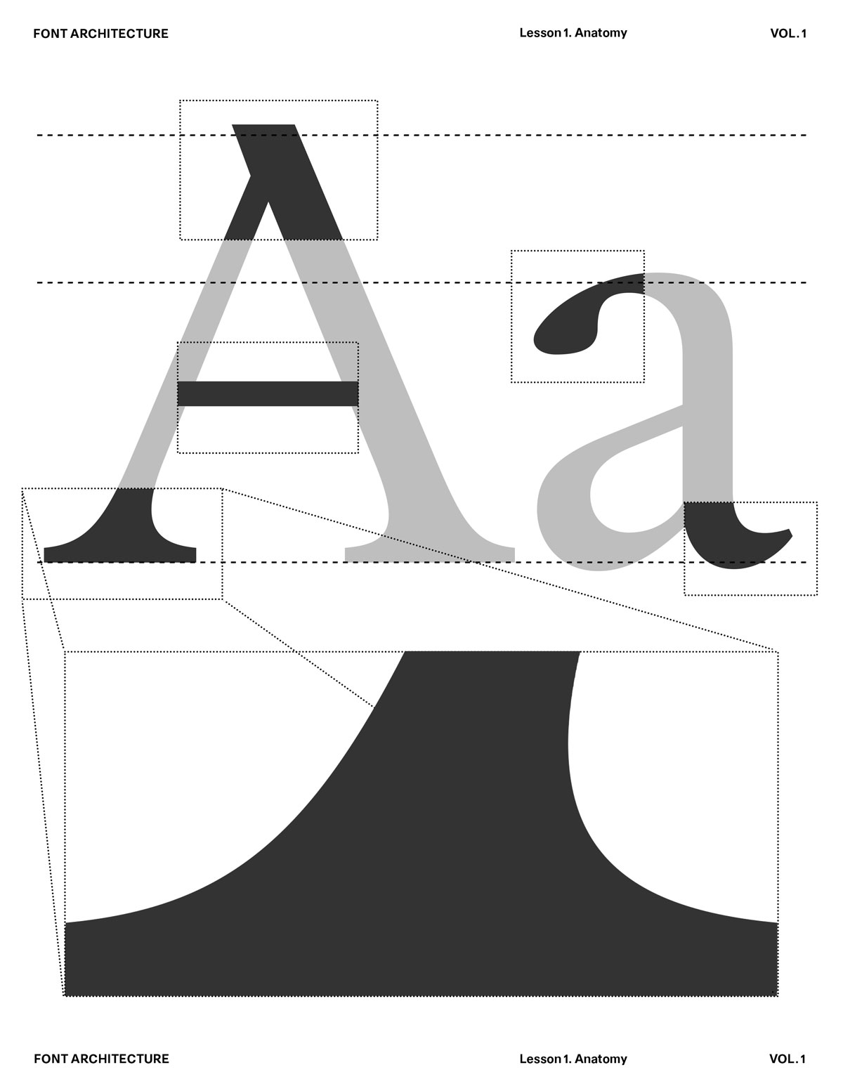
2. Anatomy of Letterforms
3. Contrast
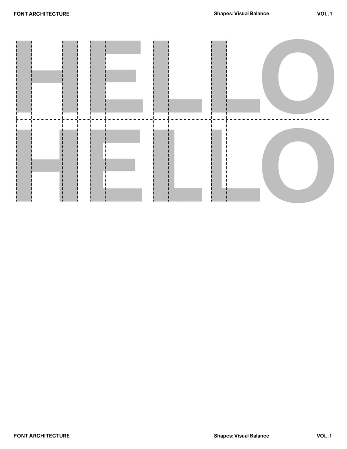
4. Balance
5. Spacing
Letters as Components, Not Pictures
Harmony and Contrast
Letters don’t exist in isolation. They live in words, sentences, and paragraphs. The moment you type a word, every shape begins to interact — spacing, rhythm, counterspace, optical weight — all become part of one continuous system.

Each letter contributes to a shared structure — a skeleton of proportions, angles, and rhythm. You’re not designing a beautiful “a” or a perfect “g” — you’re designing how “a” and “g” relate to “n,” “o,” “e,” “r” and every other glyph in the system. For example: If your n has a tall, narrow rhythm, your o can’t suddenly be wide and heavy — it breaks the system.If your verticals are thick and your diagonals are thin, that logic must stay consistent across the alphabet.You’re creating a visual grammar, not just a gallery of forms.
Harmony and Contrast Systems
Type design balances harmony (everything feels part of the same family) with contrast (enough variation to feel human and alive). The genius of good type lies in that equilibrium — every letter feels distinct, yet none feels out of place. So when you’re adjusting a curve or spacing a pair, you’re not fixing that one shape — you’re maintaining the conversation between shapes. The letter “n” teaches the rhythm. The letter “o” sets the curve logic. The letter “h” and “d” define proportion and contrast. Together, they become your system’s DNA.
Harmony and Contrast
Letters don’t exist in isolation. They live in words, sentences, and paragraphs. The moment you type a word, every shape begins to interact — spacing, rhythm, counterspace, optical weight — all become part of one continuous system.

Each letter contributes to a shared structure — a skeleton of proportions, angles, and rhythm. You’re not designing a beautiful “a” or a perfect “g” — you’re designing how “a” and “g” relate to “n,” “o,” “e,” “r” and every other glyph in the system. For example: If your n has a tall, narrow rhythm, your o can’t suddenly be wide and heavy — it breaks the system.If your verticals are thick and your diagonals are thin, that logic must stay consistent across the alphabet.You’re creating a visual grammar, not just a gallery of forms.
Harmony and Contrast Systems
Type design balances harmony (everything feels part of the same family) with contrast (enough variation to feel human and alive). The genius of good type lies in that equilibrium — every letter feels distinct, yet none feels out of place. So when you’re adjusting a curve or spacing a pair, you’re not fixing that one shape — you’re maintaining the conversation between shapes. The letter “n” teaches the rhythm. The letter “o” sets the curve logic. The letter “h” and “d” define proportion and contrast. Together, they become your system’s DNA.
Harmony and Contrast
Letters don’t exist in isolation. They live in words, sentences, and paragraphs. The moment you type a word, every shape begins to interact — spacing, rhythm, counterspace, optical weight — all become part of one continuous system.

Each letter contributes to a shared structure — a skeleton of proportions, angles, and rhythm. You’re not designing a beautiful “a” or a perfect “g” — you’re designing how “a” and “g” relate to “n,” “o,” “e,” “r” and every other glyph in the system. For example: If your n has a tall, narrow rhythm, your o can’t suddenly be wide and heavy — it breaks the system.If your verticals are thick and your diagonals are thin, that logic must stay consistent across the alphabet.You’re creating a visual grammar, not just a gallery of forms.
Where We’re Going
Build upon these sketches over the month.
Rework them, refine them, break them and rebuild them.

Module 1 is about learning to see type; Module 2 is about learning to shape it. Next month, we’ll dive deeper into the craft: Developing the Full Character Set. How to self-critique your letters with clarity. Understanding spacing, rhythm, and internal logic. Refining your shapes in preparation for digitization.

You’ll learn how each adjustment changes the entire voice of a typeface. Module 2 turns your early ideas into a working system. Keep your pencils moving. Your first typeface is already taking form.