Setting Up Your Workflow
This is where the work ramps up. Your sketches, rough or refined, move into digitization. Structure becomes solidified and decisions more precise. This stage is about translation. Each character is developed, then tested against the system in place. Explore the structural and expressive limits of the design, where it holds up, where it fails, and where it can be pushed without losing coherence. Rules and guidelines provide the foundation. They explain why forms work, not just how to draw them. Understanding these rules gives you control and replaces guesswork with intent. Within this structure there is a space for bending the rules. This is the space where new ideas emerge.
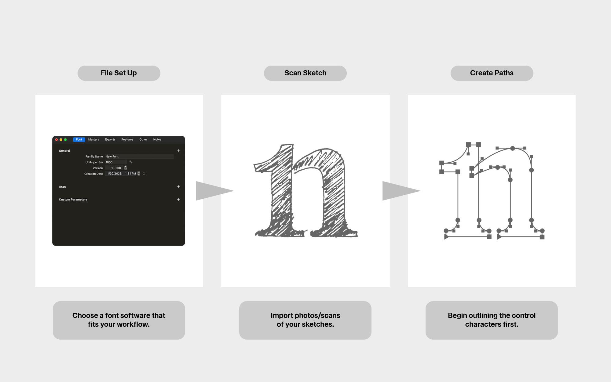
Every font editor will look slightly different, and every designer’s workflow is unique. Use these guidelines to orient yourself, then adapt as your process develops.