Digitizing
Until now, your work lived on paper. This lesson is where those ideas are tested. Digitizing is translating, not tracing. Building a system the computer can repeat, scale, and use. Your task is to define those rules without minimizing your forms. You will learn to move from sketch to vector; placing points deliberately, drawing stable curves, and building structure that holds across letters. Expect friction. The stiffness of the first pass reveals problems and forces clarity. You won’t finish a typeface here. You will build a foundation; a small set of letters that agree, respect the original idea, and are ready to grow.
Paste as Background:

Copy your image (scan or photo). Open the glyph you want to draw and paste the image directly into the Edit view. The image will appear as a background layer, not an outline.
Adjusting the image:

Use the Background panel to scale and move the image precisely. Lower opacity so outlines remain readable. Lock the background to avoid accidental movement.
Align First:
‍
Scale your image to the metrics first; then draw. Tracing before alignment bakes in errors.
Approximate Nodes First
When digitizing, start with simple outlines. Use straight lines to block in the shape before introducing curves. Place nodes only at the key structural points; corners, extrema, and major direction changes. Don’t aim for precision yet. The goal is to establish the skeleton of the letter. Once the structure is solid, you can refine curves, spacing, and details with confidence.
Build the skeleton first; align key nodes on shared axes before refining curves or details.
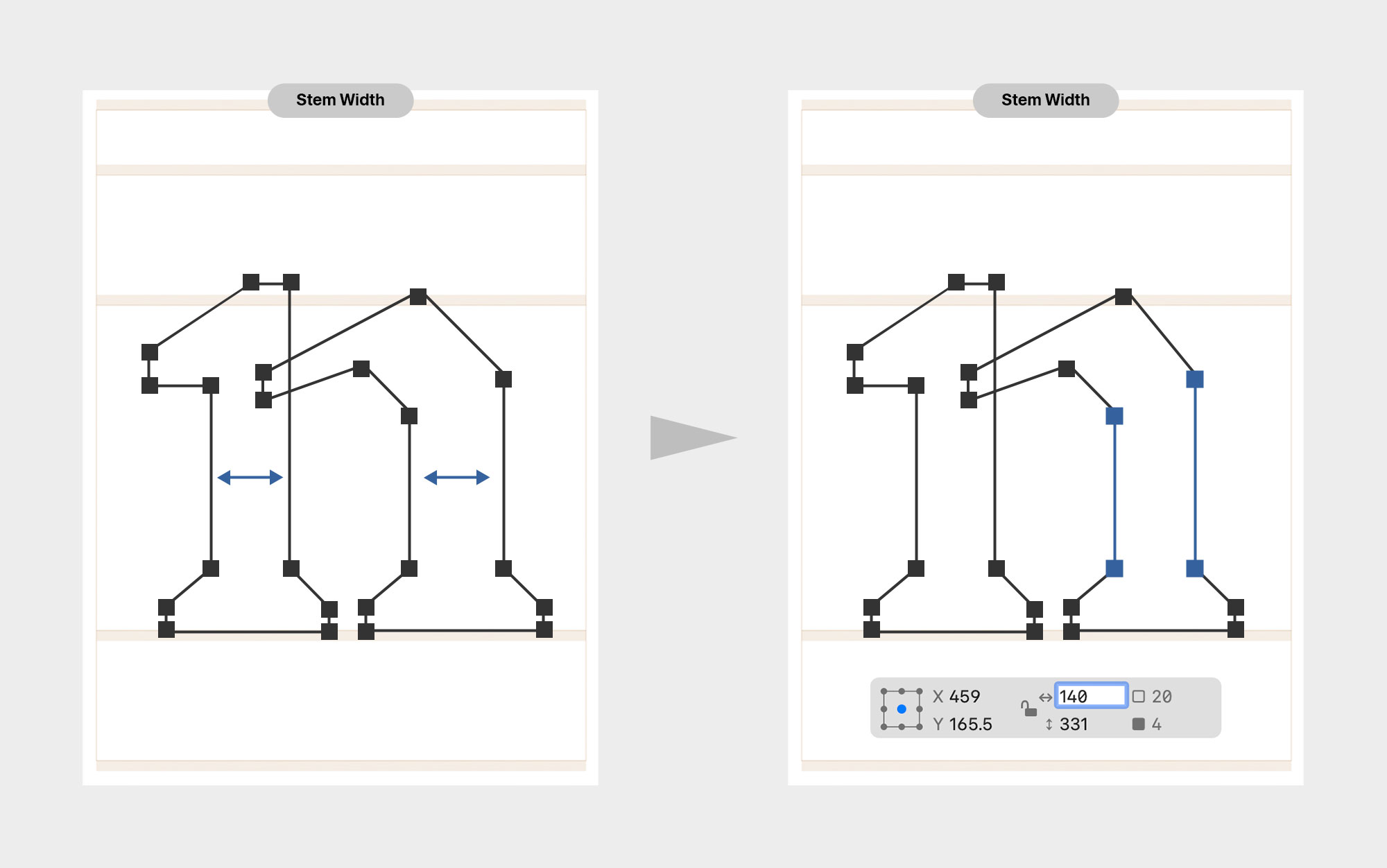
Equalize Stems
Make sure vertical and horizontal stems maintain consistent thickness where they are meant to match. Don’t rely on visual judgment alone. Use measurement tools, such as the Info panel, to check values before committing to a shape. Establishing consistent stem weights early prevents uneven forms and saves correction later.
Lock in consistent stem weights early; it solidifies the foundation of the entire typeface.
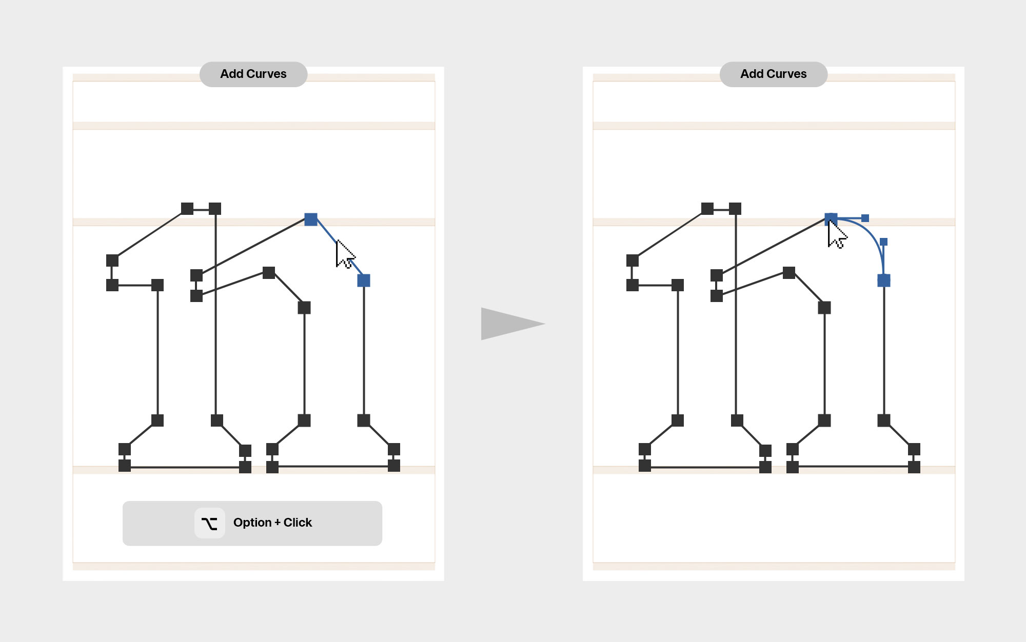
Adding Curves
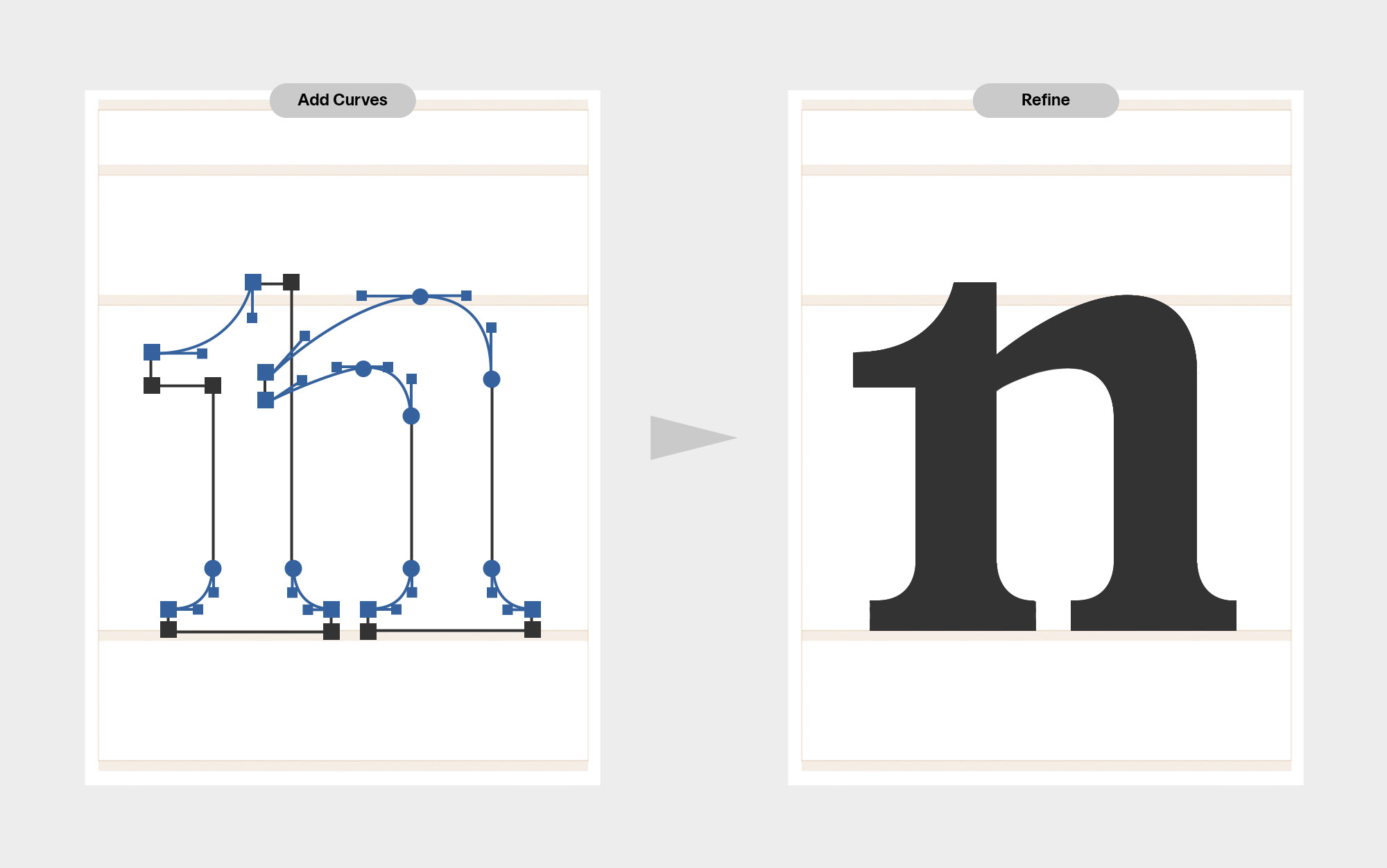
Once the straight outlines are in place, begin introducing curves. Add curve handles using Option/Alt-clicks, then shape the curves by adjusting the handles rather than the nodes. Keep handles horizontal or vertical whenever possible to maintain clean, controlled geometry. This approach produces smoother curves and makes later adjustments easier.
If a curve becomes unstable, reset the handles before adding more points; fewer, cleaner controls produce stronger outlines.
Adjust Curvature
Make small, controlled adjustments to nodes and handles. Most corrections are minor but cumulative. Use a Curve or Handle palette to set handle lengths deliberately. Inner curves usually require slightly more curvature than outer curves. Check for bumps where curved segments meet, especially at extrema. These are usually caused by poor node placement. Move nodes slightly while keeping handle directions stable.
Use tools or plugins (such as Harmonizer or SpeedPunk) to visualize curvature issues, then correct them manually.
The Magic Triangle
Every curve lives inside a triangle; if it doesn’t, the structure is already broken. A segment runs between two on-curve points, and curved segments always include two control points whose directional extensions define this invisible triangle. Handles must stay inside it; when they cross, curves fold into inflections, cusps, or self-intersections that break clarity and rasterization. When this happens, fix the node placement before adjusting handles. In type design, handles belong to the segment, curves never use a single handle, and any “missing” handle is usually hiding inside a node. Clean curves come from structure, not shortcuts.
If a curve looks wrong, move the nodes before touching the handles.
Inflections
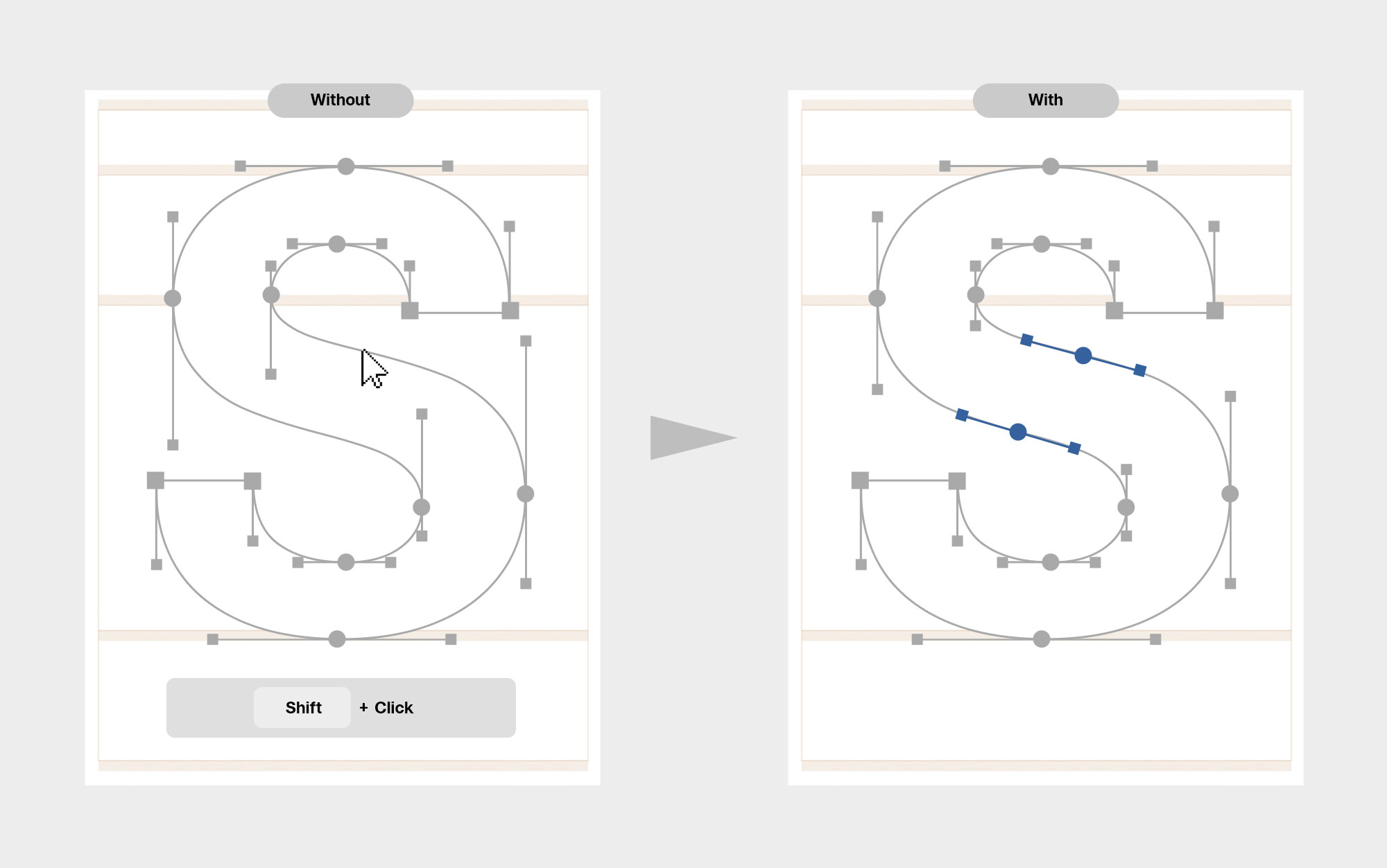
A curve should usually move in one direction. Inflections are the exception, not the default. For letters like s or a tilde, you are often better off avoiding inflections entirely, especially if the typeface will interpolate. If the curve flows cleanly with orthogonal handles, there is no technical reason to add an inflection. Fewer points mean fewer problems. Only introduce an inflection when the curve truly cannot work without it. Add it deliberately at the natural turning point, not by forcing the handles to bend. Even then, be cautious; inflections are a common source of kinks between masters and can break interpolation if handled carelessly. When in doubt, simplify. Stability comes from restraint, not complexity.
If an inflection is unavoidable, add it deliberately at the true turning point using Shift-click; never force the curve by bending the handles.
<
DIGITIZING
>
Continue Lesson Three