Module 3
Until now, your work lived on paper. This lesson is where those ideas are tested. Digitizing is translating, not tracing. Building a system the computer can repeat, scale, and use. Your task is to define those rules without minimizing your forms. You will learn to move from sketch to vector; placing points deliberately, drawing stable curves, and building structure that holds across letters. Expect friction. The stiffness of the first pass reveals problems and forces clarity. You won’t finish a typeface here. You will build a foundation; a small set of letters that agree, respect the original idea, and are ready to grow.
What You'll Need?
This module moves your work from paper into software. The goal is not to trace your drawings, but to translate them. Understanding how curves, points, and spacing behave in a digital environment. Precision matters here, but only in service of structure and consistency. Have patience for redrawing; digitization is not a one pass process. You will redraw curves, move points, and simplify outlines repeatedly. This is normal. This is the work.
1. Your refined sketches: Scans or clear photos of your drawings. These are guides, not blueprints. Expect the digital version to change as you respond to what the outlines reveal on screen.

2. Type design software: Glyphs, FontLab, or FontForge. Any professional font editor will work. What matters is learning how outlines, metrics, and spacing function inside a real type system.

3. A Mouse, Trackpad, or Tablet: A tablet can help with intuition; a mouse can help with precision. Use whatever allows you to draw confidently and make controlled adjustments.

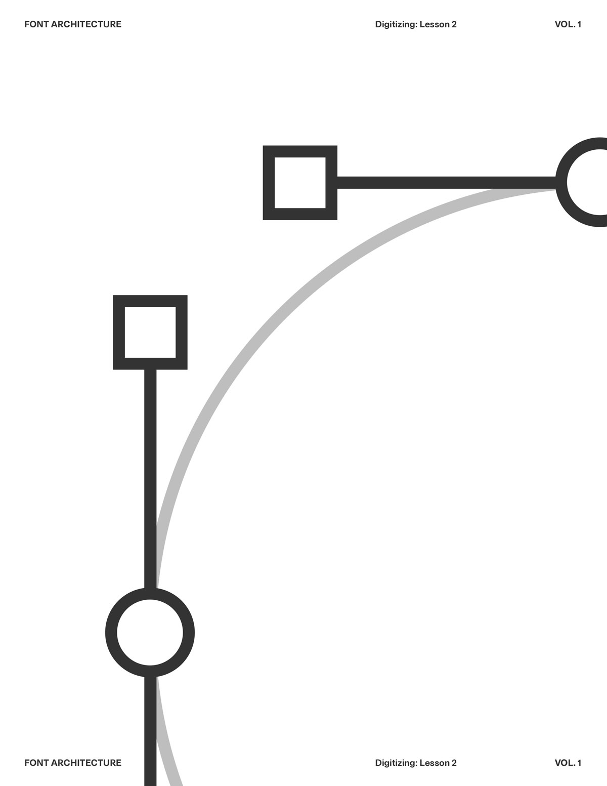
4. Basic Knowledge of the Pen Tool: You don’t need mastery yet, but you should understand points, handles, smooth vs. corner nodes, and how Bézier curves are built.

5. A Proofing System: Simple words, repeated strings, and short paragraphs to test your letters at different sizes as you draw. Don’t design in isolation.

6. Zoom Discipline: Work zoomed out more than you think. Extreme zoom hides spacing and weight problems. Let the font live at reading sizes.
1. What is Type Design
2. Anatomy of Letterforms
3. Contrast
4. Balance
5. Spacing
Letters as Components, Not Pictures
Harmony and Contrast
Letters don’t exist in isolation. They live in words, sentences, and paragraphs. The moment you type a word, every shape begins to interact — spacing, rhythm, counterspace, optical weight — all become part of one continuous system.

Each letter contributes to a shared structure — a skeleton of proportions, angles, and rhythm. You’re not designing a beautiful “a” or a perfect “g” — you’re designing how “a” and “g” relate to “n,” “o,” “e,” “r” and every other glyph in the system. For example: If your n has a tall, narrow rhythm, your o can’t suddenly be wide and heavy — it breaks the system.If your verticals are thick and your diagonals are thin, that logic must stay consistent across the alphabet.You’re creating a visual grammar, not just a gallery of forms.
Harmony and Contrast Systems
Type design balances harmony (everything feels part of the same family) with contrast (enough variation to feel human and alive). The genius of good type lies in that equilibrium — every letter feels distinct, yet none feels out of place. So when you’re adjusting a curve or spacing a pair, you’re not fixing that one shape — you’re maintaining the conversation between shapes. The letter “n” teaches the rhythm. The letter “o” sets the curve logic. The letter “h” and “d” define proportion and contrast. Together, they become your system’s DNA.
Harmony and Contrast
Letters don’t exist in isolation. They live in words, sentences, and paragraphs. The moment you type a word, every shape begins to interact — spacing, rhythm, counterspace, optical weight — all become part of one continuous system.

Each letter contributes to a shared structure — a skeleton of proportions, angles, and rhythm. You’re not designing a beautiful “a” or a perfect “g” — you’re designing how “a” and “g” relate to “n,” “o,” “e,” “r” and every other glyph in the system. For example: If your n has a tall, narrow rhythm, your o can’t suddenly be wide and heavy — it breaks the system.If your verticals are thick and your diagonals are thin, that logic must stay consistent across the alphabet.You’re creating a visual grammar, not just a gallery of forms.
Harmony and Contrast Systems
Type design balances harmony (everything feels part of the same family) with contrast (enough variation to feel human and alive). The genius of good type lies in that equilibrium — every letter feels distinct, yet none feels out of place. So when you’re adjusting a curve or spacing a pair, you’re not fixing that one shape — you’re maintaining the conversation between shapes. The letter “n” teaches the rhythm. The letter “o” sets the curve logic. The letter “h” and “d” define proportion and contrast. Together, they become your system’s DNA.
Harmony and Contrast
Letters don’t exist in isolation. They live in words, sentences, and paragraphs. The moment you type a word, every shape begins to interact — spacing, rhythm, counterspace, optical weight — all become part of one continuous system.

Each letter contributes to a shared structure — a skeleton of proportions, angles, and rhythm. You’re not designing a beautiful “a” or a perfect “g” — you’re designing how “a” and “g” relate to “n,” “o,” “e,” “r” and every other glyph in the system. For example: If your n has a tall, narrow rhythm, your o can’t suddenly be wide and heavy — it breaks the system.If your verticals are thick and your diagonals are thin, that logic must stay consistent across the alphabet.You’re creating a visual grammar, not just a gallery of forms.
Where We’re Going
From a working font to a finished typeface. Module 4 is the discipline phase. You already have the concept; now we'll make it consistent across the full character set. You'll make it behave in real layouts, hold up at small and large sizes, and export cleanly. You’ll complete the alphabet and supporting characters. Expanding on spacing, set kerning and publish your final font.

Slow down. Proof everything. Make changes that improve the whole system, not just one letter.