Refine Before Expanding
Do not rush to the full alphabet. Early speed creates late problems. Work with a small control set and compare letters side by side constantly. The goal is not to finish letters, but to establish relationships. Individual glyphs can misinform; pairs and groups reveal the system. Print proofs early and often. Paper exposes weight, spacing, and rhythm issues that screens soften or hide. If it doesn’t hold up in print, it isn’t resolved. Adjust curves, weight, and proportions globally before adding new glyphs. Fix the system once instead of correcting the same problem twenty times later. If core letters like n and o don’t feel related, pause and loop back. They define the voice of the typeface. Any expansion built on an unstable core will multiply inconsistencies, not progress.
Lock the system with a small control set before expanding.
Superfluous Points
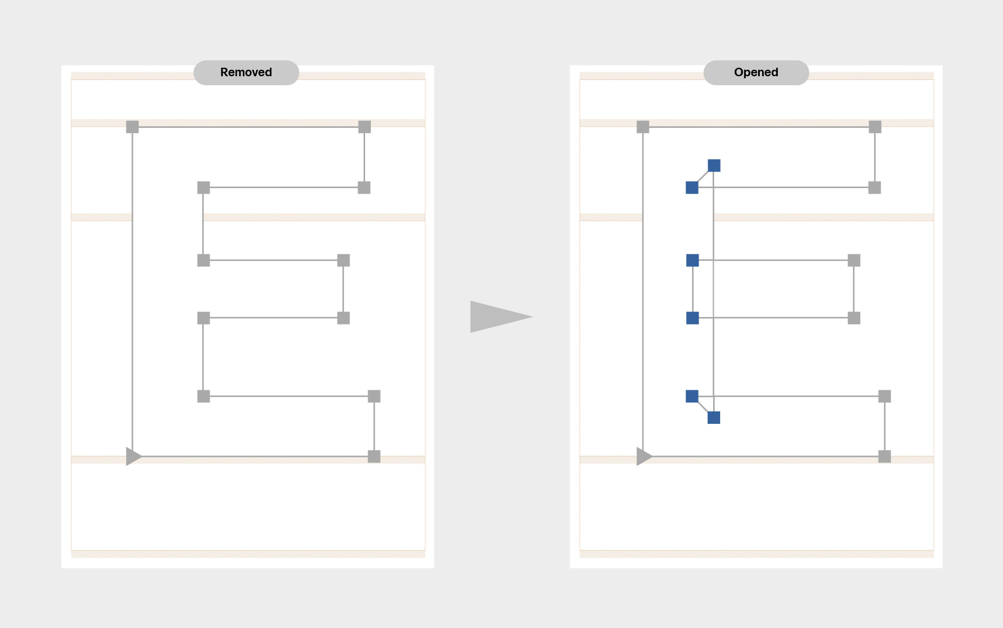
Superfluous points are small problems that accumulate. Extra nodes, unnecessary handles, and wrong node types add complexity without improving the shape, and they can slow rendering. Use Tidy Up Paths to remove anything the outline does not actually need; straight segments should stay straight, curve points should be curves, and duplicate points should not exist at all. Cleaner paths are easier to read, easier to interpolate, and easier to trust.
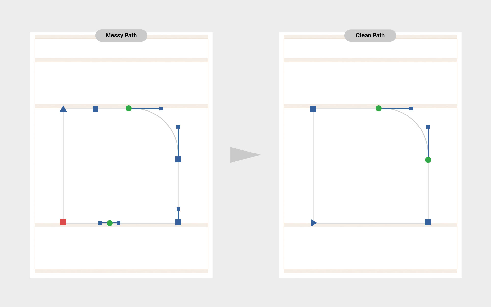
(Cmd-Opt-Shift-T) removes unnecessary nodes and handles, corrects wrong node types, and fixes zero-length segments; all without changing the visible shape.
Path Direction
Path direction is not optional. Outer contours must run counter-clockwise; counters clockwise. Get this wrong and counters break, hinting fails, and interpolation becomes unstable. Rather than fixing paths by hand, use Correct Path Direction to reset orientation, path order, and start points in one move. In multiple-master files, apply it across all masters to quickly restore compatibility. Clean direction equals predictable behaviour.
When interpolation breaks, run Correct Path Direction before fixing anything else.
Self-intersection
Exported fonts cannot contain self-intersecting paths. During design, however, overlaps are often useful; they simplify editing and improve interpolation. Keep them if needed, but remove overlaps on export. Variable Fonts are the exception. Overlaps become a problem when they stack. Double overlaps can leave behind tiny gaps or fragments, especially where curves meet straight segments. These errors are easy to miss and hard to diagnose by eye. Use scripts to preview outlines after overlap removal and catch debris early. Clean exports come from intentional overlaps, not accidental ones.
If outlines look correct but export breaks, check for self-intersections and stacked overlaps before anything else.
Expand Systematically
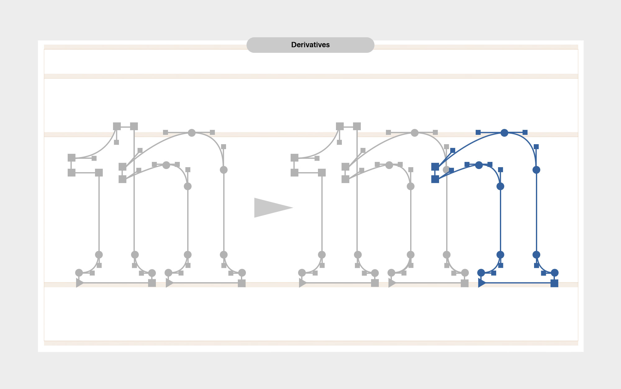
Build c and e from o, as we did in the last module, preserving curve tension and weight relationships. Introduce diagonals only after verticals and curves are resolved. Diagonals expose weaknesses immediately and should follow established rules, not create new ones. Every glyph should feel like a variation of the same decision set. If a letter looks “designed” instead of derived, the system is drifting.
Derive before you invent; every new letter should reuse existing rules, not introduce new ones.
Negative Space
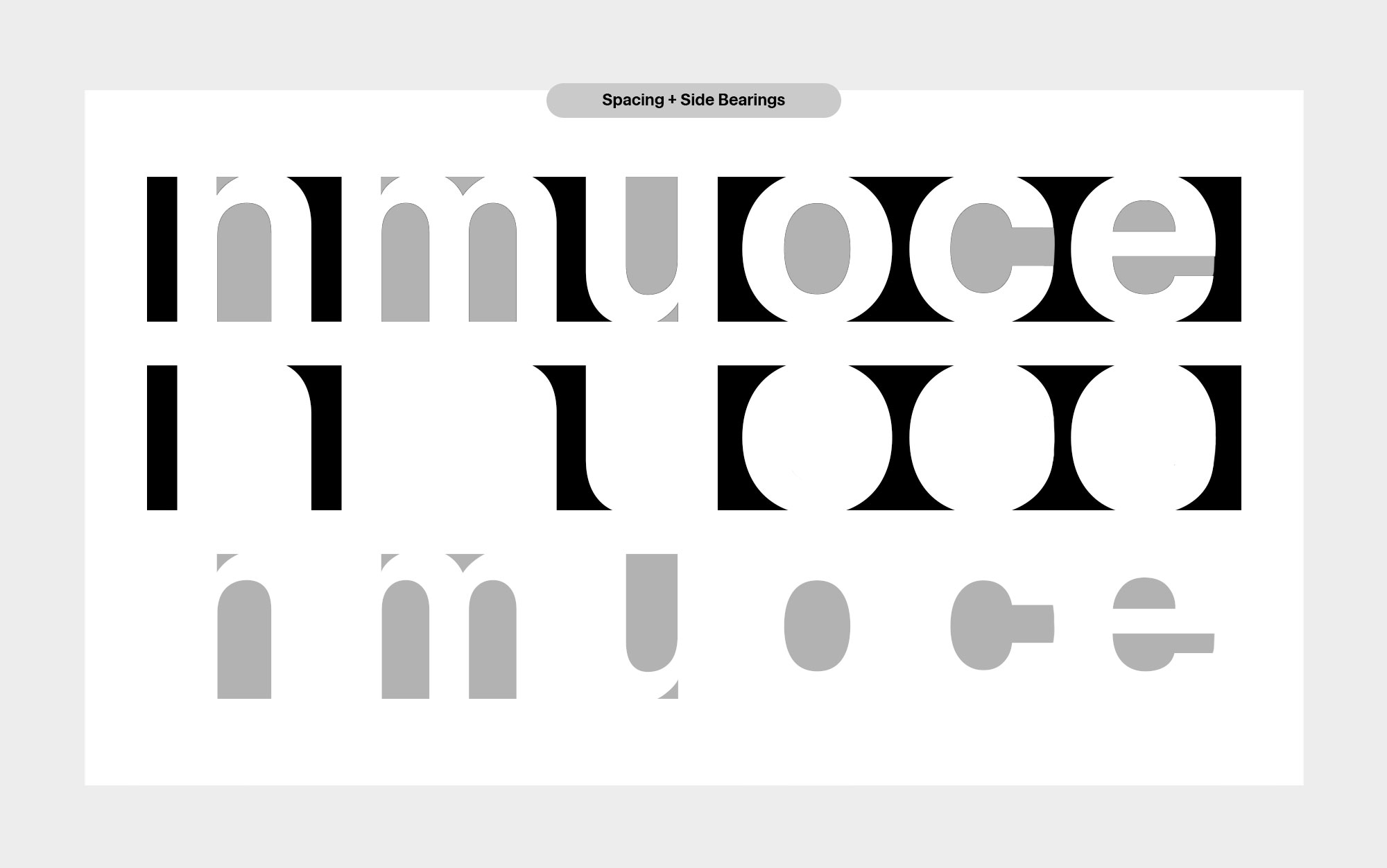
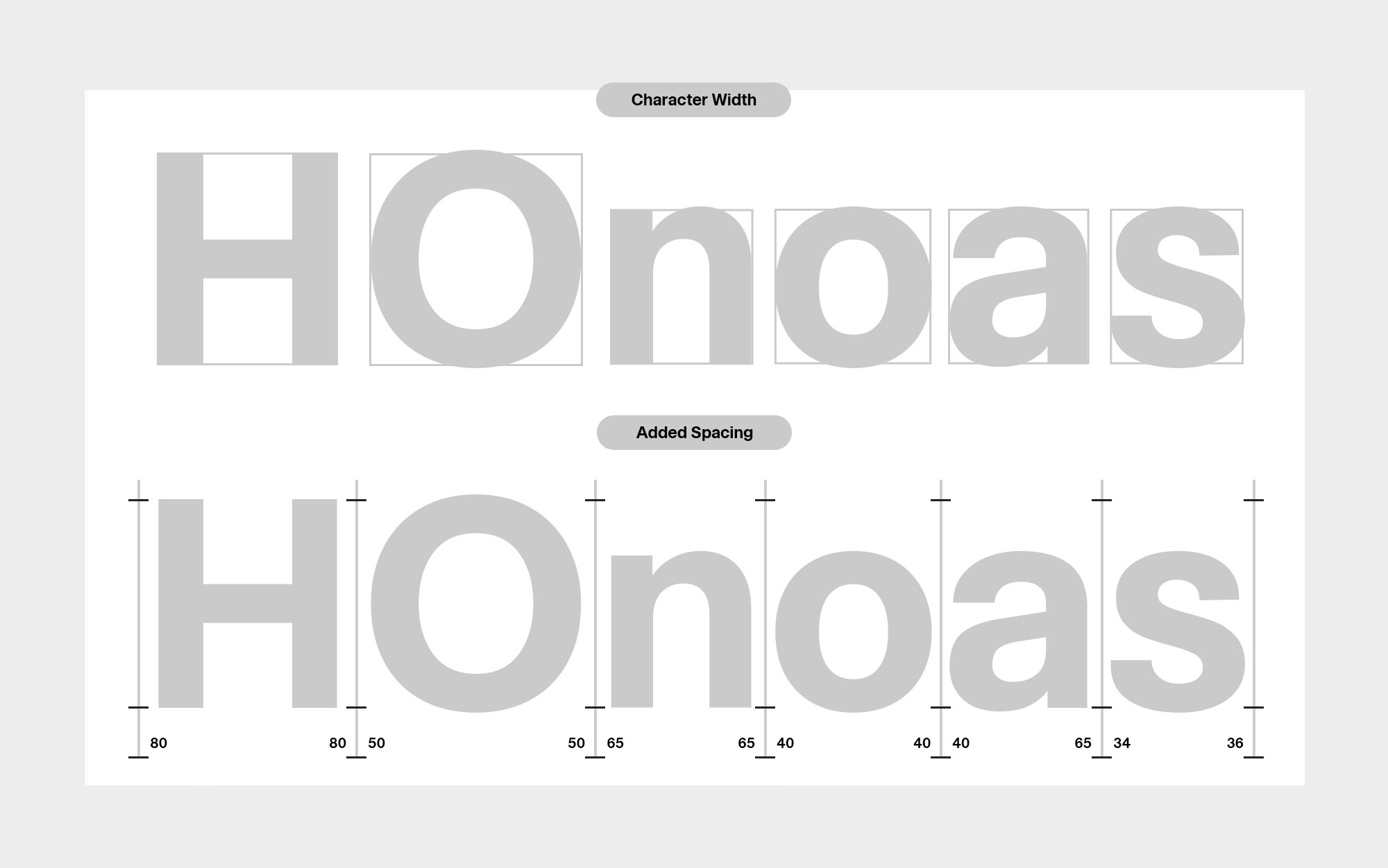
Spacing is not universal; it is tied to size, weight, and use. A text face and a display face cannot be spaced the same way. Strong letterforms mean little if the negative space is wrong; readability lives in the gaps. Use the counter as a starting reference for sidebearings, then adjust with intent. Heavier and condensed designs need more space at small sizes to avoid closing up; lighter designs need less, or the text will fall apart. One typeface may require multiple spacing systems to stay readable across contexts.

Set side-bearings as you build each glyph. Spacing decisions affect how shapes read and must evolve alongside the outlines. Test early with simple strings: nnn, non, hand, minimum. These reveal rhythm immediately. Adjust spacing before making weight corrections. Fixing weight on poorly spaced letters leads to false solutions.
Set spacing so paragraphs read as an even gray texture at a distance, not so single letters look balanced up close.
Spacing and Side Bearings
A sidebearing is the space on either side of a letter; every glyph has a left and a right. This space is guided by the counter, but it is shaped by the form itself. Rounded and diagonal letters usually need tighter spacing, while single-stem letters need more room to breathe. Sidebearings are not symmetrical by default; a letter may need different space on each side to sit comfortably next to its neighbors. Uppercase and lowercase letters follow different spacing logic. Spacing is not about balance in isolation; it is about how letters behave in sequence.
Space letters in words, not alone; context reveals what isolation hides.
Expect It to Look Clunky (At First)
The first digital pass always feels stiff. That’s normal. Digitization introduces precision, repeatability, and constraints. These qualities are necessary, but they can also flatten expression. Your job is to reintroduce life through optical decisions; adjusting curves, weight, and spacing so the letters feel intentional rather than mechanical.
Ask yourself:

Does this letter feel constructed, or simply traced?
Are curves responding optically, or just mathematically?
If I repeat this decision across the alphabet, does it strengthen the system?

The goal is to amplify your sketch, translating it into a system that holds up in use.
<
REFINEMENT
>
Where We’re Going
From a working font to a finished typeface. Module 4 is the discipline phase. You already have the concept; now we'll make it consistent across the full character set. You'll make it behave in real layouts, hold up at small and large sizes, and export cleanly. You’ll complete the alphabet and supporting characters. Expanding on spacing, set kerning and publish your final font.

Slow down. Proof everything. Make changes that improve the whole system, not just one letter.