Constructing the Invisible Framework
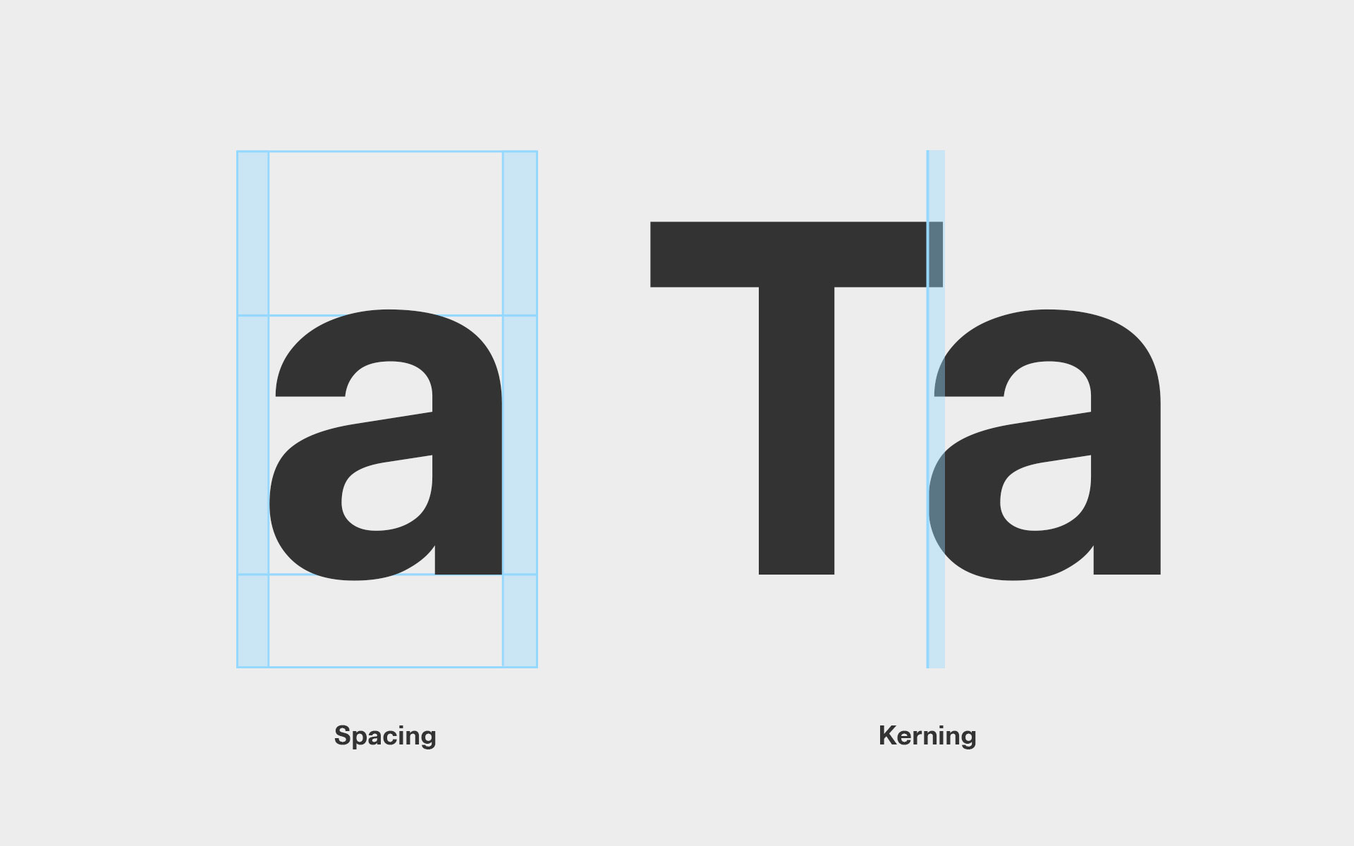
As letters are refined, spacing must be refined alongside them; the two are inseparable. We touched on this briefly in the previous module; now it’s time to develop those ideas fully. Spacing is not decoration. It is the invisible framework that determines whether a typeface reads as calm, tense, clumsy, or confident. Every spacing decision teaches the font how to behave in sequence.
Align First:
Scale your image to the metrics first; then draw. Tracing before alignment bakes in errors.
Scale your image to the metrics first; then draw. Tracing before alignment bakes in errors.
Sidebearings Are Structural Decisions
Sidebearings are not padding added after the fact; they are the letter continuing into space. Every character opens toward its neighbors in a specific way, and the sidebearings must respect that behavior. Flat edges can sit closer together because they end cleanly. Curved edges need more room so forms do not feel cramped or swollen. Open diagonals demand the most space; they push outward and visually require air.
When sidebearings ignore the actual shape of the letter, kerning becomes a cover-up. Get the sidebearings right, and most spacing problems resolve themselves long before you ever touch a kern pair.
When sidebearings ignore the actual shape of the letter, kerning becomes a cover-up. Get the sidebearings right, and most spacing problems resolve themselves long before you ever touch a kern pair.

Top tip:
Space letters in words, not in isolation. If a sidebearing only works when the letter is alone, it is probably wrong.
Space letters in words, not in isolation. If a sidebearing only works when the letter is alone, it is probably wrong.
Build Spacing from a Single Logic
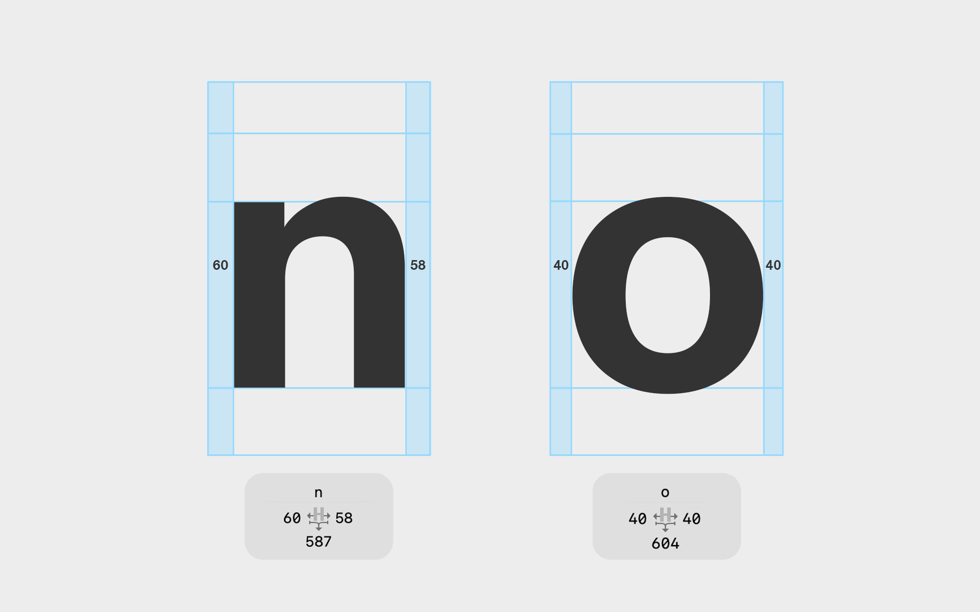
Spacing only works when it is guided by a single, consistent idea of distance. Early on, choose a reference relationship; something stable like H–H or O–O; and treat it as your anchor. That pair establishes how space should feel across the entire typeface. From there, every other letter is judged against the same logic, never adjusted in isolation.
Capitals behave as discrete units, not as a continuous texture like lowercase. They should be spaced to align optically as solid blocks, each carrying its own weight. Lowercase spacing logic does not transfer here. Capitals can tolerate more air, but they cannot tolerate inconsistency. A tight H beside a loose O immediately fractures the authority and confidence capitals are meant to project. When capital spacing fails, it fails loudly.
Capitals behave as discrete units, not as a continuous texture like lowercase. They should be spaced to align optically as solid blocks, each carrying its own weight. Lowercase spacing logic does not transfer here. Capitals can tolerate more air, but they cannot tolerate inconsistency. A tight H beside a loose O immediately fractures the authority and confidence capitals are meant to project. When capital spacing fails, it fails loudly.


Top tip:
If you find yourself constantly “fixing” new pairs, stop and re-check your reference pair; most spacing problems trace back to a drifting baseline, not a single bad letter.
If you find yourself constantly “fixing” new pairs, stop and re-check your reference pair; most spacing problems trace back to a drifting baseline, not a single bad letter.
Lowercase Rhythm Is Continuous
Lowercase letters form a continuous texture on the page, and any spacing error here multiplies quickly. This is where rhythm either holds or collapses. Begin by watching the shoulder-to-shoulder flow in letters like n, h, m, and r; they establish the baseline beat of the text. Then test bowls against stems; o next to n, p, or b; to ensure curves neither collapse inward nor drift away.
Even when individual letters appear fine in isolation, uneven lowercase spacing makes reading feel restless and tiring. When rhythm breaks here, no amount of later correction will fully repair it.
Even when individual letters appear fine in isolation, uneven lowercase spacing makes reading feel restless and tiring. When rhythm breaks here, no amount of later correction will fully repair it.
Top tip:
Set long runs of real text and read them quickly. If your eye keeps snagging or slowing down, the rhythm is off, even if you can’t yet point to a single “wrong” letter.
Set long runs of real text and read them quickly. If your eye keeps snagging or slowing down, the rhythm is off, even if you can’t yet point to a single “wrong” letter.
Kerning as a System, Not a Fix
Kerning is not decoration. It is not polish. It is structural correction. By the time you reach this stage, your letters already exist as a system; they carry weight, contrast, rhythm, and a spacing logic that should mostly hold on its own. Kerning begins where spacing ends; where global rules break down and local exceptions expose the truth of your design. This lesson trains your eye to see relationships, not isolated pairs. You’ll learn to kern by category, diagnose spacing failures, and recognize when kerning is doing real work versus quietly hiding a deeper structural problem. Kerning is the point where a typeface stops behaving like a collection of shapes and starts behaving like language.
Kerning is not about making pairs look good. It is about preserving rhythm when spacing alone cannot. If spacing defines normal behavior, kerning defines exceptions. Used well, it stays quiet and reinforces the system. Used poorly, it destabilizes everything around it. This lesson treats kerning as structural refinement; never decoration, never rescue.
Kerning is not about making pairs look good. It is about preserving rhythm when spacing alone cannot. If spacing defines normal behavior, kerning defines exceptions. Used well, it stays quiet and reinforces the system. Used poorly, it destabilizes everything around it. This lesson treats kerning as structural refinement; never decoration, never rescue.

Align First:
Scale your image to the metrics first; then draw. Tracing before alignment bakes in errors.
Scale your image to the metrics first; then draw. Tracing before alignment bakes in errors.
What Kerning Actually Does
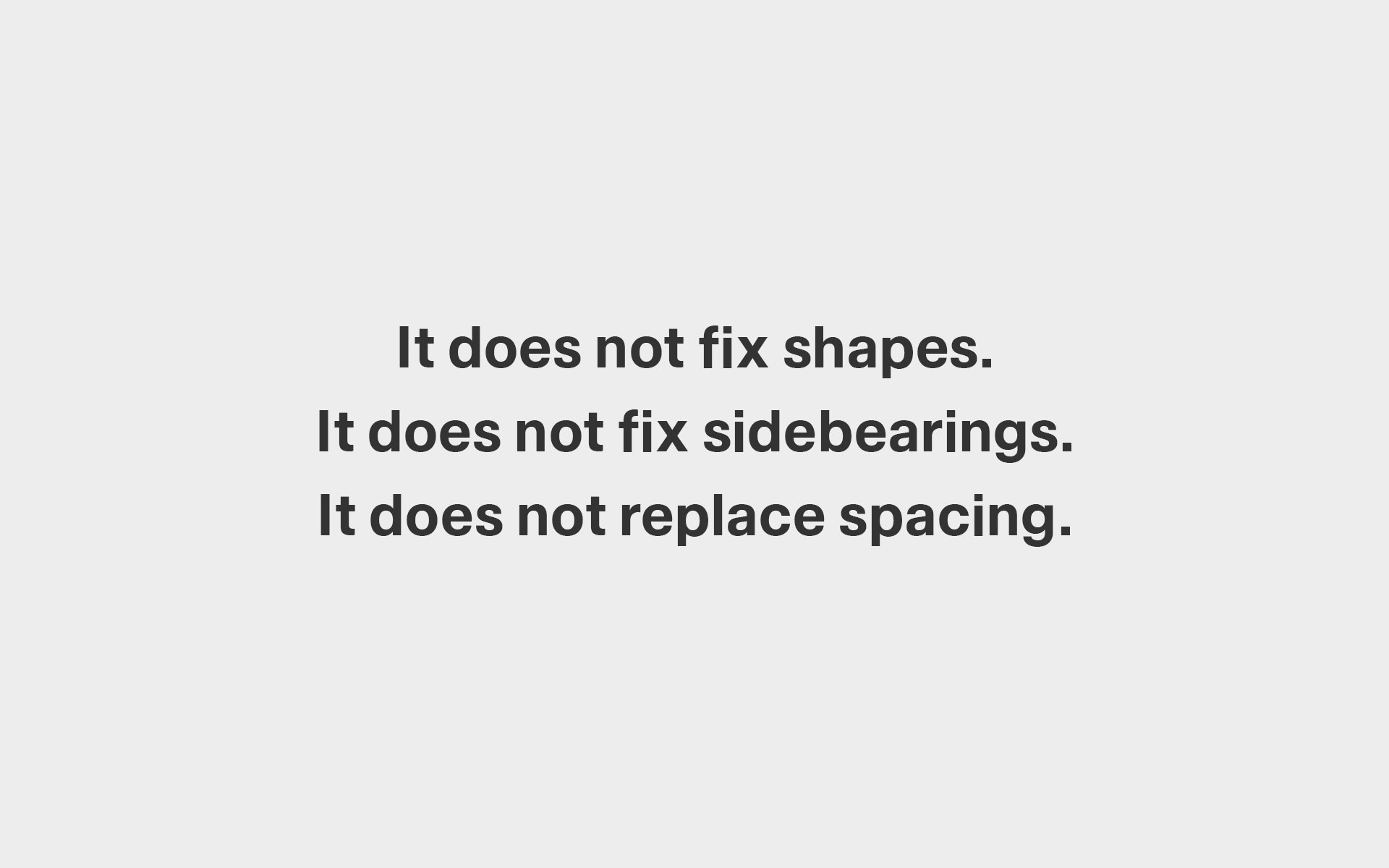
Kerning comes last. It exists to fine-tune relationships once the system is already stable. Bad shapes cannot be kerned into submission, and weak sidebearings will surface no matter how many pairs you add. Treat kerning as a finishing move, not a foundation; a quiet correction applied only when the underlying structure is sound. If you want, next we can sharpen this into a rule card, callout box, or a student checklist that sits alongside the lesson.
Top tip:
If a pair looks wrong everywhere, spacing is the problem.
If it looks wrong only in certain combinations, kerning is appropriate.
If a pair looks wrong everywhere, spacing is the problem.
If it looks wrong only in certain combinations, kerning is appropriate.
Think in Classes, Not Pairs
Kerning letter by letter creates fragile systems. It treats symptoms instead of structure. The result is bloated spacing, contradictory values, and a font that only works under supervision. Pair-by-pair fixes feel productive, but they quietly dismantle consistency.
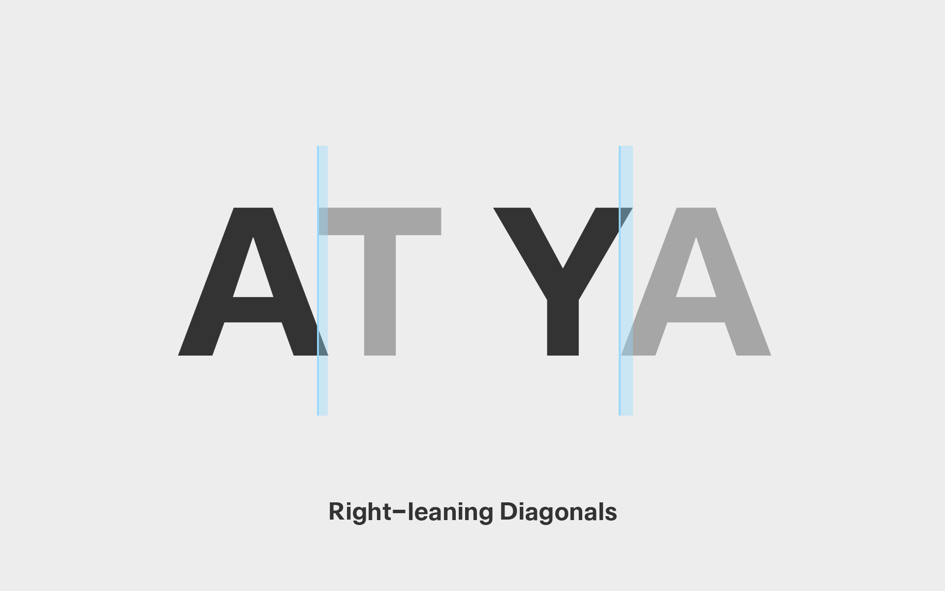
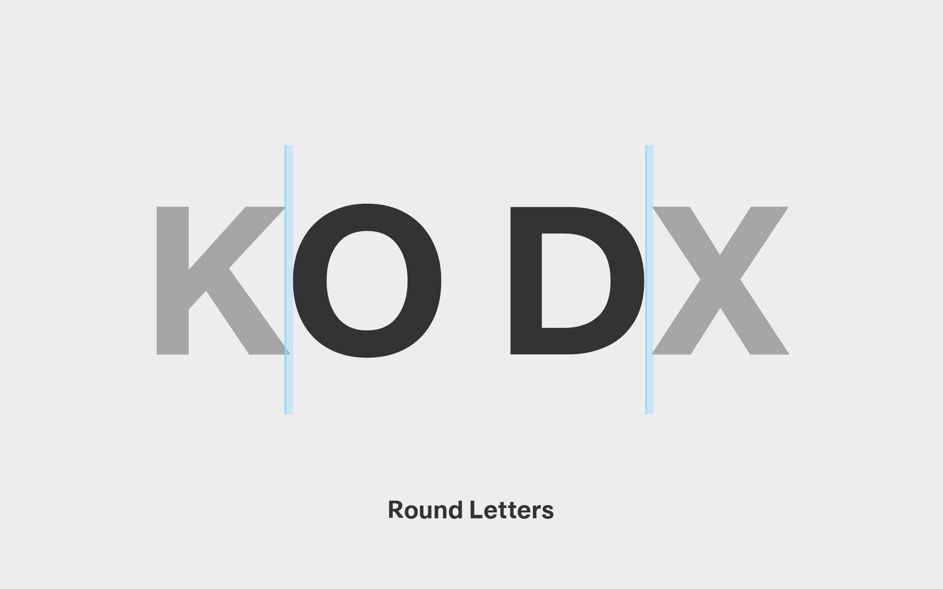
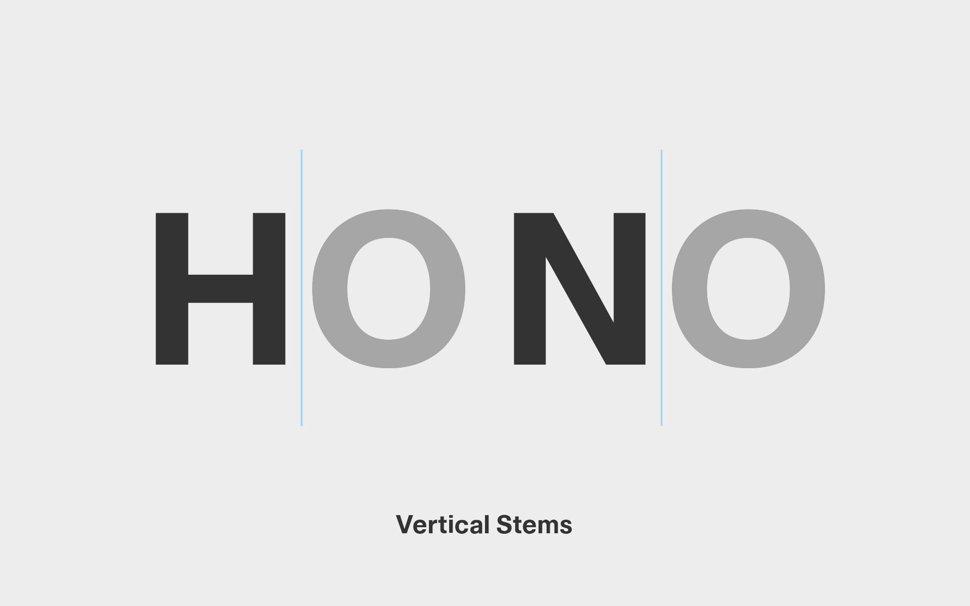
Work by structural classes instead. Group letters by how they behave, not by what they are called; left-leaning diagonals (V, W, Y), right-leaning diagonals (A, V, W), rounds (O, C, G), vertical stems (H, I, N). Classes preserve logic. If two forms behave the same, they should kern the same. When they do not, the system fractures.
Kern by shape, not by letter name. You are not adjusting “A and V.” You are correcting how two forms collide, open, or pull apart in space. Once you see that distinction, kerning stops being a list of pairs and becomes a coherent system.
Work by structural classes instead. Group letters by how they behave, not by what they are called; left-leaning diagonals (V, W, Y), right-leaning diagonals (A, V, W), rounds (O, C, G), vertical stems (H, I, N). Classes preserve logic. If two forms behave the same, they should kern the same. When they do not, the system fractures.
Kern by shape, not by letter name. You are not adjusting “A and V.” You are correcting how two forms collide, open, or pull apart in space. Once you see that distinction, kerning stops being a list of pairs and becomes a coherent system.

Top tip:
If a kern pair feels necessary for one letter but wrong for its close relatives, stop. The problem isn’t the pair; it’s the class definition or the spacing underneath it.
If a kern pair feels necessary for one letter but wrong for its close relatives, stop. The problem isn’t the pair; it’s the class definition or the spacing underneath it.
Start with Problem Pairs
Do not kern alphabetically. That method hides real problems and wastes time. It encourages cosmetic fixes instead of structural decisions. Start with high-impact collisions instead; diagonal against vertical, diagonal against round, and round against round; along with classic uppercase stress pairs like AV, VA, To, and Ta. These combinations expose weaknesses immediately.
These pairs place the most pressure on the spacing system. If they hold, everything else becomes easier. If they fail, no amount of tidy alphabetical kerning will rescue the font. Early decisions here define the tone, authority, and tolerance of the entire system. Get these right, and the rest follows.
These pairs place the most pressure on the spacing system. If they hold, everything else becomes easier. If they fail, no amount of tidy alphabetical kerning will rescue the font. Early decisions here define the tone, authority, and tolerance of the entire system. Get these right, and the rest follows.
AV AW VA YA
Diagonal + Diagonal
Two angled forms create a triangular void that feels too wide.
Two angled forms create a triangular void that feels too wide.
To Vo Yo
Diagonal + Round
The diagonal opens space that the round cannot visually fill.
The diagonal opens space that the round cannot visually fill.
f j r y
Overhang Letters
Overhangs intrude into neighboring territory and disrupt rhythm.
Overhangs intrude into neighboring territory and disrupt rhythm.
P. T. V, Y,
Punctuation
Punctuation exposes imbalance immediately.
Punctuation exposes imbalance immediately.
Top tip:
If your worst collisions still feel calm and intentional, the rest of the kerning will fall into place with minimal effort.
If your worst collisions still feel calm and intentional, the rest of the kerning will fall into place with minimal effort.
Kerning Adjustments
Top tip:
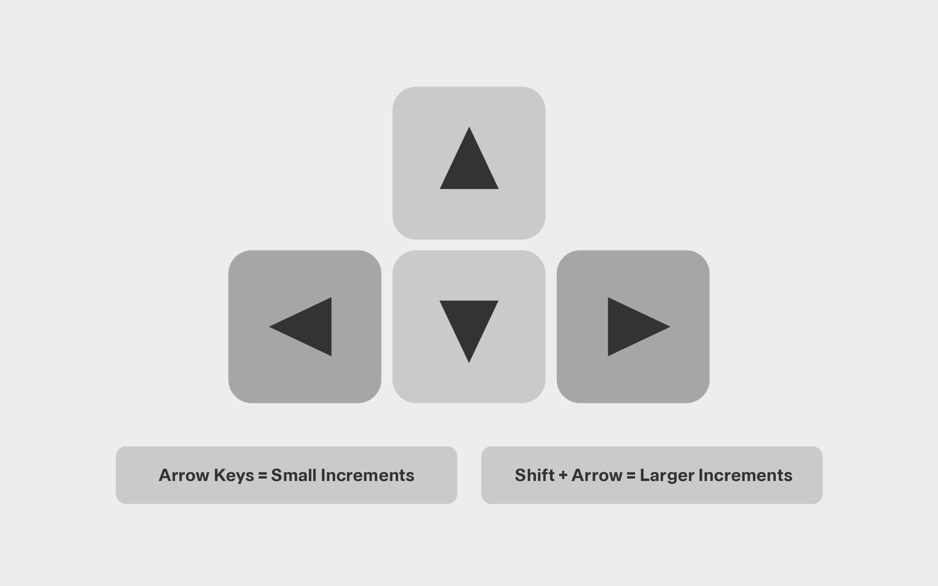
Keyboard Shortcuts. Kerning should be done with keys, not by dragging. Work in small steps. Large jumps usually mean something is wrong upstream.
Keyboard Shortcuts. Kerning should be done with keys, not by dragging. Work in small steps. Large jumps usually mean something is wrong upstream.
Always Test Kerning in Context
Words are where rhythm reveals itself. They show whether spacing supports reading or interrupts it. A good kern pair disappears inside a word; it should never announce its presence. This is why repeated strings matter; AVAV, ToTo, nnono. Repetition strips away meaning and leaves only structure. Patterns exaggerate spacing errors and make imbalance impossible to ignore. If the rhythm stutters, the kerning is wrong.
Always test uppercase and lowercase separately; they obey different rules. Capitals are built from discrete blocks, while lowercase forms a continuous, flowing texture. A solution that works for one rarely works for the other. If a pair only looks right in isolation, it isn’t solved. If it collapses inside a word, the spacing logic is flawed. Kerning is not about fixing moments; it is about maintaining rhythm across the entire system.
Always test uppercase and lowercase separately; they obey different rules. Capitals are built from discrete blocks, while lowercase forms a continuous, flowing texture. A solution that works for one rarely works for the other. If a pair only looks right in isolation, it isn’t solved. If it collapses inside a word, the spacing logic is flawed. Kerning is not about fixing moments; it is about maintaining rhythm across the entire system.
AVAVAV
AVOID
VECTOR
Top tip:
Read your test words quickly and from a distance. If your eye trips or slows down, trust that reaction; your spacing is telling on itself.
Read your test words quickly and from a distance. If your eye trips or slows down, trust that reaction; your spacing is telling on itself.
Use Restraint
Over-kerning does more damage than under-kerning. Aggressively tight values lock letters together and collapse the natural elasticity of the spacing system. They may solve a single collision, but they introduce tension everywhere else. Large or surprising kern values are warning signs, not victories. When letters need to be forced together to look right, the problem is rarely the pair. It lives deeper; in the shapes themselves or in the sidebearings that surround them. Kerning should relieve pressure, not apply it.

Top tip:
If a kern value makes you pause or feel “too clever,” undo it and revisit the spacing. Good kerning feels boring because the system is doing the work.
If a kern value makes you pause or feel “too clever,” undo it and revisit the spacing. Good kerning feels boring because the system is doing the work.
Proof Ruthlessly
Proof your spacing from every angle. Switch between light text on dark backgrounds and dark text on light. Test at very small sizes and at extreme scales. Print the work if you can. Each context applies different pressure to the spacing system and reveals problems that a single view will hide. Kerning issues surface through repetition and use, not careful staring. Spacing is rhythmic and perceptual. Read the text aloud if you need to; your ear often catches breaks in flow before your eye can name them.
Top tip:
If a spacing issue only appears in one viewing mode, don’t ignore it; that’s often where real-world use will expose the font first.
If a spacing issue only appears in one viewing mode, don’t ignore it; that’s often where real-world use will expose the font first.