BOULEVARD
Font Architecture:
Designing Letterforms
(i)
Welcome to the course. This program is not about producing a finished typeface as quickly as possible, but about learning how type is built, tested, and understood. We will move slowly, work deliberately, and prioritize observation over correction. Through drawing, digitization, and structured experimentation, you’ll develop an understanding of letterforms as a connected system rather than a collection of isolated shapes. The goal is not perfection, but clarity, learning how decisions accumulate, how structure creates voice, and how to recognize when a typeface is beginning to hold together as a whole.
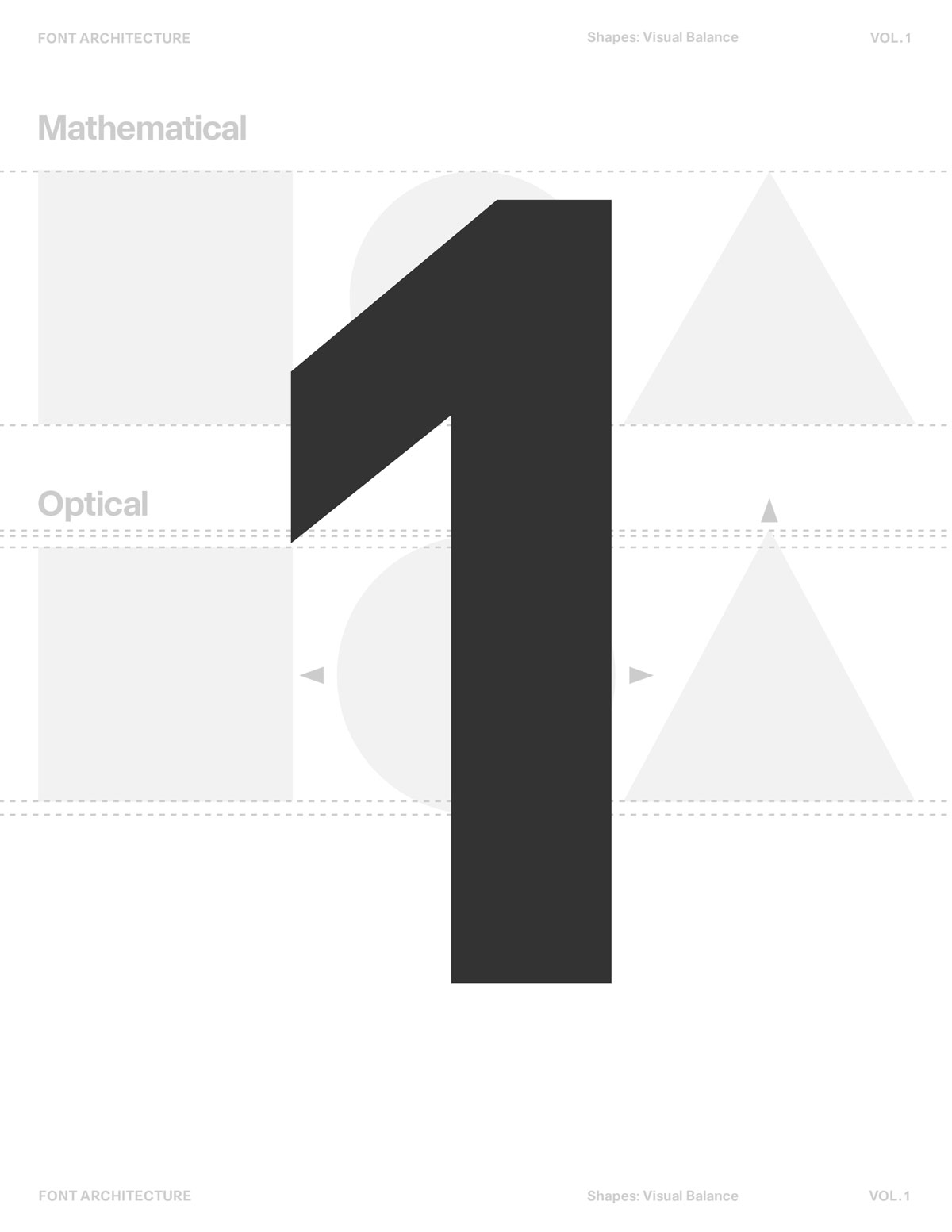
FOUNDATIONS 101 This lesson introduces the foundations of type design. Anatomy, contrast, balance, and spacing. Providing the core principles needed to understand how letterforms function individually and as a cohesive system.
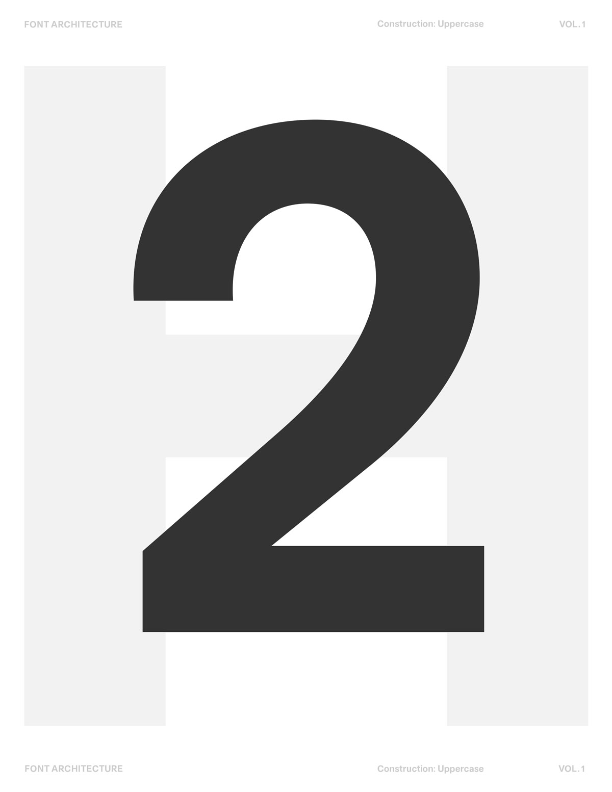
MODULE 2 This lesson covers drawing letterforms—how to sketch ideas by hand, refine them through iteration, and translate those decisions into digital form without losing their original intent.
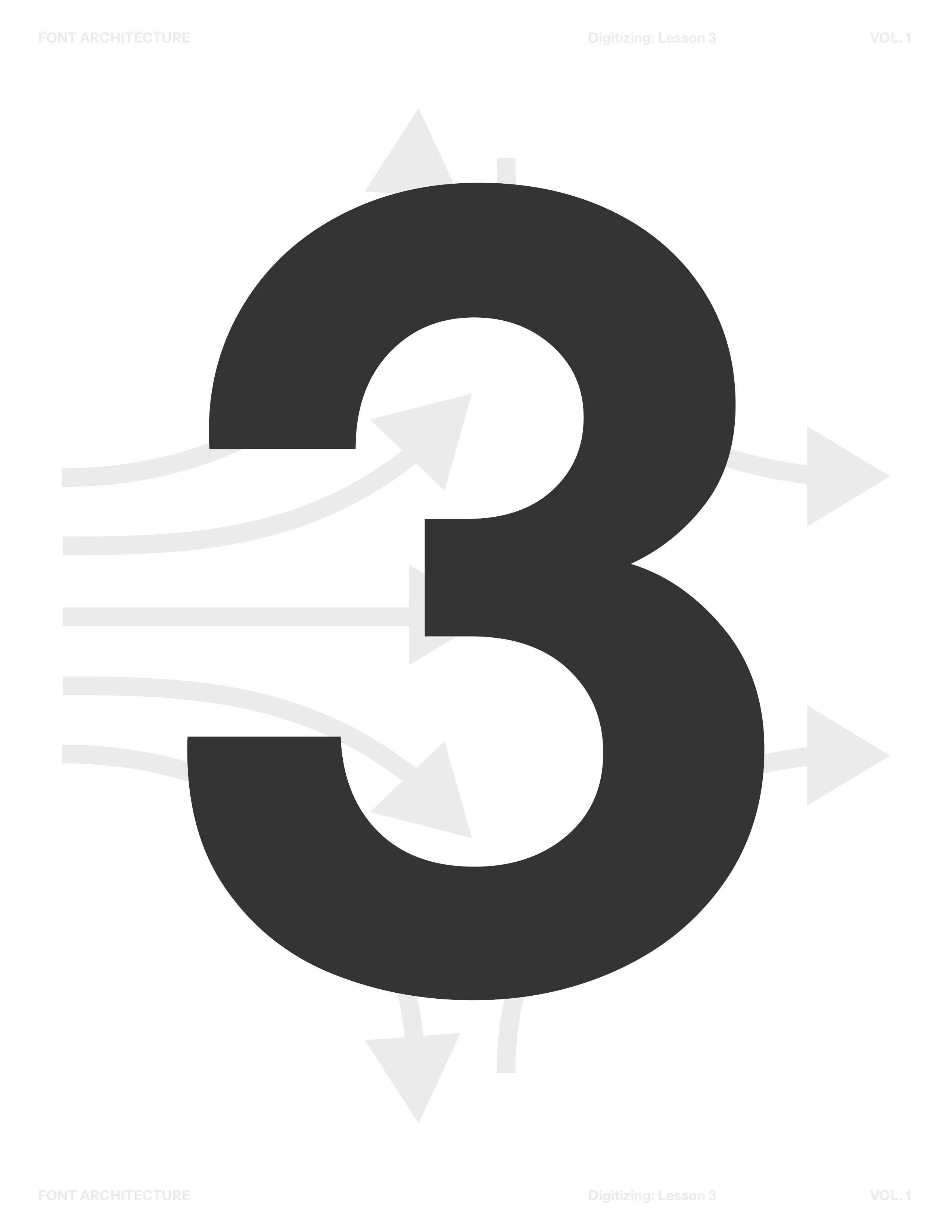
MODULE 3 This lesson focuses on building a complete typeface—bringing your initial concept into a cohesive system ready for real-world use. Critique and iterate on your own work with clarity,
MODULE 4 This lesson focuses on spacing, kerning, and preparing your typeface for publishing. You’ll refine rhythm and readability, test your font in real text, and strengthen consistency across the system.

Typeface Archive
Access Boulevard LAB's Font Hardrive
From our first font to on-going projects and everything inbetween.
‍
Download Files
How This Course Works
This course is process-driven. Each lesson builds on the previous one, and progress comes from repetition, not speed. You’ll move between sketching, observation, and digital refinement, learning when to act and when to pause. There are no shortcuts here—only systems, decisions, and consequences.You are encouraged to keep all versions of your work. Early sketches and rough drafts are not mistakes; they are reference points that help you understand how your thinking evolves.
What This Course Is Not
This course is not about copying existing fonts.
It is not about mastering software quickly.
It is not about polishing every letter until it looks “correct.”

Instead, it is about developing judgment—learning how to recognize structure, imbalance, rhythm, and voice in your own work.
What You’ll Learn
Type anatomy, contrast, balance, spacing
Drawing and constructing letterforms by hand
Control characters and alphabet systems
Professional type design software fundamentals
Optical adjustments beyond measurement
Critique and iteration as a designer
From concept to usable typeface
What you need to make a typeface?
Paper (printer paper or a sketchbook)
Pencil or pen
Eraser (optional, refinment)
Ruler (optional, for guides)
Computer for digitizing type
Type design software (Glyphs, FontLab, or FontForge)
When You Feel Stuck
Return to your control letters.
Test in text, not in isolation.
Redraw rather than refine.
Diagnose before adjusting.

Type design is a continual practice. Stay with the process.